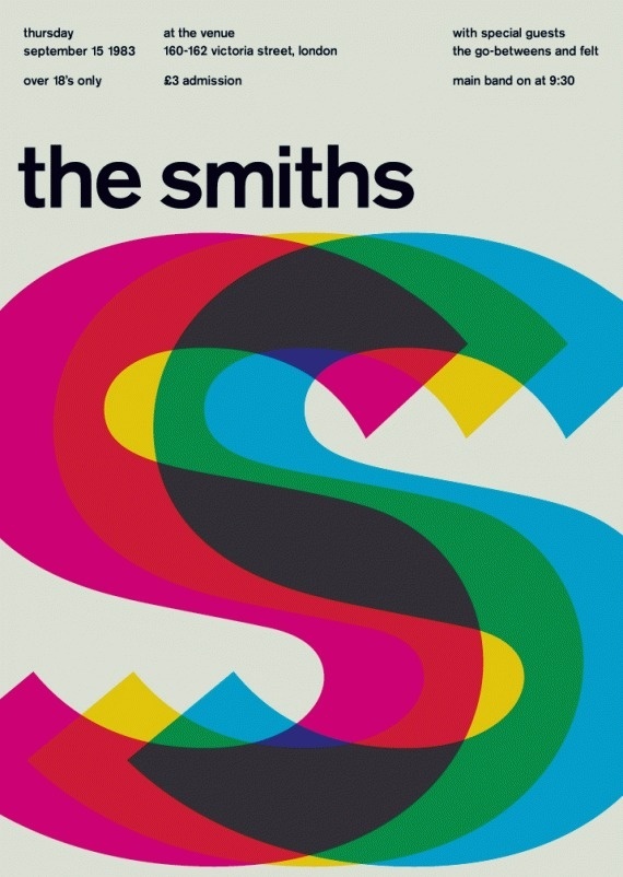
Your assignment this week is to design and develop a website about New York using a strong grid drawn from Swiss Poster Design examples.
Your goal this week is to practice defining a grid and ensuring you can layout and position any and every element exactly as you want. This takes a keen awareness and knowledge of CSS layout and positioning, specifically with flexbox. You will be able to take artistic license in "making and breaking the grid" but in general, your task is to
 |
 |
 |
- Web Design Process Guide
- Design for Developers - structuring the DOM and styling
- CSS Guide
- Specifically:
- CSS: An art, a science, a nightmare (everything you should know)
- The sections on layout - flexbox and BEM conventions
- Specifically:
- JavaScript Frontend guide
- Specifically:
- JavaScript and the DOM which includes selecting and updating the DOM in JavaScript and JavaScript Events
- Specifically:
- Dev Tools Guide
- You don't need a framework for responsive design
Your assignment will be comprised of four parts: design > development > deployment > documentation
Effective front end web development, is as about able to translate an interface or visual design into code and identifying how to combine content with layout, structure, and styling.
Part 1 of this assignment is about focusing on organizing typography, layout, and color before you start coding. We would like to see:
-
- Sketches: Annotated hand-drawn sketches of your layout and content
-
- Wireframes: Wireframes that translate your hand-drawn sketches into a digital format
-
- Design: A "final" design that breathes life into your wireframes
-
- Style Guide: Basic style guide that is specifies at the very least about your typographic hierarchy, your grid, and color palette and acts as your project's visual design source during development.
NOTE: If you are coming from a UX design or classical design background and have done this work before, you'll know that it takes an IMMENSE effort to do all those aspects above with full fidelity. The point of this part of the assignment is to cue you into these steps as critical steps in your development process. Each of these steps could easily take an entire week so make sure to pace yourself and set constraints on the time/effort balancing design and development time. We are not expecting polished and pixel-perfect results here, but are looking to see that you can articulate your ideas on paper and in a design program, and extract out general guidelines for your developers (e.g. you) to work from.
As a front end developer, your task is often to create faithful reproductions of the visual design of the web app/site that lands on your desk. Over time you will acquire new tips and tricks on how to make high fidelity recreations of the designs you've made or those that have been given to you. You will even be able to add delightful animations and add surprising effects that will tickle your users.
For now, your job is to translate your own designs as faithfully as possible into code. In this step, you will identify how to take the specifications in your style guide and design (see part 1) and articulate them as HTML, CSS, and JavaScript.
Here you will:
- Semantic and Structured HTML: Create an HTML structure that best uses semantic HTML to structure your content
- HINT: You should read your CSS and JavaScript in as external files.
- Elegant CSS: Define CSS rules that follow as best as possible BEM conventions that structure your layout and style your DOM elements
-
HINT: Remember the CSS Box model? You'll probably want to use
border-boxbox-sizing on all of your elements using the universal selector so that your DOM elements are always constrained by the width and height you want.* { box-sizing: border-box; }
- Interactivity: Write JavaScript that fulfills the 5 below interactive elements that use the following events. The JavaScript should update the CSS using in response to the following events:
onloadclickscrollmouseoveronkeypress
- Responsive page layout: Your page should show some responsiveness to screen size. You will have to use a
@mediaquery to affect some layout changes to your page.- HINT: Changing
flex-direction: rowtoflex-direction: columnon a flex container will do wonders here. Furthermore, changing thefont-sizewill make a massive difference as well.
- HINT: Changing
Your website will be served using a static web server on Glitch and will be pulled from a remote Github repository. You will need to practice good git tracking and connect your local git repository to a remote Github Repository.
Consider structuring your project directory like so:
/myCoolProject
  README.md
  index.html
  /public
    /js
      main.js
    /css
      main.css
- You must have a README.md that explains:
- how to set up and run your application.
- how you built your HTML page
- inspiration, process documentation, struggles, references, and questions, like your ITP blog
- and how you deployed your work to Glitch.com.
- You may use this README template to structure your README documentation and blog post
Details:
- Due Date: week 3 - Feb 10
- Your assignment must be turned in BEFORE midnight on Sunday, the day before class, Feb 9.
📨All Assignments should be submitted to your respective section:
- Section 1:
- Section 2: