When a user navigates on the web, they get to see the inner workings of web experiences: flash of white followed by a piece-meal rendering phase. This sequenced user experience results in a higher cognitive load because the user has to connect the dots between where they were, and where they are. Not only that, a smooth animation to transition between scenes also reduces the loading latency perceived by the user even if the actual loading time is the same. For these reasons, most platforms provide easy to use primitives to enable developers to build seamless transitions: Android, iOS/Mac and Windows.
Shared Element Transitions provides developers with the same capability on the web, irrespective of whether the transitions are cross-document or intra-document (SPA).
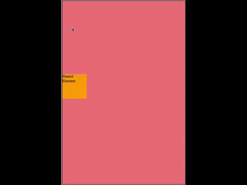
A visual demo of some example transition patterns targeted by this feature are here. The following is a summary of the semantics of these transition patterns :
- Root Transitions : The full page content animates between two web pages with an optional static UI element on top. Shared axis shows an example.
- Shared Element Transitions : A persistent UI element morphs into another (which could be a UI element on the next page or the whole page) changing its shape and content. Container transform shows an example.
- Entry/Exit Transitions : A UI element animates as it exits or enters the screen. This issue shows an example.
These transitions should be feasible in SPAs (Single Page Apps) and MPAs (Multi Page Apps).
Let's take the example below which shows how the API can be used by a developer to animate the background and a shared element on a same origin navigation (MPA). The SPA equivalent of this case is one where the old document is mutated into the new document via DOM APIs. See API Extensions for more code examples.
Note that the API shape below is tentative and used to explain the core feature design.
<html>
<head>
  <style>
    body {
      background-color: blue;
    }
    .animated {
      position: relative;
      top: 300px;
      width: 100px;
      height: 100px;
      background-color: red;
    }
  </style>
</head>
<body>
  <div class="animated" sharedid="header-id" id="header">Shared Element</div>
  <a href="new-document.html">Click Me</a>
</body>
</html><html>
<head>
<style>
body {
background-color: lightblue;
}
.animated {
position: relative;
top: 100px;
width: 200px;
height: 200px;
background-color: green;
}
::shared-container(header-id) {
animation: ::shared-container-header-id 1s ease-in;
}
</style>
</head>
<body>
<div class="animated" sharedid="header-id" id="header">Shared Element</div>
</body>
</html>The steps taken by the browser during the transition are as follows.
-
When the user presses "Click Me" and a navigation is initiated on the old Document, create the following pseudo-elements in the top layer1. Note that a shared element must not be nested inside another shared element :
a. A container pseudo-element and child replaced pseudo-element for each element with the
sharedidattribute. These are identified via ::shared-container(shared_id) and ::shared-old(shared_id) respectively, where shared_id is the value of thesharedidattribute.b. A replaced pseudo-element for the root/html element identified via ::shared-old-root.
c. The box hierarchy in the top layer stacking context is :
├───shared-old-root ├───shared-container(header-id) ├───shared-old(header-id) -
Apply the following UA stylesheet to the pseudo elements on the old page :
::shared-old-root, ::shared-container(header-id) {
  position: fixed;
  top: 0px;
  left: 0px;
}

::shared-old-root {
  width: 100vw;
  height: 100vh;
  // The output of element() function on the root element.
  content: element(html);
}

::shared-container(header-id) {
  /* This size is is chosen exactly according to the header-id element's
   border box dimensions after layout. */
  width: 100px;
  height: 100px;

  /* A transform positioning the element relative to the viewport so that it overlaps
   exactly with its screen coordinates and orientation it had on the old page. */
  transform: translate(8px, 308px);
}

::shared-old(header-id) {
  position: absolute;
  width: 100%;
  height: 100%;
  content: element(header-id);
}
-
Save the output of the element() function for each pseudo element referenced above with the computed size and transform applied to container elements.
-
Navigate to the new page leaving the last rendered pixels of the old page on screen.
-
When the new page loads, suppress rendering until resources required for first render have been fetched.
-
Once the page is ready for first render, create the following pseudo elements in the top layer. The pseudo elements are kept in sync with the corresponding shared elements in the DOM until the transition completes as specified in step 8 :
a. A container pseudo-element and child replaced pseudo-element for each shared element on the old page using state saved in step 3.
b. A container pseudo-element and child replaced pseudo-element for each element with the
sharedidattribute on the new page. The container is reused if already present.c. A replaced element for the root/html element identified via ::shared-new-root.
d. The box hierarchy in the top layer stacking context is :
├───shared-new-root ├───shared-old-root ├───shared-container(header-id) ├───shared-new(header-id) ├───shared-old(header-id) -
Apply the following UA stylesheet to the pseudo elements on the new page.
::shared-old-root, ::shared-new-root, ::shared-container(header-id) {
  position: fixed;
  top: 0px;
  left: 0px;
}

::shared-old-root, ::shared-new-root {
  width: 100vw;
  height: 100vh;
  content: element(html);
}

/* Update the container's size and transform to the shared element on the new page. */
::shared-container(header-id) {
  width: 200px;
  height: 200px;
  transform: translate(8px, 108px);

  /* The blend mode referenced below is not currently exposed with mix-blend-mode. */
  isolation: isolate;
  mix-blend-mode: [plus-lighter](https://drafts.fxtf.org/compositing/#porterduffcompositingoperators_plus_lighter);
}

::shared-old(header-id), ::shared-new(header-id) {
  position: absolute;
  width: 100%;
  height: 100%;
}

::shared-old-root {
  /* This is the saved output referenced in step 3. */
  content: cached-element(html);
}
::shared-old(header-id) {
  content: cached-element(header-id);
}

::shared-new-root {
  content: element(html);
}
::shared-new(header-id) {
  content: element(header-id);
}

/* Default animations added by the UA which can be overridden by the developer stylesheet/script. */
@keyframes ::shared-new-fade-in {
  0% {opacity: 0;}
  100% {opacity: 1;}
}
::shared-new-root, ::shared-new(header-id) {
  animation: ::shared-new-fade-in 0.25s;
}

@keyframes ::shared-old-fade-out {
  0% {opacity: 1;}
  100% {opacity: 0;}
}
::shared-old-root, ::shared-old(header-id) {
  animation: ::shared-old-fade-out 0.25s;
}

/* Generated for each shared element with the syntax shared-container-sharedid. */
@keyframes ::shared-container-header-id {
  from {
    width: 100px;
    height: 100px;
    transform: translate(8px, 308px);
  }
}
::shared-container(header-id) {
  animation: ::shared-container-header-id 0.25s;
}
-
When the transition finishes, remove all pseudo elements from the top layer. The transition finishes when there is no active animation on any pseudo element. See issue 64 for discussion on this.
An example simulating the steps above using the existing element() function
is here (open in Firefox).
A common capability desirable during transitions is to interpolate styles like border-radius that change the element's shape. The container transform examples show a visual demo of that. Painting properties like the element's border within its image when using the element() function makes this difficult.
Consider the same example as above with the addition of box decorations to the shared element.
<html>
<head>
  <style>
    body {
      background-color: blue;
    }

    .animated {
      position: relative;
      top: 300px;
      width: 100px;
      height: 100px;
      background-color: red;

      border: 10px solid black;
      border-radius: 10% 10%;
      box-shadow: 0px 0px 10px;
    }

    .animated:transition {
      /* Retain the border to ensure it is painted transparent but the box size is unchanged. */
      border: 10px solid transparent;
      border-radius: none;
      box-shadow: none;
    }

    ::shared-container(header-id) {
      border: 10px solid black;
      border-radius: 10% 10%;
      box-shadow: 0px 0px 10px;
    }

    /* Offset the image to account for the border in the snapshot. */
    ::shared-old(header-id) {
      top: -10px;
      left: -10px;
    }
  </style>
</head>
<body>
  <div class="animated" sharedid="header-id" id="header">Shared Element</div>
</body>
</html><html>
<head>
<style>
body {
background-color: blue;
}
.animated {
position: relative;
top: 100px;
width: 200px;
height: 200px;
background-color: green;
border: 5px solid black;
border-radius: 50% 50%;
box-shadow: 0px 0px 5px;
}
.animated:transition {
border: 5px solid transparent;
border-radius: none;
box-shadow: none;
}
::shared-container(header-id) {
border: 5px solid black;
border-radius: 50% 50%;
box-shadow: 0px 0px 5px;
}
::shared-new(header-id) {
top: -5px;
left: -5px;
}
@keyframes border-animation {
from {
border: 10px solid black;
border-radius: 10% 10%;
box-shadow: 0px 0px 10px;
}
}
::shared-container(header-id) {
animation: ::shared-container-header-id 1s ease-in, border-animation 1s ease-in;
}
@keyframes position-animation {
from {
top: -10px;
left: -10px;
}
to {
top: -5px;
left: -5px;
}
}
::shared-old(header-id), ::shared-new(header-id) {
animation: position-animation 1s ease-in;
}
</style>
</head>
<body>
<div class="animated" sharedid="header-id" id="header">Shared Element</div>
</body>
</html>The additional steps taken by the browser in the example above are :
i. When a pseudo element is created for shared elements in the old page in step 1, the pseudo-class "transition" is enabled for each shared element.
ii. In step 3 when saving state from the old page, the completed ComputedStyle on the pseudo elements is saved in addition to the computed size and transform.
iii. In step 7 when applying a UA stylesheet to pseudo elements on the new page, the saved style is also applied to the old pseudo elements :
::shared-container(header-id) {
  /* This is the saved output referenced in step 3. Applied before updating to
   values from the shared element in the new DOM. */
  width: 100px;
  height: 100px;
  transform: translate(8px, 308px);
  border: 10px solid black;
  border-radius: 10% 10%;
  box-shadow: 0px 0px 10px;
}

::shared-old(header-id) {
  position: absolute;
  width: 100%;
  height: 100%;

  /* This is the saved output referenced in step 3. */
  content: cached-element(header-id);
  top: -10px;
  left: -10px;
}
An example simulating the steps above using the existing element() function
is here (open in Firefox).
The following changes will be made to the element() spec as a part of this proposal. The element captured by this function is the target element :
- The target element must have paint containment (contain:paint) to ensure the element is the containing block for all positioned descendents and generates a stacking context.
- The target element must disallow fragmentation (similar to
break-inside:avoid). - A new cached-element() function is introduced to refer to the saved output of the element() function in step 3 of the design. (This part may not be developer exposed though.)
- Nested shared elements are omitted from the output of element() function.
- Elements captured using element() and displayed via pseudo-elements during
the transition are not painted in the regular DOM - they behave as if they
have
content-visibility: hidden, except that they don't havecontain:size. - The special cases when running the
element()function on the html element are :- The natural size for the generated image is the visual viewport bounds.
- When creating the image, the element is drawn on a canvas with the background color of the document.
The SPA code requires the addition of script APIs which provide the equivalent of "navigation" and "ready for first render" events referenced in step 1 and 4 of the design. The rest of the code is identical between MPA and SPA.
function handleTransition() {
  document.documentTransition.prepare(async () => {
    await loadNextPage();
  });
}- The prepare API initiates step 1 to 3 to save the state of shared elements in the current DOM. The API takes a callback once the save operation finishes executing.
- The async callback initiates load of the next page and initiates step 4 which suppresses rendering.
- When the callback returns, the new DOM is considered ready for first render. This starts step 5 onwards to create new pseudo elements and start animations.
The following example shows how developers can configure the transition in script for an MPA.
addEventListener("navigate", (event) => {
  // Add sharedid attribute to elements to offer for the transition
  // based on current document state.
  document.querySelector(".header").sharedid="header-id";

  // setData can be used to pass opaque contextual information to the
  // new page. The argument type is |any|.
  document.documentTransition.setData({ version: 123 });
});requestAnimationFrame(() => {
let pendingTransition = document.documentTransition.getPendingTransition();
if (pendingTransition.getData().version !== 123)
return;
// |offeredTransitionElements| provides a list of objects to access state
// saved from the old page.
let oldHeader = pendingTransition.offeredTransitionItems.get("header-id");
if (oldHeader) {
// Add sharedid attribute to elements animated in the new DOM.
document.querySelector(".header").sharedid="header-id";
// Query the style information saved from the old page.
let oldHeaderStyle = oldHeader.getContainerComputedStyle();
// The pseudo elements for each shared element are associated with the root element.
// The existing [pseudoElement](https://drafts.csswg.org/web-animations-1/#dom-keyframeeffect-pseudoelement) option can be used
// to target them with Web Animations API.
document.documentElement.animate(
[{ width: oldHeaderStyle.width,
height: oldHeaderStyle.height,
transform: oldHeaderStyle.transform }],
{ duration: 1000,
pseudoElement: '::shared-container(header-id)' });
}
});This proposal disallows a shared element to be nested inside another shared element. The restriction avoids the need to preserve the hierarchy of the shared elements and associated properties (transform, clip, effects inherited by descendents) when creating pseudo elements. This is a consideration for future iterations of the feature.
One consideration is to render each shared element using a replaced element directly instead of creating a container element. The motivation behind this split is to provide a stacking context to cross-fade the content of old and new shared elements. This is necessary to ensure blending identical pixels is a no-op using plus-lighter blending. While same-origin transitions could work around this, it enables future extensibility for cross-origin transitions where cross-fading identical images would be common.
An alternate approach to the setup described in
Animating Box Decoration CSS Properties is to
support this natively in the browser by introducing a new content-element()
function. This function would behave similarly to the element() function
except skipping the following properties when painting the element: box
decorations and visual effects which generate a stacking context. The image
would also be sized to the element's content-box (as opposed to the border-box
used by the element() function). The motivation for supporting this natively
would be to make these properties animatable instead of requiring developers to
implement it themselves.
The security considerations below cover same-origin transitions. These are a subset of what's required for cross-origin transitions :
- Script can never read pixel content for images generated using the element() function. This is necessary since the document may embed cross-origin content (iframes, CORS resources, etc.) and multiple restricted user information (visited links history, dictionary used for spell check, etc.)
- The Live Animatable Properties could reference resources which are restricted in the new document for an MPA navigation. For example, the old page may use a cross-origin image for border-image which can't be accessed by the new page due to differences in COEP. Fetching these styles will fail on the new page. For same-origin navigations, the developer already has knowledge of the cross-origin policy on the new page. They can ensure not to reference cross-origin resources in the properties made live.
An aspect of the feature that needs to be defined is the type of navigations that the old page can configure. We expect this will closely align with the navigations that can be observed by the page using app-history's navigate event.
Footnotes
-
The pseudo elements in the top layer will not have an associated ::backdrop that is created for other elements in the top layer. ↩