Toastifications is a toast notification component library, for creating simple and elegant notifications for your web based site or application.
VanillaJS: Vanilla JS, SCSS (CSS pre-complied), HTML
ReactJS: React.JS, Vite (dev testing), SCSS, HTML
Toastifications is currently available for VanillaJS and ReactJS, more framework support is coming soon! To get started find your corresponding framework below:
Install toast-ifications by linking the script and style files in your project.
<script src="./toastComponent.js" charset="utf-8" defer></script>
<link rel="stylesheet" href="./toastStyle.css">To get started you need to init the ToastNotification class and set some options.
new ToastNotification({notificationType: 'info', message: 'Hello World'}).render();Install toast-ifications by importing the component file into your project.
import ToastNotification from './components/toastNotification';To get started you need to init the ToastNotification class and set some options.
<ToastNotification notificationData={{notificationType: 'info', message: 'Hello World'}} />Here is an example object to render a personalised component, none of the options are strictly required, but I do recommend at least setting the notificationType and message.
The rest of the options, if not set, are set to default values.
{
notificationType: 'error',
notificationAction: 'none',
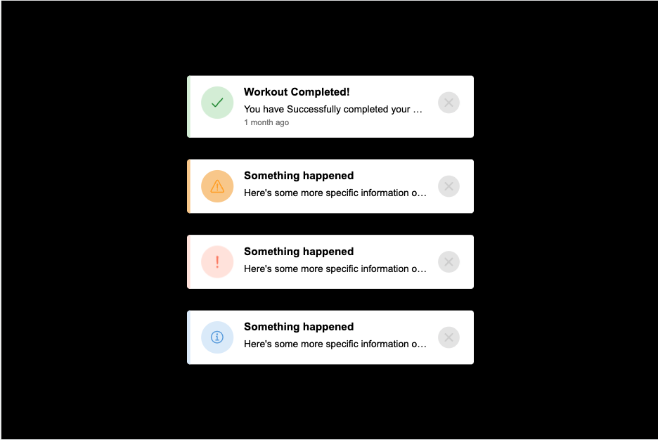
title: 'Workout Completed!',
message: 'You have Successfully completed your workout, congrats! Keep up the good work!',
messageExtended: false,
theme: 'dark',
time: '2022-06-04 0:35:00',
icon: 'hammer-outline',
animated: true,
autodelete: false
}These parameters affect the base appearance and functionality of the component.
| Parameter | Type | Description |
|---|---|---|
notificationType |
string |
Sets the type toast notification. |
notificationAction |
string |
Not-functional Set onClick function of notification. |
theme |
string |
Not-functional Set light or dark-mode. |
animated |
bool |
Animates the icon of the notification. |
autodelete |
bool int |
Deletes the component after setTimeout. |
These paramaters set custom visual data on the notification component.
| Parameter | Type | Description |
|---|---|---|
title |
string |
Set the title of notification component. |
message |
string |
Set the message to display in notification. |
messageExtended |
bool |
Set the message to display in notification. |
time |
date |
Set the time the notification was created. |
icon |
string |
Set an icon from the ionic icon library. |
Upcoming or planned functions and features to the library.
-
Improved responsive design
-
Angular and Vue support
-
Better documentation