
Since 2013, the Citi Bike Program has implemented a robust infrastructure for collecting data on the program's utilization. However, while the data is made public on the Citi Bike Data webpage and has been regularly updated, the team has yet to implement a dashboard or sophisticated reporting process. City officials have a number of questions on the program, so the first task is to build a set of data reports to provide the answers.
The task is to aggregate the data found in the Citi Bike Trip History Logs and find two unexpected phenomena. I designed 15 visualizations for each discovered phenomena. I took the dataset for the year 2017 and cleaned the data in jupyter notebook and merged the new data and exported in csv format and used it in Tableau Public Desktop to create the visualizations.
The Trip_Dataset was taken from Citibike website which included trip duration, start time and date, stop time and date,start station name, end station name, station ID, Station Lat/Long, Bike ID, user type(Customer = 24-hour pass or 3-day pass user; Subscriber = Annual Member), gender(Zero=unknown; 1=male; 2=female), year of birth.
The visulaizations were created based on the following questions.
- How many trips have been recorded total during the chosen period?
- By what percentage has total ridership grown?
- How has the proportion of short-term customers and annual subscribers changed?
- What are the peak hours in which bikes are used during summer months?
- What are the peak hours in which bikes are used during winter months?
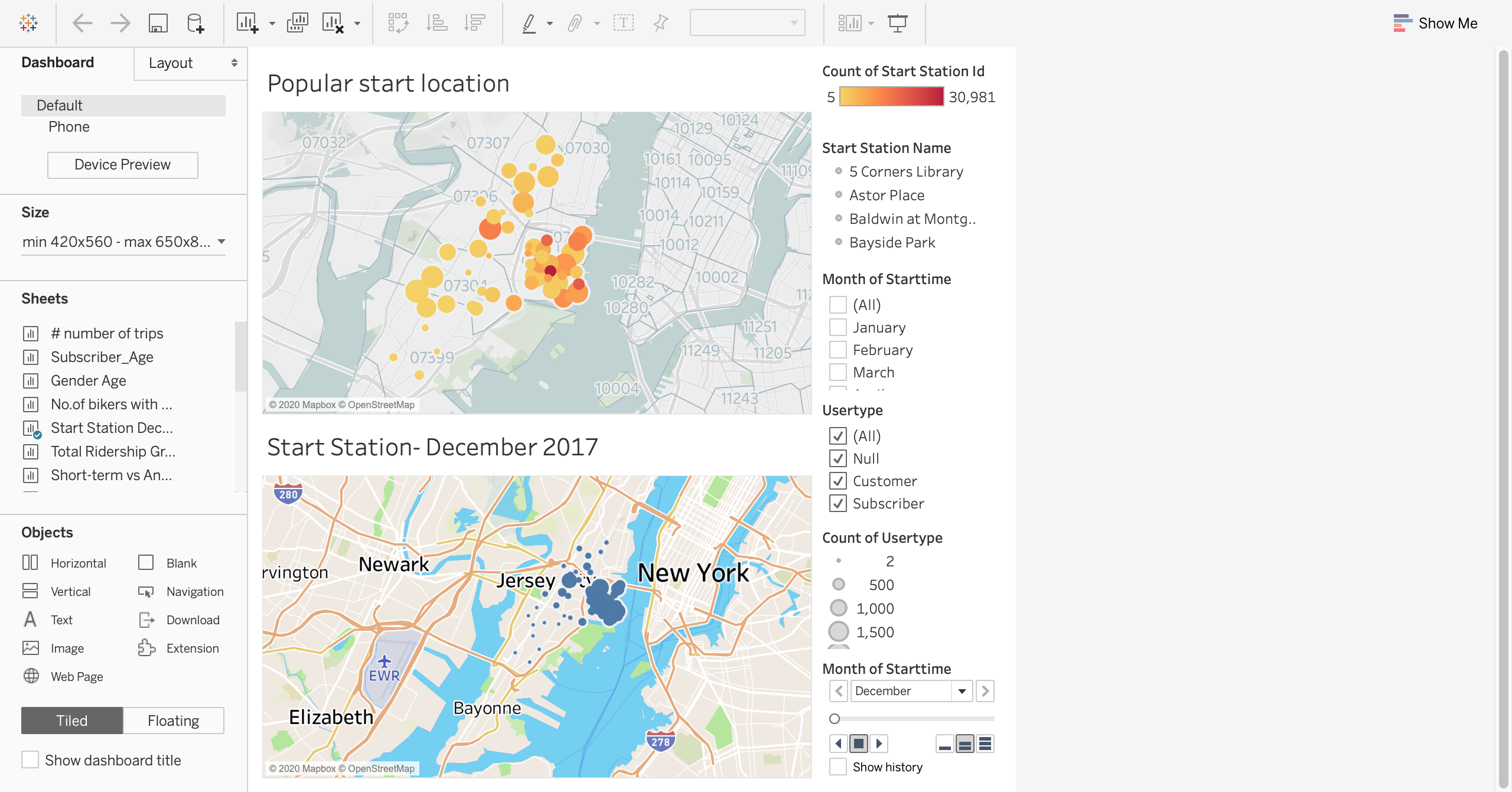
- What are the top 10 stations in the city for starting a journey? (Based on data, why do you hypothesize these are the top locations?)
- What are the top 10 stations in the city for ending a journey? (Based on data, why?)
- What are the bottom 10 stations in the city for starting a journey? (Based on data, why?)
- What are the bottom 10 stations in the city for ending a journey (Based on data, why?)
- What is the gender breakdown of active participants (Male v. Female)?
- How effective has gender outreach been in increasing female ridership over the timespan?
- How does the average trip duration change by age?
- What is the average distance in miles that a bike is ridden?
- Which bikes (by ID) are most likely due for repair or inspection in the timespan?
- How variable is the utilization by bike ID?
Created a Tableau Dashboard and a Story based on the above questions.

Jupyter Notebook, Tableau Public Desktop.