Project's status: finished ✔️
This project is a fast way to put into practice fandamental HTML and CSS concepts by making a responsive landing page for a gameing store.
1. CSS
2. HTML
3. JavaScript
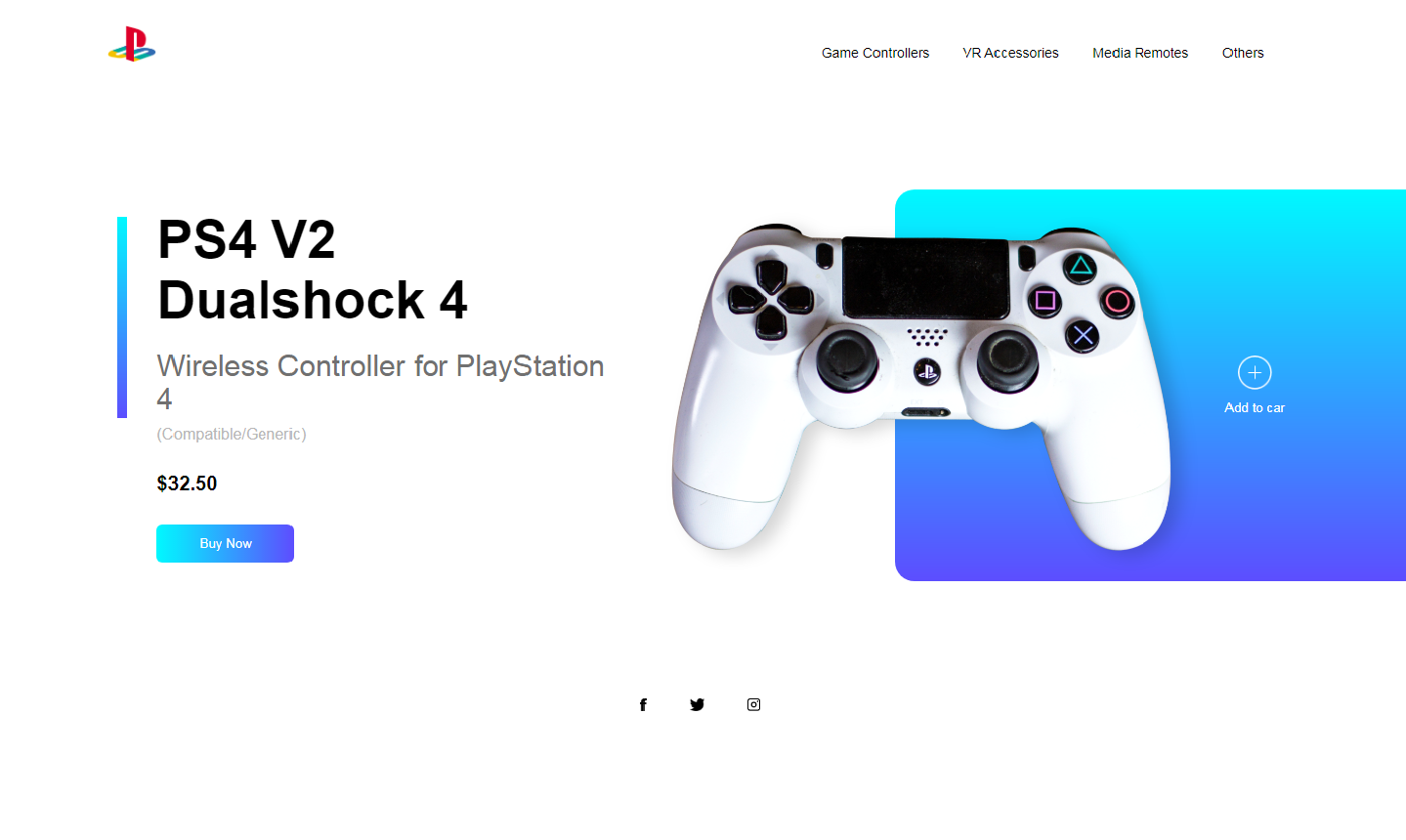
The desktop view is composed by three parts; firstly, the header which holds four buttons on the top-right side and a nintendo logo on the top-left side. Secondly, the middle part shows a game controller and "add to car" butoon on the right side, while a brief description of the product and a animated button is shown on the left side. Finally, the footer which holds social media icons.
The mobile view manages the same parts as the desktop view with the difference that the header doesn't hold the four buttons shown on the top-right desktop view. Instead, it holds a dropdown menu button and when it's clicked on it displays the four options as in the desktop view.
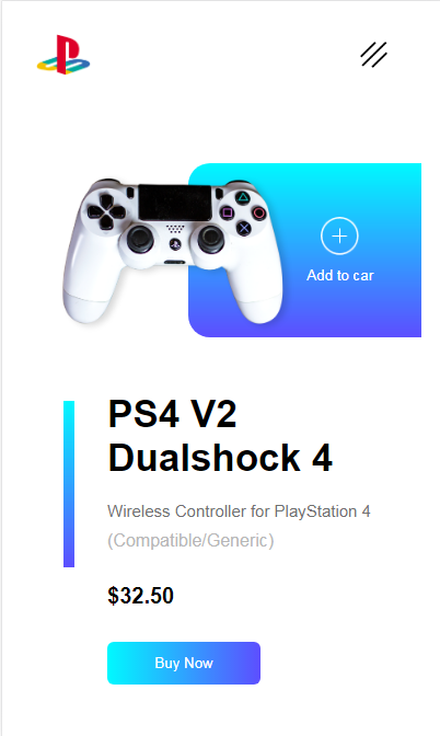
The dropdown menu is only shown on the mobile view, when the user clicks on the menu icon button activates a JavaScript function which compares the unordered list's maximum height whose default value is 0px on the mobile view and if it is 0px, it sets as new maximum heigh 130px displaying all four buttons showed on the desktop view as a list. Otherwise, if the unordered list's maximum height is greater than 0px, it sets as new maximum height 0px hidding all the four buttons.
let menuList = document.getElementById("menuList");

menuList.style.maxHeight = "0px";

function togglemenu(){
	if (menuList.style.maxHeight == "0px") {
		menuList.style.maxHeight = "130px";
	}else {
		menuList.style.maxHeight = "0px";
	}
}Copyright © 2021 David Lozada