guide layout with primeng angular
The purpose of this guide is to get a basic understanding of creating layouts of PrimeNG in a devon4ng application. PrimeNG is a HTML/CSS framework.
We start with opening the console(in the Devon distribution folder) and running the following command to start a project named AngularZorroLayout.
devon ng new AngularPrimeNgLayout
Select y when it asks whether it would like to add Angular routing and select SCSS when it asks for the style sheet format. You can also use the devonfw IDE CLI to create a new devon4ng application.
Once the creation process is complete, open your newly created application in Visual Studio Code. Try running the empty application by running the following command in the integrated terminal:
devon ng serve
Angular will spin up a server and you can check your application by visiting http://localhost:4200/ in your browser.
Next we will add Angular Material to our application. In the integrated terminal, press CTRL + C to terminate the running application and run the following command:
Run the ng add command for PrimeNG:
npm install primeng
npm install primeicons --save
After that we can see that the module is imported on app.module.ts
The css dependencies are as follows, Prime Icons, theme of your choice and structural css of components.
 "src/styles.scss",
 "node_modules/primeicons/primeicons.css",
 "node_modules/primeng/resources/themes/saga-blue/thcss",
 "node_modules/primeng/resources/primeng.min.css"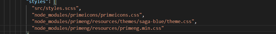
Now we need to create a component for the header. We will create it with the command We will create a folder component to have a good practices.
ng generate component components/header
And will create the code like:
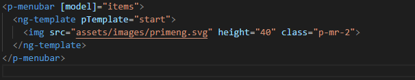
<p-menubar [model]="items">
  <ng-template pTemplate="start">
    <img src="assets/images/primeng.svg" height="40" class="p-mr-2">
  </ng-template>
</p-menubar>
How we see the menu has some properties from the library.
<p-menubar> is the first one, with this label we can create the menu and with the <ng-template pTemplate> we decided where the menu will be aligned.
The [model]=items means that the menu is looking for the "items" to print.
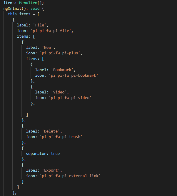
The items is a array but his type come from the PrimeNG. So we just need to import the MenuItem.
import { MenuItem } from 'primeng/api';`
this.items = [
{
label: 'File',
icon: 'pi pi-fw pi-file',
items: [
{
label: 'New',
icon: 'pi pi-fw pi-plus',
items: [
{
label: 'Bookmark',
icon: 'pi pi-fw pi-bookmark'
},
{
label: 'Video',
icon: 'pi pi-fw pi-video'
},
]
},
{
label: 'Delete',
icon: 'pi pi-fw pi-trash'
},
{
separator: true
},
{
label: 'Export',
icon: 'pi pi-fw pi-external-link'
}
]
},
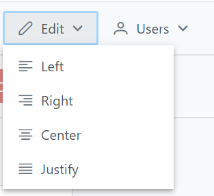
{
label: 'Edit',
icon: 'pi pi-fw pi-pencil',
items: [
{
label: 'Left',
icon: 'pi pi-fw pi-align-left'
},
{
label: 'Right',
icon: 'pi pi-fw pi-align-right'
},
{
label: 'Center',
icon: 'pi pi-fw pi-align-center'
},
{
label: 'Justify',
icon: 'pi pi-fw pi-align-justify'
},
]
},
{
label: 'Users',
icon: 'pi pi-fw pi-user',
items: [
{
label: 'New',
icon: 'pi pi-fw pi-user-plus',
},
{
label: 'Delete',
icon: 'pi pi-fw pi-user-minus',
},
{
label: 'Search',
icon: 'pi pi-fw pi-users',
items: [
{
label: 'Filter',
icon: 'pi pi-fw pi-filter',
items: [
{
label: 'Print',
icon: 'pi pi-fw pi-print'
}
]
},
{
icon: 'pi pi-fw pi-bars',
label: 'List'
}
]
}
]
},
{
label: 'Events',
icon: 'pi pi-fw pi-calendar',
items: [
{
label: 'Edit',
icon: 'pi pi-fw pi-pencil',
items: [
{
label: 'Save',
icon: 'pi pi-fw pi-calendar-plus'
},
{
label: 'Delete',
icon: 'pi pi-fw pi-calendar-minus'
},
]
},
{
label: 'Archieve',
icon: 'pi pi-fw pi-calendar-times',
items: [
{
label: 'Remove',
icon: 'pi pi-fw pi-calendar-minus'
}
]
}
]
},
{
label: 'Quit',
icon: 'pi pi-fw pi-power-off'
}
];
}
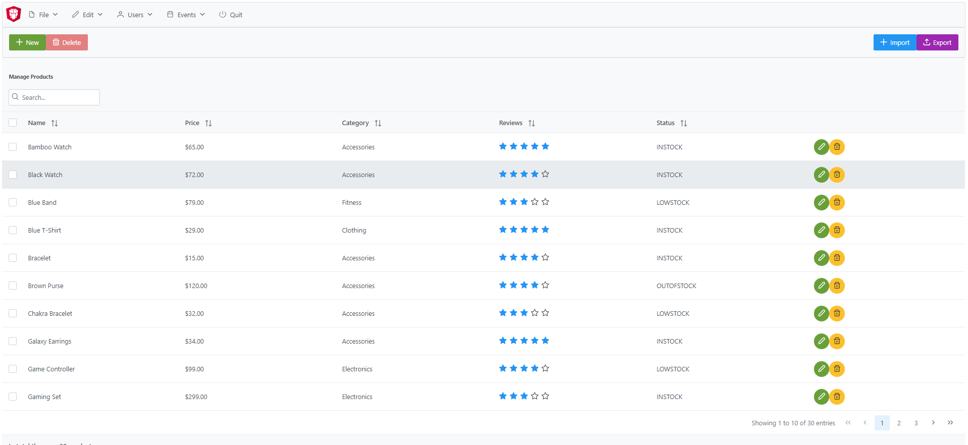
After the menus is done. The next step is create the main container, in this case will be the table.
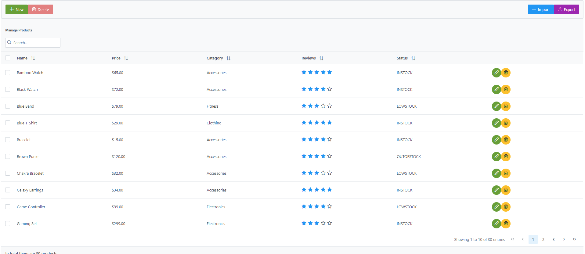
How is a very complex table we are going to explain component by component

To create those buttons we just need to write this piece of code
<p-toolbar styleClass="p-mb-4">
    <ng-template pTemplate="left">
      <button pButton pRipple label="New" icon="pi pi-plus" class="p-button-success p-mr-2"
        (click)="openNew()"></button>
      <button pButton pRipple label="Delete" icon="pi pi-trash" class="p-button-danger"
        (click)="deleteSelectedProducts()" [disabled]="!selectedProducts || !selectedProducts.length"></button>
    </ng-template>

    <ng-template pTemplate="right">
      <p-fileUpload mode="basic" accept="image/*" [maxFileSize]="1000000" label="Import" chooseLabel="Import"
        class="p-mr-2 p-d-inline-block"></p-fileUpload>
      <button pButton pRipple label="Export" icon="pi pi-upload" class="p-button-help"></button>
    </ng-template>
  </p-toolbar>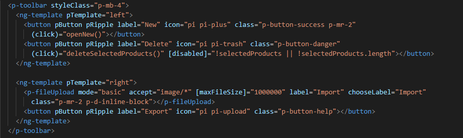
We can see some labels and attributes, for example <p-toolbar>, pButton, <p-fuleUpload>.
To use them, we need to import on app.module with the following code
import { TableModule } from 'primeng/table';
import { ButtonModule } from 'primeng/button';
import {ToolbarModule} from 'primeng/toolbar';
import {FileUploadModule} from 'primeng/fileupload';
We see the first method is openNew() when we call this method a variable is going to be true
openNew(): any {
  this.product = {};
  this.submitted = false;
  this.productDialog = true;
}Modal with the following code and will look like:
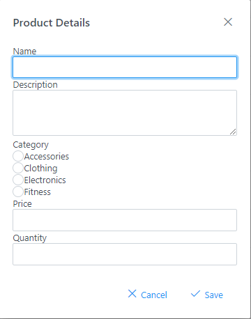
<p-dialog [(visible)]="productDialog" [style]="{width: '450px'}" header="Product Details" [modal]="true"
  styleClass="p-fluid">
  <ng-template pTemplate="content">
    <div class="p-field">
      <label for="name">Name</label>
      <input type="text" pInputText id="name" [(ngModel)]="product.name" required autofocus />
      <small class="p-invalid" *ngIf="submitted && !product.name">Name is required.</small>
    </div>
    <div class="p-field">
      <label for="description">Description</label>
      <textarea id="description" pInputTextarea [(ngModel)]="product.description" required rows="3"
        cols="20"></textarea>
    </div>

    <div class="p-field">
      <label class="p-mb-3">Category</label>
      <div class="p-formgrid p-grid">
        <div class="p-field-radiobutton p-col-6">
          <p-radioButton id="category1" name="category" value="Accessories" [(ngModel)]="product.category">
          </p-radioButton>
          <label for="category1">Accessories</label>
        </div>
        <div class="p-field-radiobutton p-col-6">
          <p-radioButton id="category2" name="category" value="Clothing" [(ngModel)]="product.category"></p-radioButton>
          <label for="category2">Clothing</label>
        </div>
        <div class="p-field-radiobutton p-col-6">
          <p-radioButton id="category3" name="category" value="Electronics" [(ngModel)]="product.category">
          </p-radioButton>
          <label for="category3">Electronics</label>
        </div>
        <div class="p-field-radiobutton p-col-6">
          <p-radioButton id="category4" name="category" value="Fitness" [(ngModel)]="product.category"></p-radioButton>
          <label for="category4">Fitness</label>
        </div>
      </div>
    </div>

    <div class="p-formgrid p-grid">
      <div class="p-field p-col">
        <label for="price">Price</label>
        <p-inputNumber id="price" [(ngModel)]="product.price" mode="currency" currency="USD" locale="en-US">
        </p-inputNumber>
      </div>
      <div class="p-field p-col">
        <label for="quantity">Quantity</label>
        <p-inputNumber id="quantity" [(ngModel)]="product.quantity"></p-inputNumber>
      </div>
    </div>
  </ng-template>

  <ng-template pTemplate="footer">
    <button pButton pRipple label="Cancel" icon="pi pi-times" class="p-button-text" (click)="hideDialog()"></button>
    <button pButton pRipple label="Save" icon="pi pi-check" class="p-button-text" (click)="saveProduct()"></button>
  </ng-template>
</p-dialog>To start to development this, we need to import DialogModule, ConfirmDialogMoudle, InputTextModule, RadioButtonModule and ` FormsModule` to do it we just need to write on app.module
import { DialogModule } from 'primeng/dialog';
import { ConfirmDialogModule } from 'primeng/confirmdialog';
import {FormsModule} from '@angular/forms';
import { RadioButtonModule } from 'primeng/radiobutton';
import { InputTextModule } from 'primeng/inputtext';After that we can see a Modal with the form and when we click on the "Save Button", We will create a new product.
saveProduct(): any {
  this.submitted = true;

  if (this.product.name.trim()) {
    if (this.product.id) {
      this.products[this.findIndexById(this.product.id)] = this.product;
      this.messageService.add({ severity: 'success', summary: 'Successful', detail: 'Product Updated', life: 3000 });
    }
    else {
      this.product.id = this.createId();
      this.product.image = 'product-placeholder.svg';
      this.products.push(this.product);
      this.messageService.add({ severity: 'success', summary: 'Successful', detail: 'Product Created', life: 3000 });
    }

    this.products = [...this.products];
    this.productDialog = false;
    this.product = {};
  }
}
After done the first buttons, just need to do the rest of the table
<p-table #dt [value]="products" [rows]="10" [paginator]="true"
    [globalFilterFields]="['name','country.name','representative.name','status']" [(selection)]="selectedProducts"
    [rowHover]="true" dataKey="id" currentPageReportTemplate="Showing {first} to {last} of {totalRecords} entries"
    [showCurrentPageReport]="true">
    <ng-template pTemplate="caption">
      <div class="p-d-flex p-ai-center p-jc-between">
        <h5 class="p-m-0">Manage Products</h5>
        <span class="p-input-icon-left">
          <i class="pi pi-search"></i>
          <input pInputText type="text" (input)="dt.filterGlobal($event.target.value, 'contains')"
            placeholder="Search..." />
        </span>
      </div>
    </ng-template>
    <ng-template pTemplate="header">
      <tr>
        <th style="width: 3rem">
          <p-tableHeaderCheckbox></p-tableHeaderCheckbox>
        </th>
        <th pSortableColumn="name">Name <p-sortIcon field="name"></p-sortIcon>
        </th>
        <th pSortableColumn="price">Price <p-sortIcon field="price"></p-sortIcon>
        </th>
        <th pSortableColumn="category">Category <p-sortIcon field="category"></p-sortIcon>
        </th>
        <th pSortableColumn="rating">Reviews <p-sortIcon field="rating"></p-sortIcon>
        </th>
        <th pSortableColumn="inventoryStatus">Status <p-sortIcon field="inventoryStatus"></p-sortIcon>
        </th>
        <th></th>
      </tr>
    </ng-template>
    <ng-template pTemplate="body" let-product>
      <tr>
        <td>
          <p-tableCheckbox [value]="product"></p-tableCheckbox>
        </td>
        <td>{{product.name}}</td>
        <td>{{product.price | currency:'USD'}}</td>
        <td>{{product.category}}</td>
        <td>
          <p-rating [ngModel]="product.rating" [readonly]="true" [cancel]="false"></p-rating>
        </td>
        <td><span
            [class]="'product-badge status-' + product.inventoryStatus.toLowerCase()">{{product.inventoryStatus}}</span>
        </td>
        <td>
          <button pButton pRipple icon="pi pi-pencil" class="p-button-rounded p-button-success p-mr-2"
            (click)="editProduct(product)"></button>
          <button pButton pRipple icon="pi pi-trash" class="p-button-rounded p-button-warning"
            (click)="deleteProduct(product)"></button>
        </td>
      </tr>
    </ng-template>
    <ng-template pTemplate="summary">
      <div class="p-d-flex p-ai-center p-jc-between">
        In total there are {{products ? products.length : 0 }} products.
      </div>
    </ng-template>
  </p-table>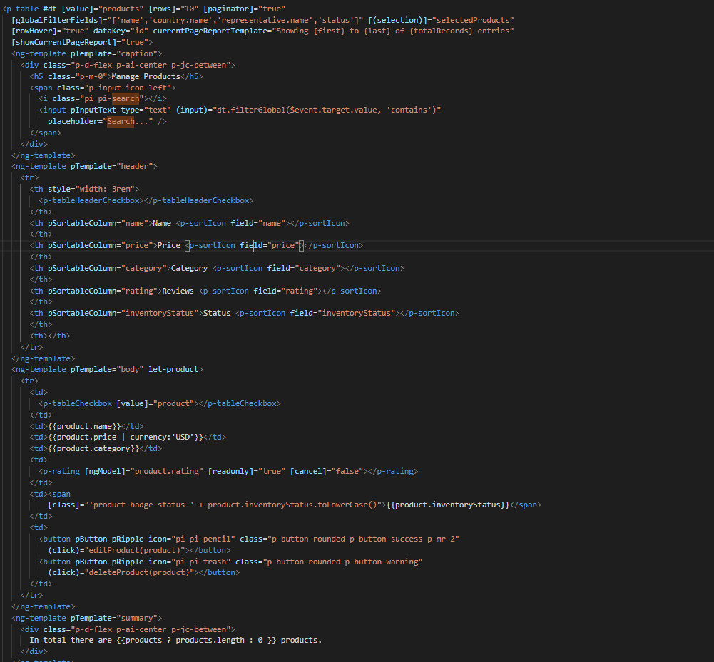
After that, need to add some styles to the code.
:host ::ng-deep {
    .p-paginator {
        .p-paginator-current {
            margin-left: auto;
        }
    }

    .p-progressbar {
        height: .5rem;
        background-color: #D8DADC;

        .p-progressbar-value {
            background-color: #607D8B;
        }
    }

    .table-header {
        display: flex;
        justify-content: space-between;
    }

    .p-calendar .p-datepicker {
        min-width: 25rem;

        td {
            font-weight: 400;
        }
    }

    .p-datatable.p-datatable-customers {
        .p-datatable-header {
            padding: 1rem;
            text-align: left;
            font-size: 1.5rem;
        }

        .p-paginator {
            padding: 1rem;
        }

        .p-datatable-thead > tr > th {
            text-align: left;
        }

        .p-datatable-tbody > tr > td {
            cursor: auto;
        }

        .p-dropdown-label:not(.p-placeholder) {
            text-transform: uppercase;
        }
    }

    /* Responsive */
    .p-datatable-customers .p-datatable-tbody > tr > td .p-column-title {
        display: none;
    }
}

@media screen and (max-width: 960px) {
    :host ::ng-deep {
        .p-datatable {
            &.p-datatable-customers {
                .p-datatable-thead > tr > th,
                .p-datatable-tfoot > tr > td {
                    display: none !important;
                }

                .p-datatable-tbody > tr {
                    border-bottom: 1px solid var(--layer-2);

                    > td {
                        text-align: left;
                        display: block;
                        border: 0 none !important;
                        width: 100% !important;
                        float: left;
                        clear: left;
                        border: 0 none;

                        .p-column-title {
                            padding: .4rem;
                            min-width: 30%;
                            display: inline-block;
                            margin: -.4rem 1rem -.4rem -.4rem;
                            font-weight: bold;
                        }

                        .p-progressbar {
                            margin-top: .5rem;
                        }
                    }
                }
            }
        }
    }

}
How we see it, we have some values already logged like products and some attributes that we need to import to use correctly the table.
All the moduls need to be in app.module
import { BrowserModule } from '@angular/platform-browser';
import { NgModule } from '@angular/core';

import { AppRoutingModule } from './app-routing.module';
import { AppComponent } from './app.component';
import { HeaderComponent } from './components/header/header.component';

import { MenubarModule } from 'primeng/menubar';
import { HttpClientModule } from '@angular/common/http';
import { TableModule } from 'primeng/table';
import { CalendarModule } from 'primeng/calendar';
import { SliderModule } from 'primeng/slider';
import { DialogModule } from 'primeng/dialog';
import { MultiSelectModule } from 'primeng/multiselect';
import { ContextMenuModule } from 'primeng/contextmenu';
import { ButtonModule } from 'primeng/button';
import { ToastModule } from 'primeng/toast';
import { InputTextModule } from 'primeng/inputtext';
import { ProgressBarModule } from 'primeng/progressbar';
import { DropdownModule } from 'primeng/dropdown';
import {ToolbarModule} from 'primeng/toolbar';
import {FileUploadModule} from 'primeng/fileupload';
import {RatingModule} from 'primeng/rating';
import { RadioButtonModule } from 'primeng/radiobutton';
import { InputNumberModule } from 'primeng/inputnumber';
import { ConfirmDialogModule } from 'primeng/confirmdialog';
import { ConfirmationService, MessageService } from 'primeng/api';
import { ProductService } from './services/product.service';
import { InputTextareaModule } from 'primeng/inputtextarea';
import {FormsModule} from '@angular/forms';

import { BrowserAnimationsModule } from '@angular/platform-browser/animations';
import { NoopAnimationsModule } from '@angular/platform-browser/animations';


@NgModule({
  declarations: [AppComponent, HeaderComponent],
  imports: [
    BrowserModule,
    BrowserAnimationsModule,
    NoopAnimationsModule,
    AppRoutingModule,
    MenubarModule,
    TableModule,
    CalendarModule,
    SliderModule,
    DialogModule,
    MultiSelectModule,
    ContextMenuModule,
    ButtonModule,
    ToastModule,
    InputTextModule,
    ProgressBarModule,
    DropdownModule,
    ToolbarModule,
    FileUploadModule,
    RatingModule,
    RadioButtonModule,
    InputNumberModule,
    ConfirmDialogModule,
    InputTextareaModule,
    FormsModule,
    HttpClientModule,
  ],
How we can see, the first thing that the table is doing is loading all the products that we have.
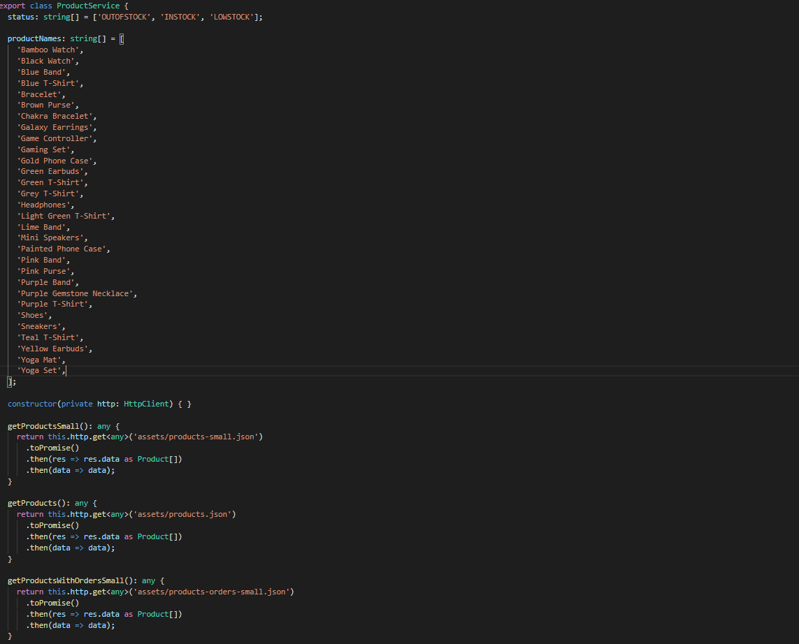
To do it, we will create a service to get all the data.
To create a service we need to use the next command
ng generate service services/product
In the service we are simulating a endpoint to get data.
We will have our products "hardcoded" and the methods to get or to set some values.
import { Injectable } from '@angular/core';
import { HttpClient } from '@angular/common/http';
import { Product } from '../models/product';

@Injectable({
  providedIn: 'root'
})
export class ProductService {
  status: string[] = ['OUTOFSTOCK', 'INSTOCK', 'LOWSTOCK'];

  productNames: string[] = [
    'Bamboo Watch',
    'Black Watch',
    'Blue Band',
    'Blue T-Shirt',
    'Bracelet',
    'Brown Purse',
    'Chakra Bracelet',
    'Galaxy Earrings',
    'Game Controller',
    'Gaming Set',
    'Gold Phone Case',
    'Green Earbuds',
    'Green T-Shirt',
    'Grey T-Shirt',
    'Headphones',
    'Light Green T-Shirt',
    'Lime Band',
    'Mini Speakers',
    'Painted Phone Case',
    'Pink Band',
    'Pink Purse',
    'Purple Band',
    'Purple Gemstone Necklace',
    'Purple T-Shirt',
    'Shoes',
    'Sneakers',
    'Teal T-Shirt',
    'Yellow Earbuds',
    'Yoga Mat',
    'Yoga Set',
  ];

  constructor(private http: HttpClient) { }

  getProductsSmall(): any {
    return this.http.get<any>('assets/products-small.json')
      .toPromise()
      .then(res => res.data as Product[])
      .then(data => data);
  }

  getProducts(): any {
    return this.http.get<any>('assets/products.json')
      .toPromise()
      .then(res => res.data as Product[])
      .then(data => data);
  }

  getProductsWithOrdersSmall(): any {
    return this.http.get<any>('assets/products-orders-small.json')
      .toPromise()
      .then(res => res.data as Product[])
      .then(data => data);
  }

  generatePrduct(): Product {
    const product: Product = {
      id: this.generateId(),
      name: this.generateName(),
      description: 'Product Description',
      price: this.generatePrice(),
      quantity: this.generateQuantity(),
      category: 'Product Category',
      inventoryStatus: this.generateStatus(),
      rating: this.generateRating()
    };

    product.image = product.name.toLocaleLowerCase().split(/[ ,]+/).join('-') + '.jpg';
    return product;
  }

  generateId(): string {
    let text = '';
    const possible = 'ABCDEFGHIJKLMNOPQRSTUVWXYZabcdefghijklmnopqrstuvwxyz0123456789';

    for (let  i = 0; i < 5; i++) {
      text += possible.charAt(Math.floor(Math.random() * possible.length));
    }

    return text;
  }


  generateName(): any {
    return this.productNames[Math.floor(Math.random() * Math.floor(30))];
  }

  generatePrice(): any {
    return Math.floor(Math.random() * Math.floor(299) + 1);
  }

  generateQuantity(): any {
    return Math.floor(Math.random() * Math.floor(75) + 1);
  }

  generateStatus(): any {
    return this.status[Math.floor(Math.random() * Math.floor(3))];
  }

  generateRating(): any {
    return Math.floor(Math.random() * Math.floor(5) + 1);
  }
}
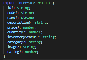
Also we create a interface for the Product, so all the products will have the same structure:
export interface Product {
  id?: string;
  code?: string;
  name?: string;
  description?: string;
  price?: number;
  quantity?: number;
  inventoryStatus?: string;
  category?: string;
  image?: string;
  rating?: number;
}
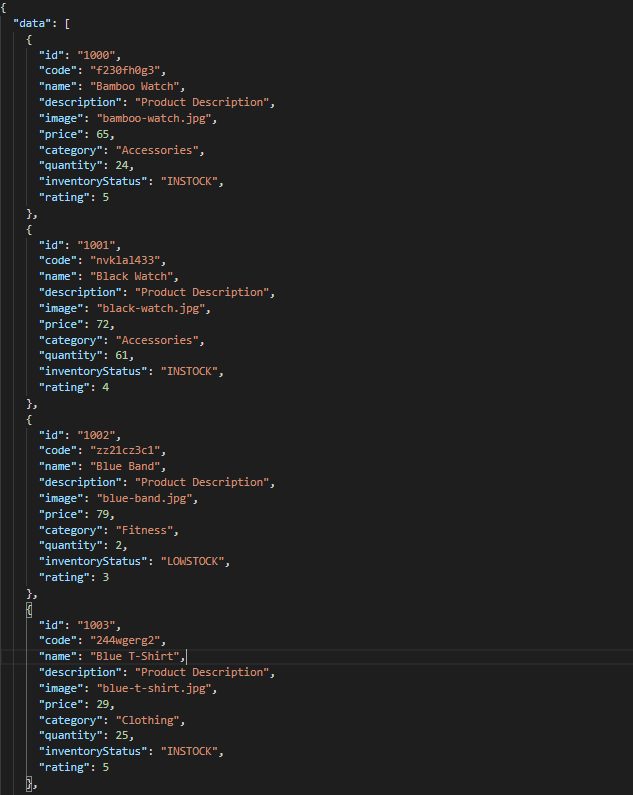
How we can see in the methods, we are getting the data from a hardcoded file product.json.
{
	"data": [
		{
			"id": "1000",
			"code": "f230fh0g3",
			"name": "Bamboo Watch",
			"description": "Product Description",
			"image": "bamboo-watch.jpg",
			"price": 65,
			"category": "Accessories",
			"quantity": 24,
			"inventoryStatus": "INSTOCK",
			"rating": 5
		},
		{
			"id": "1001",
			"code": "nvklal433",
			"name": "Black Watch",
			"description": "Product Description",
			"image": "black-watch.jpg",
			"price": 72,
			"category": "Accessories",
			"quantity": 61,
			"inventoryStatus": "INSTOCK",
			"rating": 4
		},
		{
			"id": "1002",
			"code": "zz21cz3c1",
			"name": "Blue Band",
			"description": "Product Description",
			"image": "blue-band.jpg",
			"price": 79,
			"category": "Fitness",
			"quantity": 2,
			"inventoryStatus": "LOWSTOCK",
			"rating": 3
		},
		{
			"id": "1003",
			"code": "244wgerg2",
			"name": "Blue T-Shirt",
			"description": "Product Description",
			"image": "blue-t-shirt.jpg",
			"price": 29,
			"category": "Clothing",
			"quantity": 25,
			"inventoryStatus": "INSTOCK",
			"rating": 5
		},
		{
			"id": "1004",
			"code": "h456wer53",
			"name": "Bracelet",
			"description": "Product Description",
			"image": "bracelet.jpg",
			"price": 15,
			"category": "Accessories",
			"quantity": 73,
			"inventoryStatus": "INSTOCK",
			"rating": 4
		},
		{
			"id": "1005",
			"code": "av2231fwg",
			"name": "Brown Purse",
			"description": "Product Description",
			"image": "brown-purse.jpg",
			"price": 120,
			"category": "Accessories",
			"quantity": 0,
			"inventoryStatus": "OUTOFSTOCK",
			"rating": 4
		},
		{
			"id": "1006",
			"code": "bib36pfvm",
			"name": "Chakra Bracelet",
			"description": "Product Description",
			"image": "chakra-bracelet.jpg",
			"price": 32,
			"category": "Accessories",
			"quantity": 5,
			"inventoryStatus": "LOWSTOCK",
			"rating": 3
		},
		{
			"id": "1007",
			"code": "mbvjkgip5",
			"name": "Galaxy Earrings",
			"description": "Product Description",
			"image": "galaxy-earrings.jpg",
			"price": 34,
			"category": "Accessories",
			"quantity": 23,
			"inventoryStatus": "INSTOCK",
			"rating": 5
		},
		{
			"id": "1008",
			"code": "vbb124btr",
			"name": "Game Controller",
			"description": "Product Description",
			"image": "game-controller.jpg",
			"price": 99,
			"category": "Electronics",
			"quantity": 2,
			"inventoryStatus": "LOWSTOCK",
			"rating": 4
		},
		{
			"id": "1009",
			"code": "cm230f032",
			"name": "Gaming Set",
			"description": "Product Description",
			"image": "gaming-set.jpg",
			"price": 299,
			"category": "Electronics",
			"quantity": 63,
			"inventoryStatus": "INSTOCK",
			"rating": 3
		},
		{
			"id": "1010",
			"code": "plb34234v",
			"name": "Gold Phone Case",
			"description": "Product Description",
			"image": "gold-phone-case.jpg",
			"price": 24,
			"category": "Accessories",
			"quantity": 0,
			"inventoryStatus": "OUTOFSTOCK",
			"rating": 4
		},
		{
			"id": "1011",
			"code": "4920nnc2d",
			"name": "Green Earbuds",
			"description": "Product Description",
			"image": "green-earbuds.jpg",
			"price": 89,
			"category": "Electronics",
			"quantity": 23,
			"inventoryStatus": "INSTOCK",
			"rating": 4
		},
		{
			"id": "1012",
			"code": "250vm23cc",
			"name": "Green T-Shirt",
			"description": "Product Description",
			"image": "green-t-shirt.jpg",
			"price": 49,
			"category": "Clothing",
			"quantity": 74,
			"inventoryStatus": "INSTOCK",
			"rating": 5
		},
		{
			"id": "1013",
			"code": "fldsmn31b",
			"name": "Grey T-Shirt",
			"description": "Product Description",
			"image": "grey-t-shirt.jpg",
			"price": 48,
			"category": "Clothing",
			"quantity": 0,
			"inventoryStatus": "OUTOFSTOCK",
			"rating": 3
		},
		{
			"id": "1014",
			"code": "waas1x2as",
			"name": "Headphones",
			"description": "Product Description",
			"image": "headphones.jpg",
			"price": 175,
			"category": "Electronics",
			"quantity": 8,
			"inventoryStatus": "LOWSTOCK",
			"rating": 5
		},
		{
			"id": "1015",
			"code": "vb34btbg5",
			"name": "Light Green T-Shirt",
			"description": "Product Description",
			"image": "light-green-t-shirt.jpg",
			"price": 49,
			"category": "Clothing",
			"quantity": 34,
			"inventoryStatus": "INSTOCK",
			"rating": 4
		},
		{
			"id": "1016",
			"code": "k8l6j58jl",
			"name": "Lime Band",
			"description": "Product Description",
			"image": "lime-band.jpg",
			"price": 79,
			"category": "Fitness",
			"quantity": 12,
			"inventoryStatus": "INSTOCK",
			"rating": 3
		},
		{
			"id": "1017",
			"code": "v435nn85n",
			"name": "Mini Speakers",
			"description": "Product Description",
			"image": "mini-speakers.jpg",
			"price": 85,
			"category": "Clothing",
			"quantity": 42,
			"inventoryStatus": "INSTOCK",
			"rating": 4
		},
		{
			"id": "1018",
			"code": "09zx9c0zc",
			"name": "Painted Phone Case",
			"description": "Product Description",
			"image": "painted-phone-case.jpg",
			"price": 56,
			"category": "Accessories",
			"quantity": 41,
			"inventoryStatus": "INSTOCK",
			"rating": 5
		},
		{
			"id": "1019",
			"code": "mnb5mb2m5",
			"name": "Pink Band",
			"description": "Product Description",
			"image": "pink-band.jpg",
			"price": 79,
			"category": "Fitness",
			"quantity": 63,
			"inventoryStatus": "INSTOCK",
			"rating": 4
		},
		{
			"id": "1020",
			"code": "r23fwf2w3",
			"name": "Pink Purse",
			"description": "Product Description",
			"image": "pink-purse.jpg",
			"price": 110,
			"category": "Accessories",
			"quantity": 0,
			"inventoryStatus": "OUTOFSTOCK",
			"rating": 4
		},
		{
			"id": "1021",
			"code": "pxpzczo23",
			"name": "Purple Band",
			"description": "Product Description",
			"image": "purple-band.jpg",
			"price": 79,
			"category": "Fitness",
			"quantity": 6,
			"inventoryStatus": "LOWSTOCK",
			"rating": 3
		},
		{
			"id": "1022",
			"code": "2c42cb5cb",
			"name": "Purple Gemstone Necklace",
			"description": "Product Description",
			"image": "purple-gemstone-necklace.jpg",
			"price": 45,
			"category": "Accessories",
			"quantity": 62,
			"inventoryStatus": "INSTOCK",
			"rating": 4
		},
		{
			"id": "1023",
			"code": "5k43kkk23",
			"name": "Purple T-Shirt",
			"description": "Product Description",
			"image": "purple-t-shirt.jpg",
			"price": 49,
			"category": "Clothing",
			"quantity": 2,
			"inventoryStatus": "LOWSTOCK",
			"rating": 5
		},
		{
			"id": "1024",
			"code": "lm2tny2k4",
			"name": "Shoes",
			"description": "Product Description",
			"image": "shoes.jpg",
			"price": 64,
			"category": "Clothing",
			"quantity": 0,
			"inventoryStatus": "INSTOCK",
			"rating": 4
		},
		{
			"id": "1025",
			"code": "nbm5mv45n",
			"name": "Sneakers",
			"description": "Product Description",
			"image": "sneakers.jpg",
			"price": 78,
			"category": "Clothing",
			"quantity": 52,
			"inventoryStatus": "INSTOCK",
			"rating": 4
		},
		{
			"id": "1026",
			"code": "zx23zc42c",
			"name": "Teal T-Shirt",
			"description": "Product Description",
			"image": "teal-t-shirt.jpg",
			"price": 49,
			"category": "Clothing",
			"quantity": 3,
			"inventoryStatus": "LOWSTOCK",
			"rating": 3
		},
		{
			"id": "1027",
			"code": "acvx872gc",
			"name": "Yellow Earbuds",
			"description": "Product Description",
			"image": "yellow-earbuds.jpg",
			"price": 89,
			"category": "Electronics",
			"quantity": 35,
			"inventoryStatus": "INSTOCK",
			"rating": 3
		},
		{
			"id": "1028",
			"code": "tx125ck42",
			"name": "Yoga Mat",
			"description": "Product Description",
			"image": "yoga-mat.jpg",
			"price": 20,
			"category": "Fitness",
			"quantity": 15,
			"inventoryStatus": "INSTOCK",
			"rating": 5
		},
		{
			"id": "1029",
			"code": "gwuby345v",
			"name": "Yoga Set",
			"description": "Product Description",
			"image": "yoga-set.jpg",
			"price": 20,
			"category": "Fitness",
			"quantity": 25,
			"inventoryStatus": "INSTOCK",
			"rating": 8
		}
	]
}
But in our component.ts we can see in ngOninit that we are getting the data when the component is ready. So when the component is rendered the data will be in the table.
The first lines of our table we can see a some attributes and events like value, rows, paginator, globalFilterFields, selection, rowHover, dataKey, currentPageReportTemplate, showCurrentPageReport.
We can see more details from those attributes and events here: https://primefaces.org/primeng/showcase/#/table
In the first section, we can see the <ng-template>, there is where we can search a value from the table.
<p-table #dt [value]="products" [rows]="10" [paginator]="true"
    [globalFilterFields]="['name','country.name','representative.name','status']" [(selection)]="selectedProducts"
    [rowHover]="true" dataKey="id" currentPageReportTemplate="Showing {first} to {last} of {totalRecords} entries"
    [showCurrentPageReport]="true">
    <ng-template pTemplate="caption">
      <div class="p-d-flex p-ai-center p-jc-between">
        <h5 class="p-m-0">Manage Products</h5>
        <span class="p-input-icon-left">
          <i class="pi pi-search"></i>
          <input pInputText type="text" (input)="dt.filterGlobal($event.target.value, 'contains')"
            placeholder="Search..." />
        </span>
      </div>
    </ng-template>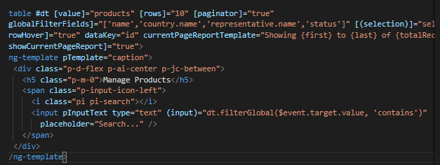
The next <ng-template> is the header of the table. We’re we can see the name of each column.
  <ng-template pTemplate="header">
    <tr>
      <th style="width: 3rem">
        <p-tableHeaderCheckbox></p-tableHeaderCheckbox>
      </th>
      <th pSortableColumn="name">Name <p-sortIcon field="name"></p-sortIcon>
      </th>
      <th pSortableColumn="price">Price <p-sortIcon field="price"></p-sortIcon>
      </th>
      <th pSortableColumn="category">Category <p-sortIcon field="category"></p-sortIcon>
      </th>
      <th pSortableColumn="rating">Reviews <p-sortIcon field="rating"></p-sortIcon>
      </th>
      <th pSortableColumn="inventoryStatus">Status <p-sortIcon field="inventoryStatus"></p-sortIcon>
      </th>
      <th></th>
    </tr>
  </ng-template>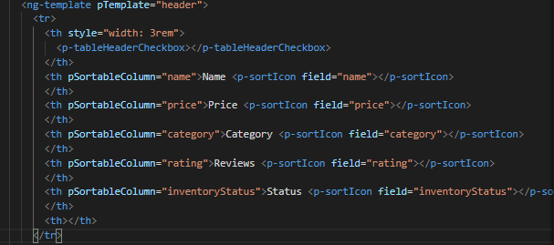
After done the header, we need to do the table body. Here is where we need to print each row values
  <ng-template pTemplate="body" let-product>
    <tr>
      <td>
        <p-tableCheckbox [value]="product"></p-tableCheckbox>
      </td>
      <td>{{product.name}}</td>
      <td>{{product.price | currency:'USD'}}</td>
      <td>{{product.category}}</td>
      <td>
        <p-rating [ngModel]="product.rating" [readonly]="true" [cancel]="false"></p-rating>
      </td>
      <td><span
          [class]="'product-badge status-' + product.inventoryStatus.toLowerCase()">{{product.inventoryStatus}}</span>
      </td>
      <td>
        <button pButton pRipple icon="pi pi-pencil" class="p-button-rounded p-button-success p-mr-2"
          (click)="editProduct(product)"></button>
        <button pButton pRipple icon="pi pi-trash" class="p-button-rounded p-button-warning"
          (click)="deleteProduct(product)"></button>
      </td>
    </tr>
  </ng-template>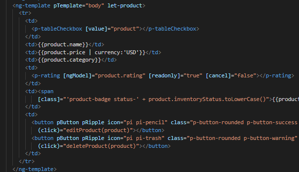
As we can see, we have some buttons with methods
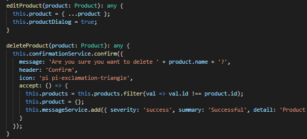
The first method is to edit a specifict product (click)="editProduct(product)" and the second one is to delete it deleteProduct(product)
editProduct(product: Product): any {
  this.product = { ...product };
  this.productDialog = true;
}

deleteProduct(product: Product): any {
  this.confirmationService.confirm({
    message: 'Are you sure you want to delete ' + product.name + '?',
    header: 'Confirm',
    icon: 'pi pi-exclamation-triangle',
    accept: () => {
      this.products = this.products.filter(val => val.id !== product.id);
      this.product = {};
      this.messageService.add({ severity: 'success', summary: 'Successful', detail: 'Product Deleted', life: 3000 });
    }
  });
}
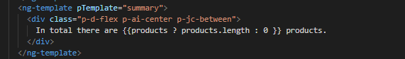
The last part of the table, we will have a section to know how many products we have.

To do it just need to do another template and add the following code:
  <ng-template pTemplate="summary">
    <div class="p-d-flex p-ai-center p-jc-between">
      In total there are {{products ? products.length : 0 }} products.
    </div>
  </ng-template>
This documentation is licensed under the Creative Commons License (Attribution-NoDerivatives 4.0 International).
