Custom Tooltip
If the default behaviour is not enough for your use case, you can always define a custom tooltip reusing our set of composable components.
A custom tooltip can be specified through the <Tooltip> component within a chart configuration:
<Chart>
  <Tooltip customTooltip={yourCustomTooltip} />
  ...
</Chart>
The customTooltip prop accepts a React class component or a stateless functional component.
const yourCustomTooltip: CustomTooltip = ({ header, values }) => {
    return (
      <TooltipContainer>
        <TooltipHeader header={header} />
        <TooltipTable columns={columns} items={values} />
      </TooltipContainer>
    );
  };
Two main props are passed to the component (the same props used internally to render the tooltip):
-
header: TooltipValue<D, SI> | nullthat provides the information used to render an header. Currently only used by cartesian chart to render the current X-Axis value see Tooltip/Cartesian charts -
values: TooltipValue<D, SI>[]an array of data points that correspond to current cursor position (with some variations)
Both these props are filled with object that follows this signature:
Type Signature: TooltipValue
interface TooltipValue<D extends BaseDatum = Datum, SI extends SeriesIdentifier = SeriesIdentifier> {
  /* The label of the tooltip value */
  label: string;
  /* The value */
  value: any;
  /* The formatted value to display*/
  formattedValue: string;
  /* The mark value */
  markValue?: number | null;
  /* The mark value to display */
  formattedMarkValue?: string | null;
  /* The color of the graphic mark (by default the color of the series) */
  color: Color;
  /* True if the mouse is over the graphic mark connected to the tooltip */
  isHighlighted: boolean;
  /* True if the tooltip is visible, false otherwise */
  isVisible: boolean;
  /* The identifier of the related series */
  seriesIdentifier: SI;
  /* The accessor linked to the current tooltip value */
  valueAccessor?: Accessor<D>;
  /* The datum associated with the current tooltip value */
  datum?: D;
}
You can render your own component, as in this example but is preferable to maintain the current look-and-feel used by the default tooltip by reusing our set of Tooltip Components.
These are the components that can be reused to render a custom tooltip:
TooltipContainerTooltipHeader-
TooltipTableTooltipTableHeaderTooltipTableBodyTooltipTableFooter-
TooltipTableRowTooltipTableCellTooltipTableColorCell
TooltipFooterTooltipDivider
Except for the TooltipHeader, TooltipFooter and the TooltipDivider all the other components are wrappers around the HTML table element and its children.
Is the mandatory root component when you are customizing the tooltip with our set of components.
The TooltipHeader is just a single bold line of text.
The signature is simple:
Type Signature: TooltipHeader
  header: TooltipValue<D, SI> | null;
  formatter?: TooltipValueFormatter<D, SI>;
and can be just like this to render a simple header-only tooltip:
<Tooltip customTooltip={({header}) => <TooltipContainer><TooltipHeader header={header} formatter={(d) => `X: ${d.formattedValue}`} /></TooltipContainer>} />The result is the following:

A TooltipTable renders a simple table by specifying the items and columns props or by manually composing a table with the provided components to render complex tables
Please, be aware that you are on a tooltip and the information you should render should be limited to just the essential
Using the columns and items props is a simplified way to render such a table. That props accept an array of columns descriptor with the following signatures:
Type Signature: TooltipTableColumnBase, TooltipTableColumnColor, TooltipTableColumnNumber, TooltipTableColumnText, TooltipTableColumnCustom
type TooltipTableColumnBase<D extends BaseDatum = Datum, SI extends SeriesIdentifier = SeriesIdentifier> = {
/* Identifier for column to be used in callbacks if needed */
id?: string;
/* ClassName to be applied to table cells within column (i.e. `td` or `th`) */
className?: string;
/* Table column header */
header?: string | ((items: TooltipValue<D, SI>[]) => string);
/* Table column footer */
footer?: string | ((items: TooltipValue<D, SI>[]) => string);
/* Boolean to hide entire column from table */
hidden?: boolean | ((items: TooltipValue<D, SI>[]) => boolean);
/* Limited styles to apply to table cells within column (i.e. `td` or `th`) */
style?: TooltipCellStyle;
};
interface TooltipTableColumnColor<D extends BaseDatum = Datum, SI extends SeriesIdentifier = SeriesIdentifier>
extends Omit<TooltipTableColumnBase<D, SI>, 'header' | 'footer'> {
type: 'color';
header?: never;
footer?: never;
}
interface TooltipTableColumnNumber<D extends BaseDatum = Datum, SI extends SeriesIdentifier = SeriesIdentifier>
extends TooltipTableColumnBase<D, SI> {
type: 'number';
/* Renders column cell element inside a `td` element */
cell: (item: TooltipValue<D, SI>) => string | number;
}
interface TooltipTableColumnText<D extends BaseDatum = Datum, SI extends SeriesIdentifier = SeriesIdentifier>
extends TooltipTableColumnBase<D, SI> {
type: 'text';
/* Renders column cell element inside a `td` element */
cell: (item: TooltipValue<D, SI>) => string;
}
interface TooltipTableColumnCustom<D extends BaseDatum = Datum, SI extends SeriesIdentifier = SeriesIdentifier>
extends TooltipTableColumnBase<D, SI> {
type: 'custom';
/* Renders column cell element inside a `td` element */
cell: (item: TooltipValue<D, SI>) => ReactNode;
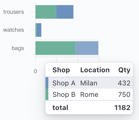
}In general, you want to define your columns in an object and then pass it to the TooltipTable component like:
const columns: TooltipTableColumn<Datum, XYChartSeriesIdentifier<Datum>>[] = [
    { type: "color"},
    { type: "text",  header: 'Shop', footer: 'total', cell: ({label}) => label },
    { type: "text", header: 'Location', cell: (d) => d.datum?.extra ?? ''},
    { type: "number", header: 'Qty', footer: (items) => `${items.reduce((s, d) => s + d.value, 0)}`,  cell: (d) => d.value, style: {textAlign: 'right'} },
];
...

<Tooltip customTooltip={({values}) =>  <TooltipContainer><TooltipTable columns={columns} items={values} /></TooltipContainer>} />
The previous example renders a table like the following:
You can also compose a table by yourself with the following set of components:
TooltipTableHeaderTooltipTableBodyTooltipTableFooter-
TooltipTableRowTooltipTableCellTooltipTableColorCell
TODO add signature
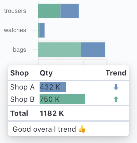
You can compose the table as in the following example:
<Tooltip
  customTooltip={({ header, values }) => (
    <TooltipContainer>
      <TooltipTable>
        <TooltipTableHeader>
          <TooltipTableRow>
            <TooltipTableCell tagName="th">Shop</TooltipTableCell>
            <TooltipTableCell tagName="th">Qty</TooltipTableCell>
            <TooltipTableCell tagName="th">Trend</TooltipTableCell>
          </TooltipTableRow>
        </TooltipTableHeader>
        <TooltipTableBody>
          {values.map((value) => (
            <TooltipTableRow>
              <TooltipTableCell>{value.label}</TooltipTableCell>
              <TooltipTableCell>
                <div style={{ width: 100 }}>
                  <div style={{ width: `${value.value / 10}%`, background: value.value < 500 ? '#6092C0' : '#54B399' }}>
                    {value.formattedValue} K
                  </div>
                </div>
              </TooltipTableCell>
              <TooltipTableCell style={{ textAlign: 'center' }}>
                <div style={{ color: value.value < 500 ? '#6092C0' : '#54B399' }}>{value.value > 500 ? `⬆` : `⬇`}</div>
              </TooltipTableCell>
            </TooltipTableRow>
          ))}
        </TooltipTableBody>
        <TooltipTableFooter>
          <TooltipTableRow>
            <TooltipTableCell>Total</TooltipTableCell>
            <TooltipTableCell>{values.reduce((s, d) => s + d.value, 0)} K</TooltipTableCell>
          </TooltipTableRow>
        </TooltipTableFooter>
      </TooltipTable>
      <TooltipFooter>
        <span style={{ fontWeight: 'normal' }}>Good overall trend 👍</span>
      </TooltipFooter>
    </TooltipContainer>
  )}
/>
that renders a table like the following: