Custom Tooltip
If the default behaviour is not enough for your use case, you can always define a custom tooltip reusing our set of composable components.
A custom tooltip can be specified through the <Tooltip> component within a chart configuration:
<Chart>
  <Tooltip customTooltip={yourCustomTooltip} />
  ...
</Chart>
The customTooltip prop accepts a React class component or a stateless functional component.
const yourCustomTooltip: CustomTooltip = ({ header, values }) => {
    return (
      <>
        <TooltipHeader header={header} />
        <TooltipTable columns={columns} items={values} />
      </>
    );
  };
Two main props are passed to the component (the same props used internally to render the tooltip):
-
header: TooltipValue<D, SI> | nullthat provides the information used to render an header. Currently only used by cartesian chart to render the current X-Axis value see Tooltip/Cartesian charts -
values: TooltipValue<D, SI>[]an array of data points that correspond to current cursor position (with some variations)
Both these props are filled with object that follows this signature:
Type Signature: TooltipValue
interface TooltipValue<D extends BaseDatum = Datum, SI extends SeriesIdentifier = SeriesIdentifier> {
  /* The label of the tooltip value */
  label: string;
  /* The value */
  value: any;
  /* The formatted value to display*/
  formattedValue: string;
  /* The mark value */
  markValue?: number | null;
  /* The mark value to display */
  formattedMarkValue?: string | null;
  /* The color of the graphic mark (by default the color of the series) */
  color: Color;
  /* True if the mouse is over the graphic mark connected to the tooltip */
  isHighlighted: boolean;
  /* True if the tooltip is visible, false otherwise */
  isVisible: boolean;
  /* The identifier of the related series */
  seriesIdentifier: SI;
  /* The accessor linked to the current tooltip value */
  valueAccessor?: Accessor<D>;
  /* The datum associated with the current tooltip value */
  datum?: D;
}
You can render your own component, as in this example but is preferable to maintain the current look-and-feel used by the default tooltip by reusing our set of Tooltip Components.
These are the components that can be reused to render a custom tooltip:
TooltipHeader-
TooltipTableTooltipTableHeaderTooltipTableBodyTooltipTableFooter-
TooltipTableRowTooltipTableCellTooltipTableColorCell
TooltipFooterTooltipDivider
Except for the TooltipHeader, TooltipFooter and the TooltipDivider all the other components are wrappers around the HTML table element and its children.
The TooltipHeader is just a single bold line of text.
The signature is simple:
Type Signature: TooltipHeader
  header: TooltipValue<D, SI> | null;
  formatter?: TooltipValueFormatter<D, SI>;
and can be just like this to render a simple header-only tooltip:
<Tooltip customTooltip={({header}) => <TooltipHeader header={header} formatter={(d) => `X: ${d.formattedValue}`} />} />The result is the following:

A TooltipTable renders a simple table by specifying the items and columns props or by manually composing a table with the provided components to render complex tables
Please, be aware that you are on a tooltip and the information you should render should be limited to just the essential
Using the columns and items props is a simplified way to render such a table. That props accept an array of columns descriptor with the following signatures:
Type Signature: TooltipTableColumnBase, TooltipTableColumnColor, TooltipTableColumnNumber, TooltipTableColumnText, TooltipTableColumnCustom
type TooltipTableColumnBase<D extends BaseDatum = Datum, SI extends SeriesIdentifier = SeriesIdentifier> = {
  /* Identifier for column to be used in callbacks if needed */
  id?: string;
  /* ClassName to be applied to table cells within column (i.e. `td` or `th`) */
  className?: string;
  /* Table column header */
  header?: string | ((items: TooltipValue<D, SI>[]) => string);
  /* Table column footer */
  footer?: string | ((items: TooltipValue<D, SI>[]) => string);
  /* Boolean to hide entire column from table */
  hidden?: boolean | ((items: TooltipValue<D, SI>[]) => boolean);
  /* Limited styles to apply to table cells within column (i.e. `td` or `th`) */
  style?: TooltipCellStyle;
};

interface TooltipTableColumnColor<D extends BaseDatum = Datum, SI extends SeriesIdentifier = SeriesIdentifier>
  extends Omit<TooltipTableColumnBase<D, SI>, 'header' | 'footer'> {
  type: 'color';
  header?: never;
  footer?: never;
}

interface TooltipTableColumnNumber<D extends BaseDatum = Datum, SI extends SeriesIdentifier = SeriesIdentifier>
  extends TooltipTableColumnBase<D, SI> {
  type: 'number';
  /* Renders column cell element inside a `td` element */
  cell: (item: TooltipValue<D, SI>) => string | number;
}

interface TooltipTableColumnText<D extends BaseDatum = Datum, SI extends SeriesIdentifier = SeriesIdentifier>
  extends TooltipTableColumnBase<D, SI> {
  type: 'text';
  /* Renders column cell element inside a `td` element */
  cell: (item: TooltipValue<D, SI>) => string;
}

interface TooltipTableColumnCustom<D extends BaseDatum = Datum, SI extends SeriesIdentifier = SeriesIdentifier>
  extends TooltipTableColumnBase<D, SI> {
  type: 'custom';
  /* Renders column cell element inside a `td` element */
  cell: (item: TooltipValue<D, SI>) => ReactNode;
}
In general, you want to define your columns in an object and then pass it to the TooltipTable component like:
const columns: TooltipTableColumn<Datum, XYChartSeriesIdentifier<Datum>>[] = [
    { type: "color"},
    { type: "text",  header: 'Shop', footer: 'total', cell: ({label}) => label },
    { type: "text", header: 'Location', cell: (d) => d.datum?.extra ?? ''},
    { type: "number", header: 'Qty', footer: (items) => `${items.reduce((s, d) => s + d.value, 0)}`,  cell: (d) => d.value, style: {textAlign: 'right'} },
];
...

<Tooltip customTooltip={({values}) =>  <TooltipTable columns={columns} items={values} />} />
The previous example renders a table like the following:
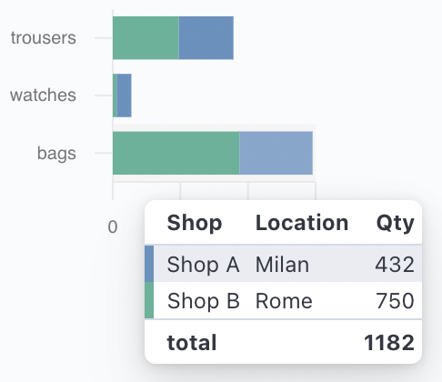
You can also compose a table by yourself with the following set of components:
TooltipTableHeaderTooltipTableBodyTooltipTableFooter-
TooltipTableRowTooltipTableCellTooltipTableColorCell
TODO add signature
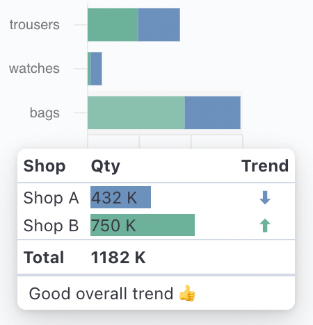
You can compose the table as in the following example:
<Tooltip
  customTooltip={({ header, values }) => (
    <>
      <TooltipTable>
        <TooltipTableHeader>
          <TooltipTableRow>
            <TooltipTableCell tagName="th">Shop</TooltipTableCell>
            <TooltipTableCell tagName="th">Qty</TooltipTableCell>
            <TooltipTableCell tagName="th">Trend</TooltipTableCell>
          </TooltipTableRow>
        </TooltipTableHeader>
        <TooltipTableBody>
          {values.map((value) => (
            <TooltipTableRow>
              <TooltipTableCell>{value.label}</TooltipTableCell>
              <TooltipTableCell>
                <div style={{ width: 100 }}>
                  <div style={{ width: `${value.value / 10}%`, background: value.value < 500 ? '#6092C0' : '#54B399' }}>
                    {value.formattedValue} K
                  </div>
                </div>
              </TooltipTableCell>
              <TooltipTableCell
                style={{
                  textAlign: 'center',
                }}
              >
                <div style={{ color: value.value < 500 ? '#6092C0' : '#54B399' }}>{value.value > 500 ? `⬆` : `⬇`}</div>
              </TooltipTableCell>
            </TooltipTableRow>
          ))}
        </TooltipTableBody>
        <TooltipTableFooter>
          <TooltipTableRow>
            <TooltipTableCell>Total</TooltipTableCell>
            <TooltipTableCell>{values.reduce((s, d) => s + d.value, 0)} K</TooltipTableCell>
          </TooltipTableRow>
        </TooltipTableFooter>
      </TooltipTable>
      <TooltipFooter>
        <span style={{ fontWeight: 'normal' }}>Good overall trend 👍</span>
      </TooltipFooter>
    </>
  )}
/>
that renders a table like the following: