-
Notifications
You must be signed in to change notification settings - Fork 1
MS6
The mobile app aims to address the problem of "Difficulties finding people to practice a sport" by providing a platform that connects Uniandes students with other like-minded individuals interested in sports. The app provides users with a range of tools and features to help them overcome logistical and social barriers, making it easier to engage in regular physical activity and pursue athletic interests. By fostering a sense of community, the app can encourage ongoing engagement in physical activity, which can lead to improved physical and mental health. The value proposal of the app is to provide users with a convenient and efficient way to connect with others who share similar interests, find and book available sports facilities, and receive relevant notifications about their preferred sports activities, all in one place.
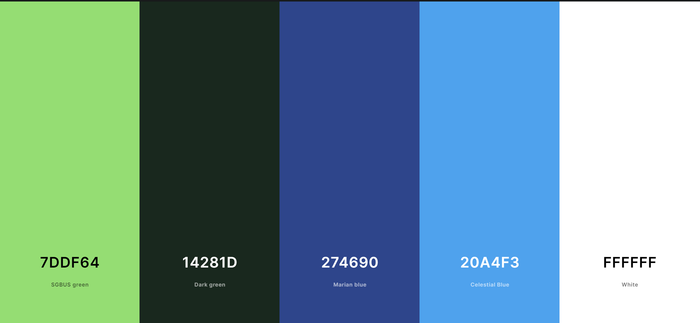
Colors to use:

The color palette chosen for this sports and fitness application includes bright and bold shades that convey energy, strength, and vitality, which are all qualities associated with physical fitness and athleticism. The colors were chosen based on their ability to create a visually engaging and cohesive interface that is easy to read and navigate.
The primary color of the palette, 0x7ddf64, is a bright green shade that is associated with growth, renewal, and vitality. This color is often used in sports and fitness branding to convey a sense of health and wellness. It is also associated with the natural world, which is often used as a source of inspiration for athletes and fitness enthusiasts.
The second color, 0x14281d, is a dark green shade that provides a strong contrast to the primary color. This color is often used to convey stability, reliability, and durability. It also provides a sense of grounding, which is important in sports and fitness applications where users need to feel secure and supported.
The third color, 0x274690, is a dark blue shade that is often associated with trust, loyalty, and confidence. This color is often used in sports and fitness branding to convey a sense of professionalism and expertise. It is also associated with water and the ocean, which can be a source of inspiration for athletes and fitness enthusiasts.
The fourth color, 0x20a4f3, is a bright blue shade that provides a strong contrast to the dark blue shade. This color is often used to convey energy, enthusiasm, and excitement. It is also associated with the sky and the outdoors, which can be a source of inspiration for athletes and fitness enthusiasts.
Finally, the fifth color, 0xffffff, is a pure white shade that provides a clean and simple background for the other colors to stand out against. This color is often used in sports and fitness applications to convey a sense of clarity and simplicity.
Overall, this color palette was chosen to create a visually engaging and cohesive interface that conveys the energy, strength, and vitality associated with sports and fitness. The colors were chosen based on their ability to create a balanced and harmonious design that is easy to read and navigate, while also providing contrast and variety.
For our application we have decided to use the fonts Roboto and Nunito for our texts and titles.
Using a combination of Roboto and Nunito fonts in a our app can create a visually engaging and clear user interface. Roboto is a modern sans-serif font that is easy to read and great for headings, while Nunito is a rounded sans-serif font that is friendly and approachable, and suitable for body text. Together, they can create a visual hierarchy that helps guide the user's attention to important information while maintaining a friendly and approachable feel. The combination of these fonts can help to break up long blocks of text and create a more dynamic and visually interesting interface that is easy to use and navigate.
https://m3.material.io/styles/typography/overview
Post MS6 Edit: In the end, after careful consideration we decided to switch the secondary font Nunito for Rubik since it shared most of Nunito's characteristics, but it was easier to use and implement. Furthermore, some Material UI articles recommended Rubik over Nunito.
For our app we're planning on using Material UI Icons because they can improve the user experience by making it easier for users to identify and interact with different parts of the interface. These icons have a simple and intuitive design that is easily recognizable and universally understood. Incorporating Material UI icons can also help to create a consistent and cohesive design language throughout the application, complementing the overall visual style and creating a polished and professional look. Overall, using Material UI icons is a smart choice for a sports and fitness application, as it can improve usability and visual appeal.
https://m3.material.io/styles/icons/overview
Here you can try a demo from our prototype: Penpot Demo Link
Our sports app is going to use bottom navigation combined with the movement by pressing sections on a screen for several reasons. First, it allows for easy and quick navigation throughout the app, making it simple for users to find the features they need. With the home screen serving as a central hub to access subsections like joining an event, opening exercise guides, or reserving a court, the bottom navigation bar offers a convenient way to switch between these subsections. Additionally, the movement by pressing sections on a screen adds an intuitive and interactive element to the navigation, making it feel more natural and engaging for users. By combining these two navigation patterns, users will be able to seamlessly move through the app and access the features they need with minimal effort. Finally, the inclusion of a profile section in the bottom navigation bar allows users to quickly access and manage their account information, further streamlining the overall user experience.