📓 Language: English | 中文
🎁 Check out the Live Demo.
💡 See the Migration Guide to learn how to migrate between breaking changes.
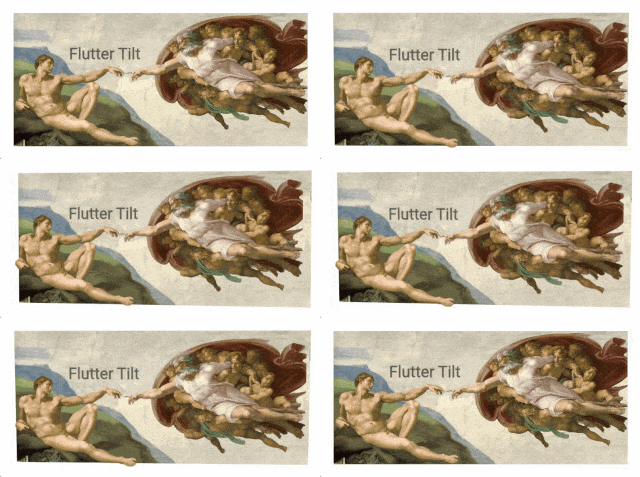
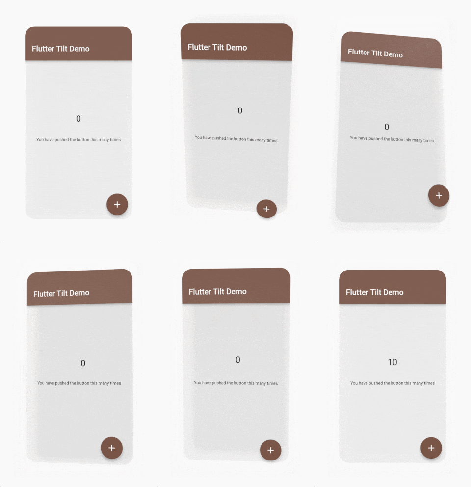
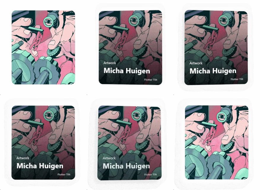
Easily apply tilt parallax hover effects for Flutter!
 
|
 
|
|
Check out the Live Demo. |
|
- 📦 Tilt effect
- 🔦 Light effect
- 💡 Shadow effect
- 👀 Parallax effect
- 📱 Gyroscope sensor support (Sensors compatibility)
- 🧱 Multiple layouts
- 👇 Supports hover, touch and sensors events
- 🖼️ Smooth animation
- ⚙️ Many custom parameters
| Flutter | 3.0.0+ | 3.10.0+ | 3.19.0+ |
|---|---|---|---|
| flutter_tilt 3.0.0+ | ❌ | ❌ | ✅ |
| flutter_tilt 2.0.0+ | ❌ | ✅ | ✅ |
| flutter_tilt 1.0.0+ | ✅ | ❌ | ❌ |
| Android | iOS | Web | macOS | Windows | Linux |
|---|---|---|---|---|---|
| ✅ | ✅ | ✅ | ✅ | ✅ | ✅ |
Run this command with Flutter,
$ flutter pub add flutter_tiltor add flutter_tilt to pubspec.yaml dependencies manually.
dependencies:
  flutter_tilt: ^latest_version
Sensors will only trigger on these platforms.
Platforms without sensors support do not affect the normal use of other features.
| Android | iOS | Web (HTTPS) | macOS | Windows | Linux |
|---|---|---|---|---|---|
| ✅ | ✅ | Browser compatibility | ❌ | ❌ | ❌ |
Note
Currently Web uses the Sensor API - Gyroscope, but it is not compatible with some of the major browsers, such as Safari, Firefox.
When multiple gestures are enabled, they are triggered based on priority:
Touch > Hover > Controller > Sensors
Example: flutter_tilt/example
Tilt widget will have default tilt, shadow, and light effects.
/// Import flutter_tilt
import 'package:flutter_tilt/flutter_tilt.dart';

Tilt(
  child: Container(
    width: 150.0,
    height: 300.0,
    color: Colors.grey,
  ),
),
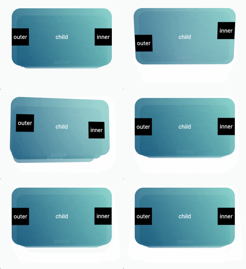
TiltParallax widget can only be used in the childLayout of Tilt widget.
/// Import flutter_tilt
import 'package:flutter_tilt/flutter_tilt.dart';

Tilt(
  childLayout: const ChildLayout(
    outer: [
      /// Parallax here
      Positioned(
        child: TiltParallax(
          child: Text('Parallax'),
        ),
      ),
      /// Parallax here
      Positioned(
        top: 20.0,
        left: 20.0,
        child: TiltParallax(
          size: Offset(-10.0, -10.0),
          child: Text('Tilt'),
        ),
      ),
    ],
  ),
  child: Container(
    width: 150.0,
    height: 300.0,
    color: Colors.brown,
  ),
),
| Parameter | Type | Default | Description |
|---|---|---|---|
child required |
Widget |
- | Create a widget that its child widget can be tilted. |
| childLayout | ChildLayout | ChildLayout() |
Other child layouts. e.g. parallax outer, inner, behind. |
| tiltStreamController | StreamController<TiltStreamModel>? | null |
StreamController<TiltStreamModel>.broadcast() to control the tilt. |
| disable | bool |
false |
Disable all effects. |
| fps | int |
60 |
Gesture triggered frames. |
| border | BoxBorder? |
null |
BoxDecoration border. |
| borderRadius | BorderRadiusGeometry? |
null |
BoxDecoration borderRadius. |
| clipBehavior | Clip |
Clip.antiAlias |
Flutter clipBehavior. |
| tiltConfig | TiltConfig | TiltConfig() |
Tilt effect config. |
| lightShadowMode | LightShadowMode | LightShadowMode.base |
Light & Shadow Mode. |
| lightConfig | LightConfig | LightConfig() |
Light effect config. |
| shadowConfig | ShadowConfig | ShadowConfig() |
Shadow effect config. |
| onGestureMove | void Function(TiltDataModel, GesturesType)? |
null |
Gesture move callback. |
| onGestureLeave | void Function(TiltDataModel, GesturesType)? |
null |
Gesture leave callback. |
| Parameter | Type | Default | Description |
|---|---|---|---|
child required |
Widget |
- | Create a widget with parallax. |
| size | Offset |
Offset(10.0, 10.0) |
Parallax size. |
| filterQuality | FilterQuality |
null |
Flutter FilterQuality. |
| Parameter | Type | Default | Description |
|---|---|---|---|
| outer | List<Widget> |
<Widget>[] |
As with Stack, you can use the Stack layout to create widgets that are outer of the child. e.g. parallax effects. |
| inner | List<Widget> |
<Widget>[] |
As with Stack, you can use the Stack layout to create widgets that are inner of the child. e.g. parallax effects. |
| behind | List<Widget> |
<Widget>[] |
As with Stack, you can use the Stack layout to create widgets that are behind of the child. e.g. parallax effects. |
final StreamController<TiltStreamModel> tiltStreamController =
      StreamController<TiltStreamModel>.broadcast();

/// The current gesture is being used
tiltStreamController.add(
  TiltStreamModel(
    position: Offset(xx, xx),
  ),
);

/// Stop using the current gesture
tiltStreamController.add(
  TiltStreamModel(
    position: Offset(xx, xx),
    gestureUse: false,
  ),
);
| Parameter | Type | Default | Description |
|---|---|---|---|
position required |
Offset |
- | The current trigger position, It will have the tilt effect of the corresponding position. e.g. There is a widget size, width: 10, height: 10, (0, 0): Maximum tilt top left. (10, 10): Maximum tilt bottom right. |
| gesturesType | GesturesType |
GesturesType.controller |
Trigger gesture type. It is triggered according to the gesture priority. If you need to customize the control with animation or other means. Recommended use of GesturesType.controller. If other types are used for triggering, Then it will be affected by the configuration and effects associated with that type. e.g. When custom triggering GesturesType.sensors. If TiltConfig.enableSensorRevert is configured to be false, it will also not revert to the initial state. |
| gestureUse | bool |
true |
Whether the gesture is being used. It is used to determine if the gesture is being used and will be processed according to the gesture priority. e.g. If GesturesType.touch is never assigned false when triggered, gestures with a lower priority than GesturesType.touch will never be triggered. |
| Parameter | Type | Default | Description |
|---|---|---|---|
| disable | bool |
false |
Only disable the tilt effect. |
| initial | Offset? |
null |
Initial tilt progress, range (x, y): (1, 1) to (-1, -1), you can exceed the range, but the maximum tilt angle during gesture movement is always tilted according to [TiltConfig.angle]. e.g. (0.0, 0.0) center (1.0, 1.0) Maximum tilt top left [TiltConfig.angle]. |
| angle | double |
10.0 |
Maximum tilt angle. e.g. 180 will flip. |
| direction | List<TiltDirection>? |
null |
Tilt Direction, multiple directions, customized direction values. |
| enableReverse | bool |
false |
Tilt reverse, can be tilted up or down. |
| filterQuality | FilterQuality |
null |
Flutter FilterQuality. |
| enableGestureSensors | bool |
true |
Gyroscope sensor triggered tilt. Only the following gestures: GesturesType.sensors |
| sensorFactor | double |
10.0 |
Sensor trigger factor (sensitivity). Only the following gestures: GesturesType.sensors |
| enableSensorRevert | bool |
true |
Enable sensor tilt revert, will revert to the initial state. Only the following gestures: GesturesType.sensors |
| sensorRevertFactor | double |
0.05 |
Sensor revert factor (damping), range of values: 0-1. Only the following gestures: GesturesType.sensors |
| sensorMoveDuration | Duration |
Duration(milliseconds: 50) |
Animation duration during sensor move. Only the following gestures: GesturesType.sensors |
| enableGestureHover | bool |
true |
Hover gesture triggered tilt. Only the following gestures: GesturesType.hover |
| enableGestureTouch | bool |
true |
Touch gesture triggered tilt. Only the following gestures: GesturesType.touch |
| enableRevert | bool |
true |
Enable tilt revert, will revert to the initial state. Only the following gestures: GesturesType.touch GesturesType.hover GesturesType.controller |
| enableOutsideAreaMove | bool |
true |
Tilt can continue to be triggered outside the area. Only the following gestures: GesturesType.touch GesturesType.controller |
| moveDuration | Duration |
Duration(milliseconds: 100) |
Animation duration during gesture move. Only the following gestures: GesturesType.touch GesturesType.hover |
| leaveDuration | Duration |
Duration(milliseconds: 300) |
Animation duration after gesture leave. Only the following gestures: GesturesType.touch GesturesType.hover |
| moveCurve | Curve |
Curves.linear |
Animation curve during gesture move. Only the following gestures: GesturesType.touch GesturesType.hover |
| leaveCurve | Curve |
Curves.linear |
Animation curve after gesture leave. Only the following gestures: GesturesType.touch GesturesType.hover |
| controllerMoveDuration | Duration |
Duration(milliseconds: 100) |
Animation duration during controller gesture move. Only the following gestures: GesturesType.controller |
| controllerLeaveDuration | Duration |
Duration(milliseconds: 300) |
Animation duration after controller gesture leave. Only the following gestures: GesturesType.controller |
| Enum Value | Description |
|---|---|
| LightShadowMode.base | [No performance risk] Use normal shadow effects only for Tilt.child without performance degradation. |
| LightShadowMode.projector | [Performance risk exists] Apply a shadow to the entire Tilt widget, similar to a projector effect. will display a shadow that exactly matches the non-transparent parts of the widget. Recommended for the following scenarios: - Images only - No data states - No Hero tags |
| Parameter | Type | Default | Description |
|---|---|---|---|
| disable | bool |
false |
Only disable the light effect. |
| color | Color |
Color(0xFFFFFFFF) |
Light color. |
| minIntensity | double |
0.0 |
Color minimum opacity, also initial opacity. |
| maxIntensity | double |
0.5 |
Color maximum opacity for tilt progresses. |
| spreadFactor | double |
4.0 |
Light spread factor, relative to current widget size. |
| projectorScale | double |
1.1 |
Light area size scale. Only the following mode: [LightShadowMode.projector] |
| direction | LightDirection |
LightDirection.around |
Light direction. Affects: [ShadowConfig.direction] (not affected after configuration). |
| enableReverse | bool |
false |
Reverse light direction. Affects: [ShadowConfig.direction] (not affected after configuration). [ShadowConfig.enableReverse] (not affected after configuration). |
| Parameter | Type | Default | Description |
|---|---|---|---|
| disable | bool |
false |
Only disable the shadow effect. |
| color | Color |
Color(0xFF9E9E9E) |
Shadow color. |
| minIntensity | double |
0.0 |
Color minimum opacity, also initial opacity. |
| maxIntensity | double |
0.5 |
Color maximum opacity as tilt progresses. |
| offsetInitial | Offset |
Offset(0.0, 0.0) |
Initial value of shadow offset. e.g. (0.0, 0.0) center. (40.0, 40.0) Offset 40 to the top left. |
| offsetFactor | double |
0.1 |
Shadow offset factor, relative to current widget size. |
| spreadInitial | double |
0.0 |
Initial value of shadow spread radius. Only the following mode: [LightShadowMode.base] |
| spreadFactor | double |
0.0 |
Shadow spread radius factor, relative to current widget size. Only the following mode: [LightShadowMode.base] |
| minBlurRadius | double |
10.0 |
Minimum blur radius, also initial blur radius. Only the following mode: [LightShadowMode.base] |
| maxBlurRadius | double |
20.0 |
Maximum blur radius for tilt progresses. Only the following mode: [LightShadowMode.base] |
| projectorScaleFrom | double |
1.0 |
Size scale for minimum progress, also initial size scale. Only the following mode: [LightShadowMode.projector] |
| projectorScaleTo | double |
1.0 |
Size scale for maximum progress. Only the following mode: [LightShadowMode.projector] |
| projectorBlurSigmaFrom | double |
5.0 |
Blur sigma for minimum progress, also initial blur sigma. Only the following mode: [LightShadowMode.projector] |
| projectorBlurSigmaTo | double |
10.0 |
Blur sigma for maximum progress. Only the following mode: [LightShadowMode.projector] |
| direction | ShadowDirection? |
null |
Shadow direction. |
| enableReverse | bool? |
null |
Reverse shadow direction. |
See graphs/contributors for more details.
Contributions of any kind are welcome! (emoji key)
|
AmosHuKe 💻 👀 📖 💡
|
LOCKEDFILE 🐛 |
aytunch 🤔 |
Open sourced under the MIT license.
© AmosHuKe


