Star on Github 👉 Github
To use the UserItem component in your React/Next.js application, you can install it via npm or yarn:
npm i useritem@latest
yarn add useritem@latest...
import UserItem from 'useritem';
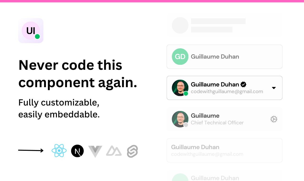
<UserItem
name="John Doe"
description="johndoe@mail.com"
avatarUrl="https://example.com/avatar.jpg"
onClick={(e) => console.log("User item clicked!", e)}
/>| Prop | Type | Description | Default |
|---|---|---|---|
avatar |
boolean |
Determines whether the avatar should be displayed or not. | true |
avatarUrl |
string |
URL of the user's avatar image. Default value is a default avatar image URL. | |
border |
boolean |
Determines whether a border should be displayed around the component. | true |
color |
string |
Background color of the avatar. | '#ccc" |
description |
string |
User description or email. | "johndoe@mailcom" |
disabled |
boolean |
Determines whether the user item should be disabled. | false |
onClick |
(event: MouseEvent) => void |
Function to handle click events on the user item. | |
loading |
boolean |
Determines whether a loading state should be displayed. | false |
limit |
number |
Determines the string limit on title & description. | |
width |
number |
Width of the component. | 275px |
online |
boolean |
Determines whether the user is online. | false |
small |
boolean |
Display a smaller version. | false |
reverse |
boolean |
Determines whether the layout should be reversed. Default value is false. |
false |
squared |
boolean |
Determines whether the corners should be squared. Default value is false. |
false |
status |
boolean |
Determines whether the user is a status user. | false |
shadow |
boolean |
Determines whether a shadow effect should be added. | false |
style |
React.CSSProperties or undefined |
Custom CSS styles for the component. | |
name |
string |
User's name or title. Default value is "John Doe". |
"John Doe" |
This component is licensed under the MIT License. Feel free to use and modify it as needed for your projects.