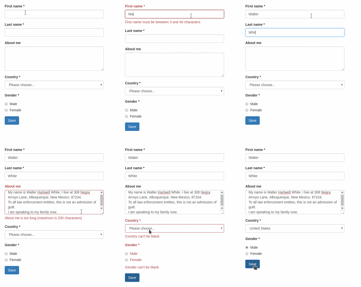
Easily create forms with client side validations.
Want to try it yourself? See the live demo.
This ember-cli addon is based on the following excellent addons
and provides a handy out-of-the-box setup for user-friendly client-side validations, featuring
- Hiding of validation errors until field has been interacted with (or submit button was pressed)
- Preventing submit action until form is valid
- Live-updating validation errors
- Bootstrap integration
*Yet another ember form addon
There are many existing ember addons with this style of API, the most prominent probably being ember-form-for. With this addon, we want to:
- focus on forms that require client-side validations
- provide good user experience out of the box
For more information, see this blog post.
First, install the addon:
ember install ember-validated-form
Basic example:
where UserValidations is a changeset:
// controller
import Ember from 'ember';
import UserValidations from 'dummy/validations/user';

export default Ember.Controller.extend({
  UserValidations
});
// validations/user.js
import {
validatePresence,
validateLength
} from 'ember-changeset-validations/validators';
export default {
firstName: [
validatePresence(true),
validateLength({min: 3, max: 40})
],
lastName: [
validatePresence(true),
validateLength({min: 3, max: 40})
],
aboutMe: [ validateLength({allowBlank: true, max: 200}) ],
country: [ validatePresence(true) ],
gender: [ validatePresence(true) ]
};{{validated-form}} takes the following options:
| Name | Type | Description |
|---|---|---|
| model | Object |
ember-changeset containing the model that backs the form |
| on-submit | Action |
Action, that is triggered on form submit. The changeset is passed as a parameter. If specified, a submit button is rendered automatically. |
| on-cancel | Action |
Same as on-submit, but for the cancel button. |
| submit-label | String |
Label for the submit button. Overrides the value specified in the config. |
| cancel-label | String |
Label for the cancel button. Overrides the value specified in the config. |
{{validated-form}} yields an object, that contains the contextual component input. All input fields share some common properties:
| Name | Type | Description |
|---|---|---|
| label | String |
The label of the form field. |
| name | String |
This is is the name of the model property this input is bound to. |
| type | Action |
Type of the form field (see supported field types below). Default: text. |
The supported field types are essentially given by ember-one-way-controls. This addon does not much more than translating {{f.input type="select"}} to {{one-way-select}}.
However, some field types require extra parameters. The supported field types are listed below.
If no field type is specified, a simple <input type="text"> is rendered. Other HTML5 text-like inputs like email, number, search require specifying their type. For more details see the docs of {{one-way-input}}.
The select element requires more options (see {{one-way-select}}):
valueoptionsoptionLabelPathoptionValuePathoptionTargetPathincludeBlank
This component renders a list of {{one-way-radio}} components.
// in your controller
genders: [{
  key: 'm',
  label: 'Male'
}, {
  key: 'f',
  label: 'Female'
}],Currently, the configuration supports
label: defaults forsubmit-labelandcancel-label. If you're using ember-i18n, you can also specify translation keys.css: CSS Classes to add to the form elements (group,control,label,help). See an example integration of bootstrap CSS below.
// environment.js

var ENV = {
  // ...
  'ember-validated-form': {
    label: {
      submit: 'Go for it',
      cancel: 'Take me back'
    },
    css: {
      // bootstrap classes
      group: 'form-group',
      control: 'form-control',
      label: 'form-label',
      help: 'help-block'
    }
  },
  // ...
}Bug reports, suggestions and pull requests are always welcome!
git clone https://github.com/adfinis-sygroup/ember-validated-formcd ember-validated-formnpm installbower install
ember serve- Visit your app at http://localhost:4200.
npm test(Runsember try:eachto test your addon against multiple Ember versions)ember testember test --server
ember build
For more information on using ember-cli, visit https://ember-cli.com/.
