this themes are designed to mimic the actual theme with some improvements.
- light : actually 20ko-30ko minified (the current theme from
maplibre-gl/maplibre-gl.cssis 65ko minified). - support dark mode
- support CSS variables for easy optimisation.
- possibility to use another icon set for your buttons
- compat mode to support
.mapboxgl-ctrland.mapboxgl-ctrl-groupclasses.
See a demo with MapLibre theme customizer.
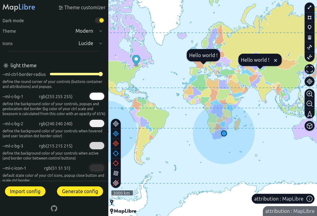
This custimizer can be used in different ways. test how this package works, create your own theme and see the associated configuration.
Important
if you have created a nice theme from the customizer and you want to share it, export it in JSON format, open a github issue with the content of the JSON, it will be added as a preset.
Compatibility : maplibre-gl >= 1.15
npm i maplibre-themein your files
// js file
- import "maplibre-gl/dist/maplibre-gl.css";
+ import "maplibre-theme/icons.<your-icon-set>.css";
+ import "maplibre-theme/<your-theme>.css";
For theme choose between : modern, classic and legacy.
For icon set choose between : default and lucide.
note: if you don't use default icon set, add this extra config in your css.
.maplibregl-map {
  --ml-font-icons: maplibregl-icons-<your-icon-set>;
}
Modern theme with lucide icon set example
import "maplibre-theme/icons.lucide.css";
import "maplibre-theme/modern.css";

.maplibregl-map {
  --ml-font-icons: maplibregl-icons-lucide;
}List of available CSS files to import. (see Scoped themes section for .scoped.css files)
.
└── maplibre-theme
    |
    | // choose one of them.
    ├── modern.css (18 ko)
    ├── classic.css (17 ko)
    |
    | // icon sets, need to be added with your theme above
    ├── icons.default.css (6 ko)
    ├── icons.lucide.css (6 ko)
    |
    | // scoped themes only if you need to use multiple theme in your app
    ├── classic.scoped.css (21 ko)
    ├── modern.scoped.css (22 ko)
    |
    | // maplibre-theme compatible plugin stylesheets
    ├── plugins
    |   └── mapbox-gl-draw.css
    |
    | // for special use cases
    └── extra
        ├── classic.compat.css
        ├── classic.scoped.css
        ├── classic.scoped.compat.css
        ├── modern.compat.css
        ├── modern.scoped.css
        ├── modern.scoped.compat.css
        ├── legacy.compat.css
        ├── legacy.scoped.css
        └── legacy.scoped.compat.css
import { Map } from "maplibre-gl";
import "maplibre-theme/icons.default.css";
import "maplibre-theme/modern.css";

new Map({
  container: "map-1"
})
new Map({
  container: "map-2"
})<div id="map-1"></div>
<div class="dark">
<div id="map-2"></div>
</div>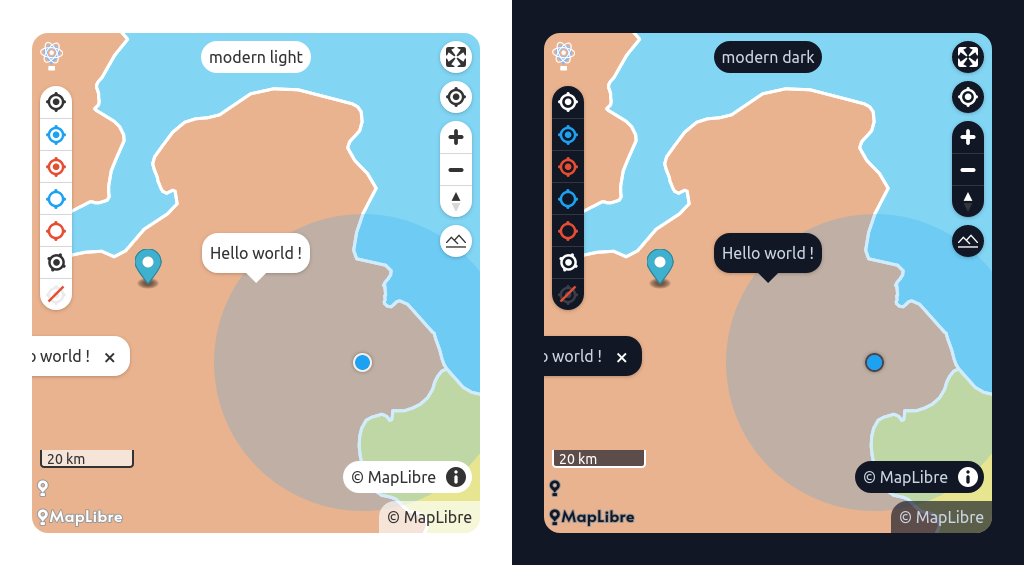
import { Map } from "maplibre-gl";
import "maplibre-theme/icons.default.css";
import "maplibre-theme/classic.css";

new Map({
  container: "map-1"
})
new Map({
  container: "map-2"
})<div id="map-1"></div>
<div class="dark">
<div id="map-2"></div>
</div>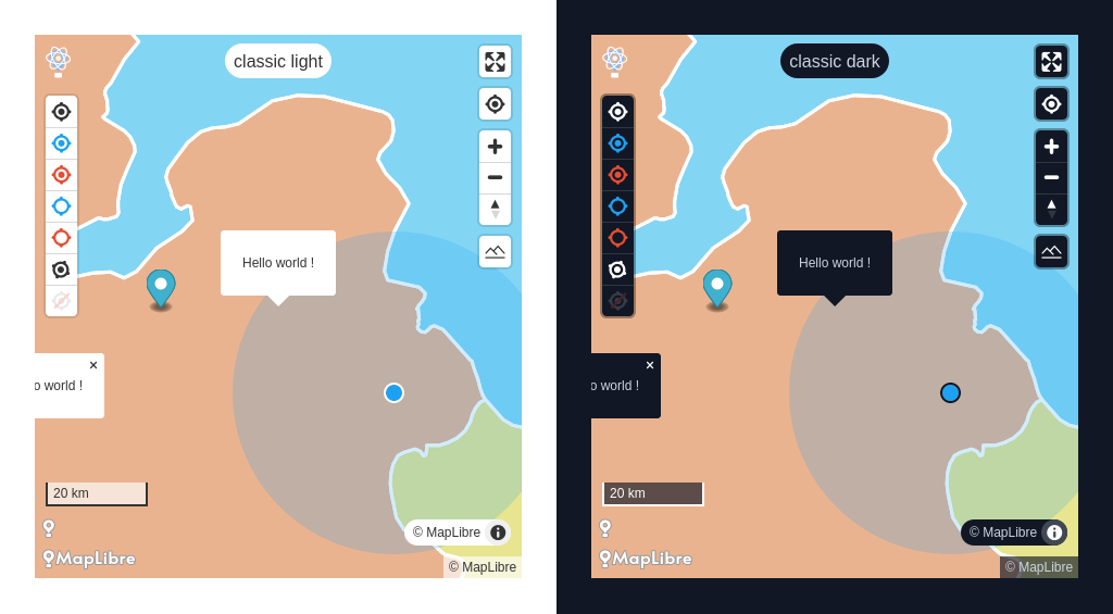
/**
 * default values are defined in :root selector
 * with .maplibregl-map you overwrite CSS vars you want
 */
.maplibregl-map {
  /* your CSS vars */
  --ml-ctrl-border-radius: 4px;

  /*
   * bg-1 default state
   * bg-2 usually hover effect
   * bg-3 active effect
   */
  --ml-c-bg-1: 255 255 255;
  --ml-c-bg-2: 240 240 240;
  --ml-c-bg-3: 215 215 215;

  /* etc... */
}
Some variables differs between classic and modern. check the source code for the exact implementation.
It is not recommended to modify css variables for media queries @media (forced-colors: active) and (prefers-color-scheme: light) and @media (forced-colors: active).
If you find inconsistencies, open an issue or submit a PR instead.
note: define your colors as just the color channel so we can work with the opacity modifier syntax TailwindCSS explanation.
If you want to use another set of icons
import "maplibre-theme/icons.<name>.css";
import "maplibre-theme/classic.css";.maplibregl-map {
--ml-font-icons: maplibregl-icons-<name>;
}example with lucide
import "maplibre-theme/icons.lucide.css";
import "maplibre-theme/classic.css";.maplibregl-map {
--ml-font-icons: maplibregl-icons-lucide;
}If you want to replace the default icons with your own set of icons.
Simply remove this import
- import "maplibre-theme/icons.default.css"Instead add this code.
@font-face {
  font-family: "maplibregl-icons-custom";
  src: url("./path/to/your/icon-font.woff2");
  font-weight: normal;
  font-style: normal;
}.maplibregl-map {
--ml-font-icons: maplibregl-icons-custom;
}And create with a tool like Fontello your icons using this codes.
| Icon | Unicode |
|---|---|
 |
U+E808 |
 |
U+E809 |
 |
U+E80A |
 |
U+E80B |
 |
U+E80C |
 |
U+E80D |
 |
U+E80E |
 |
U+E80F |
 |
U+E810 |
 |
U+002B |
 |
U+002D |
note: if you don't want to specify a bicolor compass icon. add your compass for the code U+E809 and a blank icon like space.svg for the U+E80A char code.
If you want to show multiple themes inside the same page you probably need to scope your CSS theme.
You can use the *.scoped.css version of the theme for this to work. In addition you will have to add the maplibregl-theme-<modern|classic|legacy> class name to your map container.
import "maplibre-theme/classic.scoped.css";
import "maplibre-theme/modern.scoped.css";
import { Map } from "maplibre-gl";

new Map({
  container: "map-1"
})
new Map({
  container: "map-2"
})<html>
<body>
<div id="map-1" class="maplibregl-theme-classic"></div>
<div id="map-2" class="maplibregl-theme-modern"></div>
</body>
</html>.maplibregl-map.maplibregl-theme-classic {
--ml-ctrl-border-radius: 4px;
}since MapLibre has removed mapboxgl-css classes (#1575) some MapBox plugins may display poorly on your map and therefore with your theme. (note we will talk about css incompatibilities here, there may also be some related to js features and they will not be covered here)
It is especially when the .maplibregl-ctrl and .maplibregl-ctrl-group classes are hardcoded in the js.
You can try this special <theme-name>.compat.css themes which will replace your usual import.
Note: These special stylesheets don't do magic, they help with compatibility with your theme when the plugin has hard coded in the JavaScript classnames associated with MapBox (.mapboxgl-ctrl, .mapboxgl-ctrl-group).
It will then be necessary to make the stylesheet produced by the plugin compatible but this step is easy to carry out.
- import "maplibre-theme/modern.css"
+ import "maplibre-theme/extra/modern.compat.css"
here is what this style sheet is responsible for doing
- .maplibregl-ctrl {
+ :is(.maplibregl-ctrl, .mapboxgl-ctrl) {
  clear: both;
  pointer-events: auto;

  /* workaround for a Safari bug https://github.com/mapbox/mapbox-gl-js/issues/8185 */
  transform: translate(0, 0);
}

- .maplibregl-map .maplibregl-ctrl-group button + button {
+ .maplibregl-map :is(.maplibregl-ctrl, .mapboxgl-ctrl) button + button {
  border-top: 1px solid rgb(var(--ml-c-bg-3));
}this special files create stylesheets with scoped themes and MapBox compatible. These special themes which will replace your usual import.
- import "maplibre-theme/modern.css"
+ import "maplibre-theme/extra/modern.scoped.compat.css"This section gives you some tips for integrating MapLibre plugins with your theme.
note: if the plugin was originally designed for MapBox you may encounter problems with the hard-coded classes mapbox-ctrl and mapboxgl-ctrl-group see section above.
you will also find in the maplibre-theme/plugins directory style sheets in the name of your plugin which will replace the plugin style sheet.
Be lenient MapLibre theme is not intended to provide the perfect style sheet for your use case. you will definitely need to refactor the css depending on the version of the plugin you are using. I can advise you to copy and paste this style sheet into your project and use it as a basis for work. This is why plugin stylesheets are not minified.
as this plugin comes from MapBox you will need to use the associated compat theme
import "maplibre-theme/icons.default.css";

// don't use
// import "maplibre-theme/modern.css";

// use this instead
import "maplibre-theme/extra/modern.compat.css";

// because you probably need to copy-paste this stylesheet to adapt to your use case
// (difference between version you use, etc...)
// this stylesheet is not minified.
import "maplibre-theme/plugins/mapbox-gl-draw.css";To facilitate the creation of themes for MapLibre, the main style sheet has been split into several files. vital css rules vs default style related rules.
@import "maplibre-theme/core.css";for users who are interested to create their own icon theme.
Icons are placed in a font generated by fontello. To update your font file, a nodejs script makes it easier for you.
inside maplibre-theme directory
pnpm run fontello:<your-icon-theme>

# choose -> Open Fontello in your Browser.
# select your font to add/update
# clic save

# rerun
pnpm run fontello:<your-icon-theme>
# choose -> Save your font in your local system
your src/icons/<your-icon-theme>/... is updated...
the file src/icons/<your-icon-theme>/fontello.css is used as a helper to know the correspondance between the icon and the character code.
original svg files are saved inside src/icons/<your-icon-theme>/assets directory.
There is some restriction with your SVG file, check the Fontello Wiki page.
If you want to optimize your svg icon files you can use SVGOMG.
Default generated colors with Forced-colors active.
| Theme | Light | Dark |
|---|---|---|
| CanvasText | #000000 | #fff |
| Canvas | #ffffff | #000 |
| LinkText | #0000ee | #ff0 |
| ButtonText | #000000 | #fff |
| ButtonFace | #f5f5f5 | #000 |
| HighlightText | #ffffff | #000 |
| Highlight | #1f9ede | #1aebff |
in the root directory pnpm run dev run concurrently the 2 playgrounds sandbox and wizard and start postcss in watch mode.
go to http://localhost:5173 or http://localhost:5174 to see the 2 apps.
when your working directory is clean and when you have updated the changelog.
run the all-in-one script ./bin/change-version-and-publish.sh x.y.z. The script:
- change the version number of all the packages
- create a tag
- push your work (this rebuild the wizard website)
- publish the
maplibre-themepackage.