

You need a widget that a user can use to specify any criteria of data rendered in your app. Be it for filtering, sorting, grouping; you name it. You want this widget to be responsive, accessible and easy to integrate. You also want it to have support for configurable labels for internationalization, to be themeable so that it blends in flawlessly into your UI and to be easily extendable - enabling you to support any type of criteria.
Click here for a demo of all the features offered by react-criteria.
npm install --save react-criteriayarn add react-criteriaimport Criteria from 'react-criteria'
import Select from 'react-criteria-select'
import Textfield from 'react-criteria-textfield'
function MyComponent () {
const [data, setData] = React.useState(
[{
type: 'location',
value: '1'
}, {
type: 'guests',
value: '3'
}, {
type: 'beds',
value: '2'
}]
)
const onChange = React.useCallback(newData => {
setData(newData)
}, [])
const locations = [
'Malta', 'Italy', 'Spain', 'France', 'Germany'
]
return (
<Criteria
data={data}
onChange={onChange}
criteria={{
guests: {
label: 'Guests',
component: {
component: Textfield,
props: {
min: 0,
max: 6,
type: 'number',
autoFocus: true,
placeholder: 'Enter number of guests'
}
}
},
beds: {
label: 'Beds',
component: {
component: Textfield,
props: {
min: 0,
max: 3,
type: 'number',
autoFocus: true,
placeholder: 'Enter number of beds'
}
}
},
location: {
label: 'Location',
value: value => locations[value],
component: {
component: Select,
props: {
autoFocus: true,
options: locations.map(
(location, index) => {
return {
value: String(index),
label: location
}
}
)
}
}
}
}}
/>
)
}
export default React.memo(MyComponent)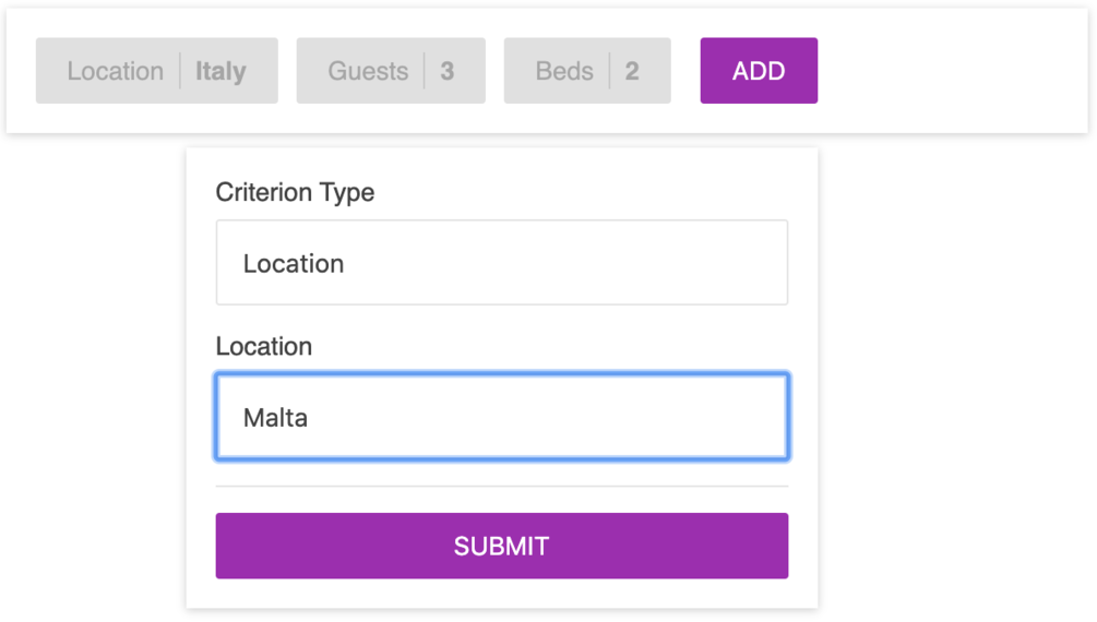
import Criteria, {
  createTheme,
  ThemeProvider
} from 'react-criteria'

function MyComponent () {
  const theme = createTheme({
    palette: {
      primary: '#9C27B0',
      secondary: '#4CAF50'
    },
    typography: {
      color: '#ffffff',
      fontSize: '14px',
      fontFamily: 'sans-serif'
    },
    container: {
      backgroundColor: '#424242',
      borderColor: 'rgba(255, 255, 255, .1)'
    },
    button: {
      primaryColor: '#ffffff',
      secondaryColor: '#ffffff',

      defaultColor: '#ffffff',
      defaultBackgroundColor: '#424242',
      defaultHoverBackgroundColor: '#333333',

      disabledColor: 'rgba(255, 255, 255, 0.26)',
      disabledBackgroundColor: 'rgba(0, 0, 0, .12)'
    }
  })

  return (
    <ThemeProvider theme={theme}>
      <Criteria ... />
    </ThemeProvider>
  )
}

export default React.memo(MyComponent)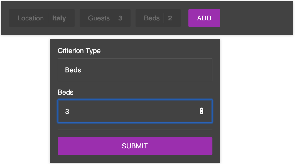
import Criteria, {
  I18nContext
} from 'react-criteria'

function MyComponent () {
  const i18n = {
    'criteria.manage-criteria': amount => `Gestisci criteri (${amount})`,
    'criteria.add-criterion-add': 'Inserisci',
    'criteria.add-criterion-title': 'Crea un nuovo criterio',
    'criteria.add-criterion-description': 'Crea un nuovo criterio',
    'criteria.criterion-title': label => `Gestisci i criterio dei '${label}'`,
    'criteria.criterion-description': label => `Gestisci i criterio dei '${label}'`,
    'criteria.modal-close': 'Chuidi',
    'criteria.modal-title': 'Gestisci Criteri',
    'criteria.modal-description': 'Modal Description',

    'add-criterion.submit': 'Invia',
    'add-criterion.type': 'Tipo di criterio',
    'add-criterion.type-placeholder': 'Seleziona il tipo di criterio',

    'criterion.submit': 'Invia',
    'criterion.cancel': 'Annulla',
    'criterion.remove': 'Rimuovere',

    'popover.overlay-title': 'Chuidi l criterio'
  }

  return (
    <I18nContext.Provider value={i18n}>
      <Criteria ... />
    </I18nContext.Provider>
  )
}

export default React.memo(MyComponent)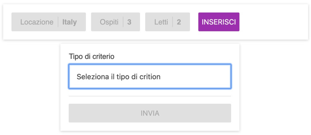
The React Criteria component is licensed under the CC-BY-NC-4.0 license.
You can purchase a license if you want to use it in a commercial project.