I just completed the final prototype of my weather app: Weathernaut, which was my first NextJS project and I really enjoyed it. While developing the weather app, NextJS 9.3 was released--and with it, the ability to opt-in for Static Site Generation on a page-by-page basis.
Stoked, I decided that it was time to build a new portfolio.
Was I going to continue using Material UI? Should I pivot and work with the ever-interesting and highly alluring Tailwind CSS?
On one hand, I've just spent the past two projects working with Material UI, so my eyes were used to navigating their documentation. I can see how powerful it would be if I could somehow manage to wrap my head around truly customizing their components and implementing their theming system. There was still so much room to grow into and learn from, that I'd be a fool to not take it all the way.
Regardless, I wanted to dive deeper into Tailwind CSS to see if there was something that could convince me otherwise. I soon discovered why a utility-first CSS framework was becoming so popular. The thing is, I'm a newbie developer and I haven't spent countless hours fighting against a CSS framework in order to get things looking the way I want them to. I just haven't had enough experience in developing user interfaces where I needed to gain more granular control.
So, the number one problem that Tailwind would solve for me was essentially a non-issue for me.
One thing that Tailwind CSS didn't have, that Material UI had in spades, was access to all the source code on how to implement all the different components.
Deciphering how the data flows through the components, seeing how other components are utilized within other components, and the countless examples of DRY code had a huge impact on how I developed this entire project. It's as if the source code examples for each component gave me a front row seat to see what code looks like when it's written at the production level.
Implementing and tinkering around with Material UI components exposed me to all the CSS attributes that would be needed to get something looking the way it did. In configuring those attributes to fit my project, I now have a better overall grasp on how to use CSS in general.
Now, I feel pretty confident that when/if I decide to learn Tailwind, I can better appreciate it for the problem that it solves. I'll also have more experience under my belt to actually know how to use it properly.
This was tough.
I had no clue how I wanted the portfolio to look and feel, so I jotted down a few ideas:
- It shouldn't be distracting. The focus should be on the content, not the site.
- It needs to be neutral, but not boring.
- It needs to be simple, but not plain.
- It has to look different from my past projects.
- I want to take full advantage of the theming system, so it's gotta have dark mode.
- Within a minute, someone should be able to navigate and quickly view the entire site.
I decided to do some research. I scoured over a ton of different portfolios, most of them from graphic designers and advanced UI/UX developers. None of them really felt like anything that I was leaning towards. Until, I found this dude's site: https://adamwathan.me/
Concise, simple, and timeless. It looked fairly easy to create--and most importantly--it wasn't distracting.
Before working on the portfolio, I wanted to create a space where I could place all my writing. Putting two and two together, I figured that a blog would be the perfect project to take advantage of NextJS's Static Site Generation.
I recently discovered Notion and was thoroughly impressed. Unfortunately, they didn't have a public API that I could use to get my data from them, so that idea was nixed. I wanted to use my Ghost Blog as a headless CMS, but there Javascript Content API just didn't do the trick.
Undeterred, I spent some time looking through NextJS's source code, more specifically, their examples and implementation section.
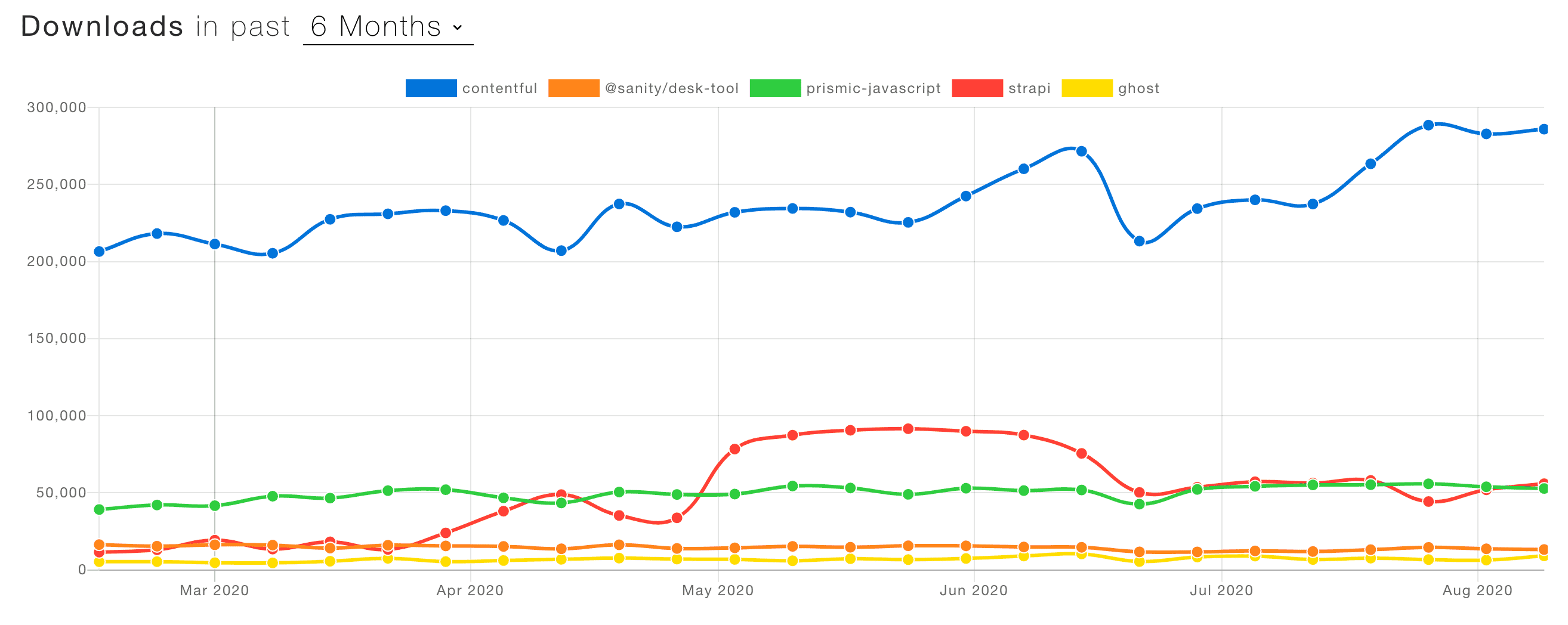
There was a new section that was entirely dedicated towards building NextJS applications with popular CMS's. From that list, the names that popped out at me were Contentful, Sanity, Prismic, and Strapi. Starting from the top, the plan was to spend an hour on each CMS to see if any of them felt better to me than the others.
Well, after the first hour of wrapping my head around Contentful, I was pretty content. Honestly, I was just too lazy to spend my day trying to make an educated decision. I headed over to npmtrends.com and compared the CMS's:
Contentful was the clear winner, plus if I ever wanted to freelance, I felt confident that I could create a site with Contentful as the headless CMS, and they'd be able to manage their site's content fairly easily.
Creating the blog was the cornerstone of this entire project.
I had implemented a personal blog with Ghost at one point and I had a really good experience. The visual composition between their images and text, along with the page layout of each individual blog post in their default Casper Theme resonated with me.
Also, I wanted to incorporate some features that I liked from Medium. In particular, I like how Medium felt light and airy. They kept the use of dividers and borders to a minimum. I also liked how all posts had an estimated reading time.
With a little more research, I began to notice that many people are creating personal blogs where blog posts were nothing more than markdown files. I liked that too, so I set up Contentful to send over markdown files. After getting everything wired up, I was confronted with the challenge on how to style the markdown.
The first thing that I did to tackle this problem was to head over to Material UI's Github in order to sift through the Issues tab in hopes that someone had already solved this problem. Lucky for me, I found this comment:
Sweet.
Armed with this tidbit of information, I decided to use markdown-to-jsx in conjunction with the Material UI's markdown component for their documentation.
I've got everything wired up and working. I have the markdown parsed and styled the way I liked it. There was only one thing left: syntax highlighting the code blocks.
This was going to be my personal blog, and I intended to explain a ton of coding related material in the future. Having proper syntax highlighting was an absolute must. After another round of heavy research, narrowed down my choices to either HighlightJs or PrismJs.
I was able to get HighlightJS working in almost no time, but their color themes weren't something to be admired of in my opinion. Instead of settling for something that works, but looks like crap, I jumped right into a black hole for about two days trying to wrap my head around how to implement PrismJS within a NextJS project.
Once I got it to work, I spent another two days tweaking around with my Markdown Renderer component to get things looking exactly like the theme my code editor has. I learned about tokens and bunch of stuff that I never knew before. The final result was well worth it.
Here's a snippet from my NavCrumbs.js component:
If you're viewing this on GitHub, of course you aren't going to see the correct syntax highlighting. Head over to: https://stevendelro.com/work/Portfolio#syntax-highlighting-with-prismjs if you're interested to see how it came out.
useEffect(() => {
  // Handle first crumb, clean up second and third crumbs
  if (route === '/') return setSecondCrumb(null)
  if (route === '/work' || '/blog' || '/mail') {
    setThirdCrumb(null)
    createSecondLevelCrumb(route)
  }

  // Handle second and third crumb for Blog routes
  if (route === '/blog/[postDetails]') {
    createSecondLevelCrumb(route)
    let currentSlug = removeDashesAndUppercaseFirstLetter(query.postDetails)
    if (thirdCrumb === null || currentSlug !== thirdCrumb) {
      setThirdCrumb(truncate(currentSlug, 5))
    }
  }

  // Handle second and third crumb for Work routes
  if (route === '/work/[projectDetails]') {
    createSecondLevelCrumb(route)
    let currentProject = removeDashesAndUppercaseFirstLetter(
      query.projectDetails
    )
    if (thirdCrumb === null || currentProject !== thirdCrumb) {
      setThirdCrumb(truncate(currentProject, 5))
    }
  }
}, [route, query])I struggled to come up with what I should do with my Work page.
But, after spending so much time on my markdown renderer component for my Blog page, the idea smacked me right in the face. Each project has a README.md, which means I could parse that markdown with my markdown renderer. On top of that, my portfolio would stay up to date anytime I updated the README.md for each project.
Not only would my portfolio always be up to date, but I now had extra incentive to make better README.md's for every project that I create in the future. I'm also cutting way back on having to create an entire different project for my Work page just to display my projects.
It was perfect. This idea really excited me and propelled me to drive the project home.
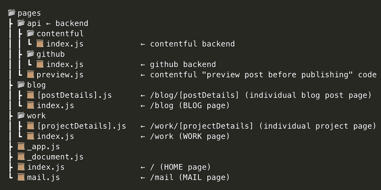
The folder structure in which I organized everything is fairly straight forward. In order to keep things visually simplified, I'm not going to include the files within each folder, only the folders themselves. If you're not familiar with NextJS's file-based routing via the /pages directory, read this before continuing.
In the root of this project there are only four folders:
Now, let's take a look at the /pages folder. Here, I'll show the individual files as each file corresponds with an entire page on the front end. The /api folder contains all the backend code.
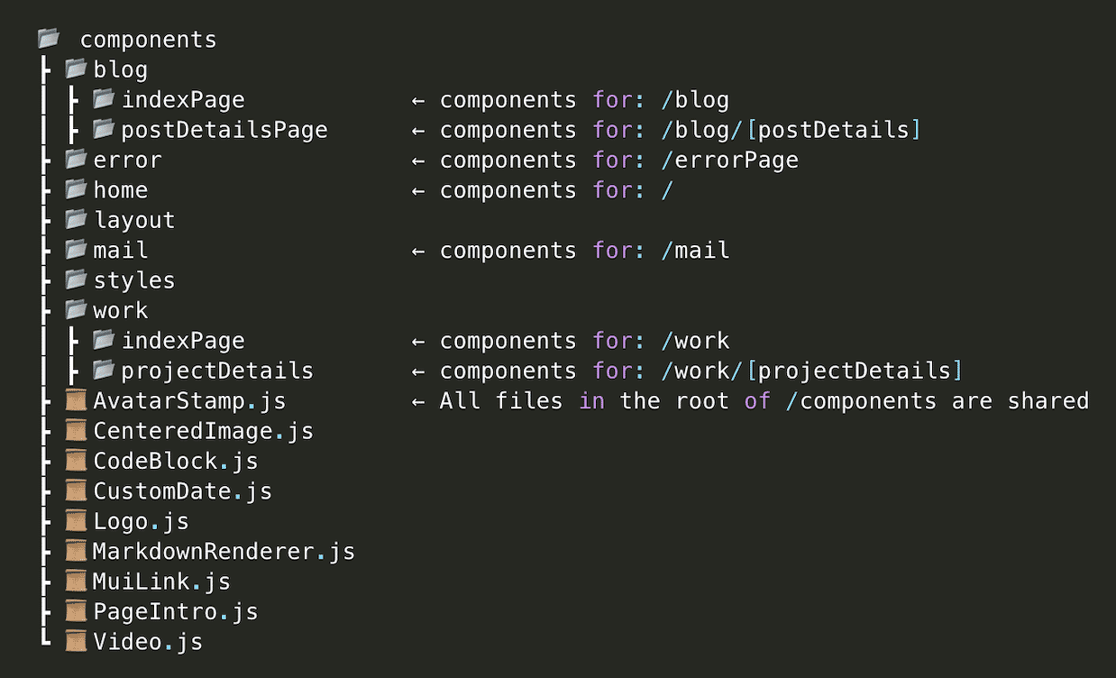
We'll step out of the /pages folder and back into the root of the project. Now, let's checkout what the /components folder looks like. Each folder within the /components folder contains all the components for that specific page. The two exceptions to this would be:
- /layout -- contains all components regarding navigation and footer.
- /styles -- contains theme.json which is the customized theme that I created for this project.
- ReactJS - A Javascript library for building user interfaces.
- NextJS - A React framework with hybrid static & server rendering, TypeScript support, smart bundling, route pre-fetching, and more.
- Material UI - A React component-based design system.
- Contentful CMS - Awesome CMS. Control all content from a single hub.
- Formik - An open source form library for React and React Native.
- SendGrid - Send emails with Javascript
- PrismJS - Prism is a lightweight, extensible syntax highlighter, built with modern web standards in mind.
- octokit/request - Send parameterized requests to GitHub’s APIs with sensible defaults in browsers and Node
- markdown-to-jsx - The most lightweight, customizable React markdown component.
- reading-time - Estimates how long an article will take to read. It works perfectly with plain text, but also with markdown or html.
- yup - A JavaScript schema builder for value parsing and validation.
- axios - Promise based HTTP client for the browser and node.js
- uuid - For the creation of RFC4122 UUIDs. Used for mapped list items.
These resources helped me immensely while developing this project:
- Ghost's Casper Theme - The primary inspiration for the design of my blog.
- Vercel - Where my portfolio is deployed. Parent company of NextJS.
- Undraw.co - Open source illustrations. Similar to unsplash, but with vector art.
- file-tree-generator - VSCode extension that made the folder structure trees for this README.md.
- ES6 Import Formatter - VSCode extension that that auto sorts my import statements.
- Sublime Material Theme - Dark - The VSCode color theme that I use and my inspiration for the syntax highlighting.
- Codevolution - Youtube channel with incredible ReactJS content.
- Sirv - This was the image CDN hosting provider that I used to host images and gifs.
- TinyPNG - Smart PNG and JPEG compression.
- SmartConverter - The fastest, easiest to use video converter on the App Store


