😎 This file is used to implement grid system in web responsive design that makes everything easier 😎
- What is grid system?
- Main ingredients
- Some definitions for the file grid.css
- Learn more
- Reference
- License & Copyright
- The grid system is a structure of horizontal and vertical lines that help divide the page layout and layout design elements accordingly.
- Role:
- Applied in UI/UX design, special role in Responsive Web Design.
- Easily arrange design elements, create balance, and look intuitive.
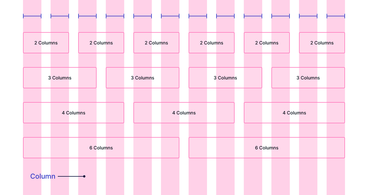
- Grid is a "father" container element that contains rows and columns
- Rows are horizontal containing columns
- Column containing the content and elements of the website
- The width of the column should use relative units to help create flexibility and easily adjust for different devices
- The number of columns in the grid system is predefined. For PC, it is usually
12|16 columns, tablets are8 columnsand mobile is4 columns
- The gutter is the distance between the two sides of the column, creating the distance between columns that are close together
- The width of the gutter is flexibly changed to fit each device. On PC is usually
24px, tablet is12pxand mobile is8px
- Margin is the margin on both sides of the main layout of the website, or understandably, the empty part outside the grid element
- The margin changes to suit each device. Large margin suitable for PC and tablet, small margin suitable for mobile
.grid {
    width: 100%;
    display: block;
    padding: 0;
}
max-width: 1200px;- Why 1200px? Read more on 👉 1200px Grid System
.grid.wide {
    max-width: 1200px;
    margin: 0 auto;
}
display: flex;- Help handle columns, contain columns in a row and columns horizontallyflex: wrap;- When the total width of the columns exceeds the allowed row size, the column will be put downmargin-leftandmargin-right- Helps to remove the extra space of gutter created to the left of the first column and to the right of the last column in the row on the mobile device
.row {
    display: flex;
    flex-wrap: wrap;
    margin-left: -4px;
    margin-right: -4px;
}
- Column:
col - Prefix class:
c-*- mean column, is used for mobile device, * from 0 to 12 (based on 12 columns in Grid System)m-*- mean medium, is used for tabletl-*- mean large, is used for PC
.col {
    padding-left: 4px;
    padding-right: 4px;
}
.
.
.
.c-1 {
    flex: 0 0 8.33333%;
    max-width: 8.33333%;
}
.
.
.
.m-1 {
    flex: 0 0 8.33333%;
    max-width: 8.33333%;
}
.
.
.
.l-1 {
    flex: 0 0 8.33333%;
    max-width: 8.33333%;
}
- Column offset:
*-o-*- Column offset helps to place columns anywhere between 1 - 11 in a 12-column layout. - Prefix class:
c-o-*- mean column offset, is used for mobile device, * from 1 to 12 (based on 12 columns in Grid System)m-o-*- mean medium offset, is used for tabletl-o-*- mean large offset, is used for PC
.c-o-1 {
    margin-left: 8.33333%;
}
.
.
.
.m-o-1 {
    margin-left: 8.33333%;
}
.
.
.
.l-o-1 {
    margin-left: 8.33333%;
}
- grid.css is designed for mobile first
@media (min-width: 740px)- For devices such as tablets from 740px and up@media (min-width: 740px) and (max-width: 1023px)- For tablets and PCs with low resolution from 740px to 1023px@media (min-width: 1024px) and (max-width: 1239px)- For PCs with low resolution from 1024px to 1239px@media (min-width: 1113px)- For PCs with low resolution from 1113px and up
- Adding
box-sizing: border-box;in your css file. If this property is missing, your columns may not be on the same horizontal row.
* {
  box-sizing: border-box;
}
- F8 - Grid System - Author Son Đang
© 2021 Tien Huynh tienhuynh-tn Licensed under the MIT LICENSE.
🤟 Feel free to use my repository and star it if you find something interesting 🤟