Analysis of the effect of multi/single-attribute decisions on the choice overload effect.
This repository contains the code used to analyze data collected from a Qualtrics survey.
The data were exported from Qualtrics as a CSV format and then processed in Excel in order to remove irrelevant information such as IP address, date/time, and so on.
Then, the records were split into four different groups based on which columns were non-null:
# Split into confidence values for each type of question
meal_short = data['meal_short'].dropna()
meal_long = data['meal_long'].dropna()

class_short = data['class_short'].dropna()
class_long = data['class_long'].dropna()The statsmodels package was used to perform a 2-way ANOVA. After the satisfaction values
were aggregated into lists by category, the following code was used for the ANOVA:
formula = 'Satisfaction ~ C(Type) + C(Length) + C(Type):C(Length)'
model = ols(formula, aggregate).fit()
aov_table = statsmodels.stats.anova.anova_lm(model, typ=1)
The results of the ANOVA were:
                      df      sum_sq    mean_sq         F    PR(>F)
C(Type)              1.0    3.582745   3.582745  0.875582  0.350383
C(Length)            1.0   17.122664  17.122664  4.184584  0.041916
C(Type):C(Length)    1.0    0.300051   0.300051  0.073329  0.786790
Residual           233.0  953.399603   4.091844       NaN       NaN
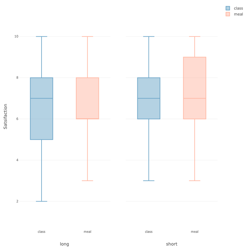
Exploratory.io was used to create a data visualization. First, we used Excel to coalesce the data into the following format:
| Type | Length | Response |
|---|---|---|
| class | short | 7 |
| meal | short | 7 |
| class | short | 6 |
| class | long | 10 |
| ... |
Then, the following box-and-whiskers plots were created from the newly formatted data:
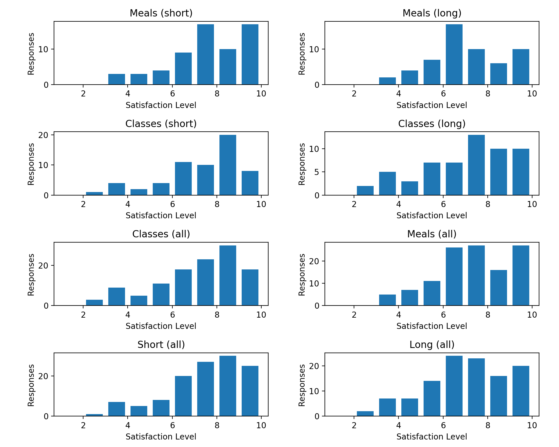
In addition, the pyplot package from matplotlib was used to create a full visualization of the data consisting of a series of histograms outlining the preference reported by users for each category of question.
Graphs were creates as follows:
plt.subplot(4, 2, 1)    # 1st plot
plt.title('Meals (short)')
plt.xlabel('Satisfaction Level')
plt.ylabel('Responses')
plt.hist(
    meal_short,
    bins=range(1, 11), # 1, 2, ..., 10
    rwidth=0.75,
    label='Meals (short)'
)

...

# Fix overlapping in layout, and then display the plots
plt.tight_layout()
plt.gcf().canvas.set_window_title('Results')    # Window title
plt.show()
This resulted in the following visualization:
A website view of this readme is hosted at decsci.raduvasilescu.com.
This host is specified in the CNAME file in this repository, and the main HTML page template has been adjusted
from the default Jekyll theme and can be found in _layouts/default.html.
- Radu Vasilescu
- Zoe Tang
- Claire Hutchinson
- Prateek Khandelwal