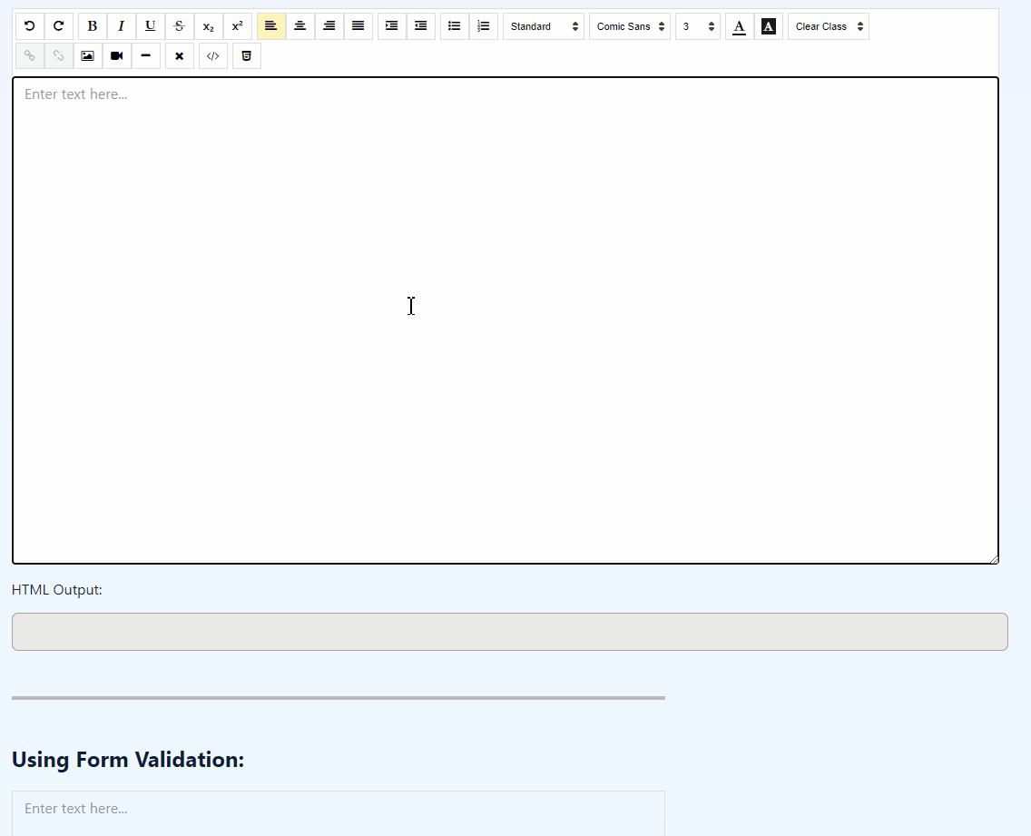
Rich text editor What You See Is What You Get created using Angular 17.
Easy to use and customize.
-
Install the package:
Using npm:
npm install @wfpena/angular-wysiwyg
Using yarn:
yarn add @wfpena/angular-wysiwyg
-
(For version
>=1.1.5) Import the fonts:Add to your global
scss:@import '@wfpena/angular-wysiwyg/'
Import module:
Note
Requires HttpClientModule for the image upload.
// Needs to import HttpClientModule
import { HttpClientModule} from '@angular/common/http';
import { AngularEditorModule } from '@wfpena/angular-wysiwyg';

@NgModule({
  imports: [ HttpClientModule, AngularEditorModule ]
})
You can use the angular-editor component. Like this:
<angular-editor [placeholder]="'Jot something down...'" [(ngModel)]="htmlContent"></angular-editor>You can add an id attribute if you are going to use the same element multiple times.
You can customize the editor by passing configs through the [config] attribute.
Like this:
<angular-editor id="editor1" [config]="editorConfig"></angular-editor>
<angular-editor id="editor2" [config]="editorConfig"></angular-editor>
Whe using multiple angular-editor components, add a unique id property to the component.
By default if you click on the image icon and select an image it will be inserted as base64 string on the img src= attribute.
You can copy and paste external images if you want to add them also.
You can define backend endpoints to save the image or directly send the url of the image which should be passed to the img element.
You can define the uploadUrl config to make a request to the backend to insert the image.
config: AngularEditorConfig = {
  uploadUrl: 'http://localhost:9000/upload_img',
  // ...
};
You can also define the upload config to make the request and map the response into a url to be inserted on the HTML on the editor.
import { HttpClient, HttpResponse } from '@angular/common/http';
import { UploadResponse, AngularEditorConfig } from '@wfpena/angular-wysiwyg';
import { map } from 'rxjs';

// ...

export class AppComponent implements OnInit {
  constructor(
    // ...
    private http: HttpClient,
  ) {}

  config: AngularEditorConfig = {
    // ...
    upload: (file) => {
      const url = 'http://localhost:9000/upload_img';
      const uploadData: FormData = new FormData();
      uploadData.append('file', file, file.name);
      return this.http
        .post<{ file: string; url: string }>(url, uploadData, {
          observe: 'response',
        })
        .pipe(
          map((response) => {
            const imageUrl = response.body.url;
            return {
              ...response,
              body: { imageUrl },
            } as HttpResponse<UploadResponse>;
          }),
        );
    },
    // ...
  };
  // ...
}One of the main features of this project is image resizing option.
You can drag the image to make it bigger or smaller, set max and min sizes through config, etc.
The imageResizeSensitivity config (default 2) defines how fast the image will resize based on the mouse move.
You have the flexibility to define custom buttons with specific actions using the executeCommandFn. This function accepts commands from execCommand, where the first argument is aCommandName, and the second argument is aValueArgument.
In the example below, a custom button is created that adds the Angular Editor logo into the editor:
<angular-editor id="editor1" formControlName="htmlContent1" [config]="editorConfig">
  <ng-template #customButtons let-executeCommandFn="executeCommandFn">
    <ae-toolbar-set>
      <ae-button
        iconClass="fa fa-html5"
        title="Insert Angular Editor Logo"
        (buttonClick)="executeCommandFn('insertHtml', angularEditorLogo)">
      </ae-button>
    </ae-toolbar-set>
  </ng-template>
</angular-editor>
Feel free to customize the iconClass, title, and buttonClick event according to your requirements.
You can replace the font-awesome images for the buttons by setting the content for the icon class on your project's global .css or .scss file.
Here are some examples of how you might be able to do it. Replace the /assets/<your-icon>.svg with the url for your own custom icon.
.fa.fa-undo::before {
  // Replace the url to the icon that you want
  content: url('/assets/<your-icon>.svg') !important;
}

// Redo
.fa.fa-repeat::before {
  content: url('/assets/<your-icon>.svg') !important;
}

// Strikethrough
.fa.fa-strikethrough::before {
  content: url('/assets/<your-icon>.svg') !important;
}

// Bold
.fa.fa-bold::before {
  content: url('/assets/<your-icon>.svg') !important;
}
// ...
This is currently a workaround for replacing the icon, in the future it will be a new feature on the library.
-
Download the font that you want to add (or have its url). For example, on this project I downloaded the
projects/angular-editor-app/src/assets/fonts/RobotoSlab-VariableFont_wght.ttffont to add as a custom font. -
Add the font family to your
scssorcssfile. Example for the RobotoSlab example:
@font-face {
  font-family: 'RobotoSlab';
  src: url('./assets/fonts/RobotoSlab-VariableFont_wght.ttf');
}- Change the
fontsconfig to either completely override the fonts or add a new custom font. For example, adding the RobotoSlab config to the demo:
// For example here I imported the default fonts from angularEditorConfig and also added a new font that will have the label Roboto Custom
fonts: [
  ...angularEditorConfig.fonts,
  { class: 'roboto-slab', name: 'RobotoSlab', label: 'Roboto Custom' },
],| Name | Example Value |
|---|---|
| customClasses | [{"name": "quote","class": "angular-editor-quote"}] |
| defaultFontName | |
| defaultFontSize | 5 |
| defaultParagraphSeparator | |
| editHistoryLimit | 50 |
| editable | true |
| enableToolbar | true |
| fonts | [{"class": "arial","name": "Arial"},{"class": "times-new-roman","name": "Times New Roman"},{"class": "calibri","name": "Calibri"},{"class": "comic-sans-ms","name": "Comic Sans MS"}] |
| height | auto |
| imageResizeSensitivity | 2 |
| maxHeight | auto |
| minHeight | 0 |
| minWidth | 0 |
| outline | true |
| placeholder | Enter text here... |
| sanitize | true |
| showToolbar | true |
| spellcheck | true |
| textAreaBackgroundColor | white |
| toolbarPosition | top |
| translate | yes |
| uploadWithCredentials | false |
| width | auto |
| textPatternsEnabled | true |
You can help make this project better by submitting issues and feature ideas on the repo issues page.