-
Notifications
You must be signed in to change notification settings - Fork 24
2. Quantifying grain size populations using GrainSizeTools Script
The aim of this section is to show how to analyse and quantify a population of grain sizes, whether apparent (grain sections) or real, and how to present them appropriately depending on the information to be communicated.
Caution
If you find errors/bugs in the documentation or in the templates, please open an issue and let us know. Make sure you are using the latest version of the script before reporting them.
Let's first create a lognormal population using the function gen_lognorm_population() with a known shape and average to see how a population of grain sizes can be described statistically.
toy_dataset = averages.gen_lognorm_population(scale=np.log(20),   # set geometric mean to 20
                                              shape=np.log(1.5),  # set lognormal shape =1.5
                                              n=500,              # set sample size = 500
                                              seed=2)

# plot an histogram
plt.hist(toy_dataset, bins='fd')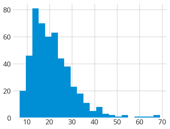
We then use the summarize() function to describe the population statistically.
summarize(toy_dataset)============================================================================
CENTRAL TENDENCY ESTIMATORS
============================================================================
Arithmetic mean = 21.33 microns
Confidence intervals at 95.0 %
mCox method: 20.51 - 22.11 (-3.8%, +3.7%), length = 1.601
============================================================================
Geometric mean = 19.57 microns
Confidence interval at 95.0 %
CLT method: 18.88 - 20.29 (-3.5%, +3.7%), length = 1.413
============================================================================
Median = 19.42 microns
Confidence interval at 95.0 %
robust method: 18.47 - 20.78 (-4.9%, +7.0%), length = 2.312
============================================================================
Mode (KDE-based) = 15.95 microns
Maximum precision set to 0.1
KDE bandwidth = 2.88 (silverman rule)
============================================================================
DISTRIBUTION FEATURES
============================================================================
Sample size (n) = 500
Standard deviation = 9.42 (1-sigma)
Interquartile range (IQR) = 11.42
Lognormal shape (Multiplicative Standard Deviation) = 1.51
============================================================================
Shapiro-Wilk test warnings:
Data is not normally distributed!
Normality test: 0.88, 0.00 (test statistic, p-value)
============================================================================By default, the summarize() function returns:
-
Several central tendency estimates ("averages") including the arithmetic and geometric means, the median, and the mode (i.e. the frequency peak) based on the kernel density estimation method.
-
The confidence intervals for the different means and the median at the 95% confidence level in absolute value and as a percentage relative to the average (also known as coefficient of variation). The meaning of these confidence intervals is that if we measure a similar population there is a 95% probability (one in 20) that the average will fall within this interval. The function gives the lower and upper bounds of the confidence interval, the percentage error from the average, and the length of the interval. As we will see later, the confidence interval level, by default 95%, can be modified.
-
The methods used (e.g. mCox, CLT, robust, etc) to estimate the confidence intervals for each average except the mode. The
summarize()function automatically chooses the optimal method depending on the distribution features (see diagram below) -
The sample size and two measures of population dispersion: the Bessel-corrected standard deviation and the interquartile range.
-
The shape of the lognormal distribution using the multiplicative standard deviation (MSD).
-
A Shapiro-Wilk test warning indicating when the data deviate from a perfect normal and/or lognormal (when p-value < 0.05).
In the example above, the Shapiro-Wilk test tells us that the distribution is not normally distributed, which is to be expected since we know that it is lognormal. Note that the estimated geometric mean and lognormal shape are very close and within the error interval of the values used to generate the synthetic dataset, 20 and 1.5 respectively.

Decision diagram showing which confidence interval calculation method the summarise() function uses based on the sample size and shape of the distribution.
Important
The choice of the measure of central tendency, often referred to as the “average,” depends on your specific goals and the dataset. Here are some guidelines based on Lopez-Sanchez (2020):
- Geometric Mean: This average is recommended for populations that follow a lognormal distribution. It shows superior performance across varying degrees of asymmetry and sample sizes.
- Median: This is the preferable average when dealing with data contamination, such as outliers or few (<10%) observations from mixed distributions.
- Arithmetic Mean: This is the most backwards-compatible average due to its common use in the past. Theoretically, it outperforms the median in low to moderately skewed distributions (MSD < 1.7) as long as the presence of extreme values (outliers) is limited. However, estimating error margins for the arithmetic mean can be problematic in real samples with asymmetric distributions, making the geometric mean or median preferable in such cases.
- Mode (KDE based): Although generally less precise than other measures of central tendency, the mode remains robust in situations common to grain size studies. It can be useful when comparing different data sets with significant differences in resolution limits and size cut-offs. In such cases it is the only meaningful (i.e. accurate) measure of central tendency when comparing different data sets. The script calculates the mode (peak frequency) using the Kernel Density Estimate (KDE) technique, which is far superior to modes calculated from the histogram.
- Root mean squared (RMS) or Area- or volume-weighted means: Avoid them, as they tend to perform poorly and are not recommended for grain size studies.
👉 TLDR: Rather than using the arithmetic mean, which is an average optimised for normal (Gaussian) distributions, you should probably use the median (plus interquartile range) or geometric mean when quantifying asymmetric distributions. However, if your aim is to use a palaeopiezometer or to compare your average with an average calculated in the past, you should always use the same type of average originally used, as different types of averages are not comparable.
Let's try now with a real population of apparent grain sizes:
# load the data
dataset = pd.read_csv('DATA\data_set.txt', sep='\t')

# estimate Equivalent Circular Diameters (if needed, in this example the dataset do not include ECDs)
dataset['ECD'] = 2 * np.sqrt(dataset['Area'] / np.pi)

# Describe grain size population
summarize(dataset['ECD'])
============================================================================
CENTRAL TENDENCY ESTIMATORS
============================================================================
Arithmetic mean = 34.79 microns
Confidence intervals at 95.0 %
CLT (ASTM) method: 34.09 - 35.48, (±2.0%), length = 1.393
============================================================================
Geometric mean = 30.10 microns
Confidence interval at 95.0 %
CLT method: 29.47 - 30.75 (-2.1%, +2.2%), length = 1.283
============================================================================
Median = 31.53 microns
Confidence interval at 95.0 %
robust method: 30.84 - 32.81 (-2.2%, +4.1%), length = 1.970
============================================================================
Mode (KDE-based) = 24.31 microns
Maximum precision set to 0.1
KDE bandwidth = 4.01 (silverman rule)
============================================================================
DISTRIBUTION FEATURES
============================================================================
Sample size (n) = 2661
Standard deviation = 18.32 (1-sigma)
Interquartile range (IQR) = 23.98
Lognormal shape (Multiplicative Standard Deviation) = 1.75
============================================================================
Shapiro-Wilk test warnings:
Data is not normally distributed!
Normality test: 0.93, 0.00 (test statistic, p-value)
Data is not lognormally distributed!
Lognormality test: 0.98, 0.01 (test statistic, p-value)
============================================================================In this case, the Shapiro-Wilk test indicates that this population of apparent grain sizes deviates from a canonical lognormal distribution. Note that the algorithm has taken this into account and has used different methods to estimate the confidence intervals of the averages compared to the first example, in particular the CLT method.
Note
This depends on the information you want to provide. If the message is about the spread of the grain size population, then the standard deviation or the interquartile range is the metric you want. If the interest is in the precision of the calculated average or in comparing averages between different grain size populations, then the confidence interval is the metric you want (e.g., when using paleopiezometers). More precisely:
The standard deviation (s.d.) is the typical difference between each value in the population and the mean value. So, in this case, it describes how broadly the grain size values are distributed within the sample. Standard deviation describes a dataset.
The standard error of the mean (s.e.m.) is an estimate of how variable the means will be if the experiment or the measure is repeated multiple times. The s.e.m. may serve to check whether sets of samples are likely to come from the same or a similar population. Standard error describes an estimate.
The 95 % confidence interval (C.I., 95%) means that the population mean will lie in this interval with 95% confidence. It's like saying, "We're 95% confident that the true average grain size falls within this range." In simpler terms, it gives you a sense of how certain you can be about the average, considering the inherent variability in your data.
All the statistical parameters calculated above only make sense if your population is unimodal. It is therefore imperative to always display the grain size distribution. The plot module includes several custom methods for visualising and characterising grain size populations. All methods of the plot module can be invoked by typing plot.method(). We will go through each of them and when to use them.
By far the most common plot to represent a grain size population is the histogram. The plot.distribution() method takes care of this, but also adds the kernel density estimate (KDE) which is an improved method similar to the histogram. In the KDE, instead of counting how many data points fall into each bin, the method place a mini distribution ("kernel") on each data point and add up the heights of the kernels that overlap. This gives a smoother estimate of the data distribution without assuming any underlying distribution. The simplest use of the function, leaving all options as default, would be to specify only the diameters as follows
fig1, ax = plot.distribution(dataset['ECD'])=======================================
Number of classes = 45
binsize = 3.41
=======================================
=======================================
KDE bandwidth = 4.01
=======================================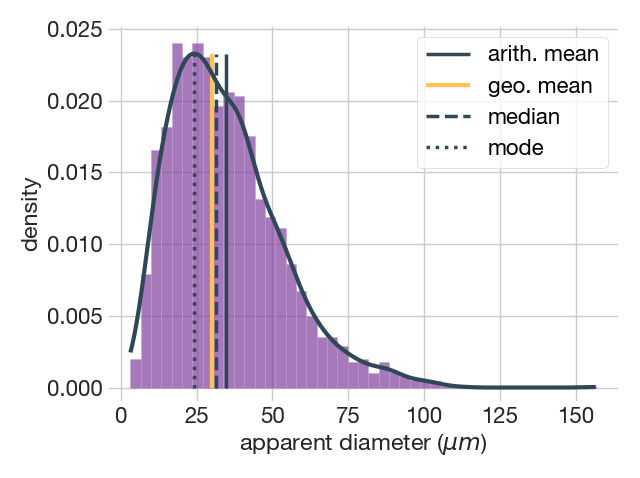
The figure above show the output of the plot.distribution() method with the default options. This includes the histogram, providing the bin size and the number of classes, the kernel density estimate (KDE) shown as a continuous black line, and the location of the various averages. This function offers the possibility of modifying some of the parameters it calculates by default. A list of the parameters and some examples are given below that we will commented on in turn.
Parameters
----------
data : array_like
    the size of the grains

plot : string, tuple or list; optional
    the type of plot, either histogram ('hist'), kernel density estimate
    ('kde') or both ('hist', 'kde'). Default is both.

avg : string, tuple or list; optional
    the central tendency measures to show, either the arithmetic ('amean')
    or geometric ('gmean') means, the median ('median'), and/or the
    KDE-based mode ('mode'). Default all averages.

binsize : string or positive scalar; optional
    If 'auto', it defines the plug-in method to calculate the bin size.
    When integer or float, it directly specifies the bin size.
    Default: the 'auto' method.

    | Available plug-in methods:
    | 'auto' (fd if sample_size > 1000 or Sturges otherwise)
    | 'doane' (Doane's rule)
    | 'fd' (Freedman-Diaconis rule)
    | 'scott' (Scott rule)
    | 'sqrt' (square-root rule)
    | 'sturges' (Sturge's rule)

bandwidth : string {'silverman' or 'scott'} or positive scalar, optional
    the method to estimate the bandwidth or a scalar directly defining the
    bandwidth. It uses the Silverman plug-in method by default.
The plot parameter allows you to specify the plot type, either the histogram, the KDE or both (the default). For example, if you only want to plot the KDE you can specify it as follows
fig2, ax = plot.distribution(dataset['diameters'], plot='kde')=======================================
KDE bandwidth = 4.01
=======================================
Another parameter that you can specify is the method that calculates the bin size of the histogram. The binsize parameter allows you to use different Numpy plug-in methods to estimate optimal bin sizes. The default mode, called auto, uses the Freedman-Diaconis rule for large datasets and the Sturges rule otherwise. More details on these methods can be found here. You can also set any bin size by specifying the size numerically. We encourage you to use the default method 'auto'. Empirical experience indicates that the 'doane' and 'scott' methods also work well for lognormal- and normal-like distributions, respectively.
fig3, ax = plot.distribution(dataset['diameters'], plot='hist', binsize='doane')=======================================
Number of classes = 17
binsize = 9.02
=======================================
The avg parameter allows to specify which measure of central tendency to display, either the arithmetic mean amean, the geometric mean gmean, the median median, and/or the KDE-based mode mode. By default, all averages are displayed. You can pass one of them, e.g. avg='amean', or several, e.g. avg=('median', 'mode').
Lastly, the bandwidth parameter allows you to specify the method for estimating the optimal bandwidth needed for constructing the KDE, either 'silverman' (the default) or 'scott'. The 'silverman' and the 'scott' are both rules-of-thumb methods optimized for normal-like distributions, so they perform better when using over log-transformed grain sizes. You can also set any bin size by specifying the bandwidth/kernel value numerically.
The CDF is built using the same information as the histogram, but provides complementary insight. Instead of density, the CDF uses the cumulative probability on the y-axis, so you have a map of grain size versus percentile all along the distribution. Note that the y-axis always range from 0 to 1 while the x-axis show the spread of values, here the grain size. The slope of the CDF is related to the number of values in a particular grain size range, so a steep slope means that there are many values (grain sizes) in that range, while an almost flat slope means there are not so many values in that range. It also clearly shows unusual values in the population in the form of vertical (a value that is repeated many times) or flat (a missing range of values in the distribution) lines. Overall, it is a type of plot that gives a lot of information about the features of the distribution in a much clearer way than the more commonly used histogram or KDE. So if your main goal is to visually describe the features of your distribution the CDF is possibly your best choice. Use it!
# An example of ploting an EDF using matplotlib using the ecdf() method
fig4, ax = plt.subplots(constrained_layout=True)

ax.ecdf(dataset['diameters'])
ax.set_xlabel('apparent diameter $\mu m$')
ax.set_ylabel("Probability of occurrence")
ax.set_ylim(bottom=-0.03, top=1.03)
In the example above, one can see directly from the CDF that 80% of the grain size population is below 50 microns, or that there are very few grains in the 100 to 150 micron range. As we will see later (section 4), the CDF is also an excellent plot for visually comparing two or more distributions, far better than the histogram or even the kernel density estimate. On the other hand, the CDF is not the best choice if you want to illustrate where the averages lie within the distribution of values, in which case the histogram and the KDE are better choices.
Tip
Want to know more about how to create custom figures with Matplotlib? Check here
Sometimes it can be helpful to test whether the data follow or deviate from a lognormal distribution. For example, to find out if the data are suitable for using the two-step stereological method, or to choose which confidence interval method is optimal.
The script uses two methods to test whether the grain size distribution follows a lognormal distribution. One is a visual method called the quantile-quantile or q-q plot and the other is a quantitative test called the Shapiro-Wilk test. The qq_plot() function from the plot module provides both
fig5, ax = plot.qq_plot(dataset)=======================================
Shapiro-Wilk test (lognormal):
0.99, 0.03 (test statistic, p-value)
It doesnt look like a lognormal distribution (p-value < 0.05)
(╯°□°)╯︵ ┻━┻
=======================================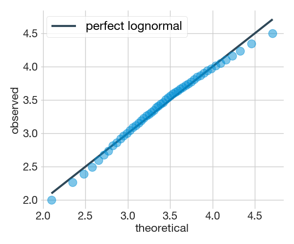
The Shapiro-Wilk test returns two different values, the test statistic and the p-value. This test considers the distribution to be lognormally distributed when the calculated p-value is greater than 0.05. The q-q plot is a visual test that if the points fall right on the reference line, it means that the distribution is similar to the model, i.e. perfectly lognormal.
Tip
To know more about the quantile-quantile plot see https://clauswilke.com/dataviz/
The results above correspond to the apparent grain size population provided as an example with the script. In this case, the Shapiro-Wilk test indicates that the distribution does not resemble a lognormal distribution as it has a p-value less than 0.05. This is a common situation when dealing with real (apparent or not) grain size populations, as the real world rarely matches the models mainly due to different constraints imposed on data acquisition.
The q-q plot has the advantage over the Shapiro-Wilk test that it shows where the distribution deviates from lognormality (if it deviates). In the example above we can see that it deviates mainly at the extremes, which is quite common in grain size populations.The deviation in the lower part of the grain size distribution is usually due to the fact that our acquisition system can only measure grain size up to a limit set by its resolution, so it is very likely that we will lose some of the smaller grain size fractions, especially when measuring apparent sections. Deviation in the upper part, known as the tail, is usually but not always due to insufficient sample size. As the probability of measuring grains in the tail is lower, it is more affected by unrepresentative sample sizes. The message here is that both, the Shapiro-Wilk test and the quantile-quantile plot, are complementary. The q-q plot is perhaps more informative as it shows where the deviation from a perfect lognormal pattern occurs and perhaps the causes.
Caution
The Shapiro-Wilk test does not tell us whether the lognormal distribution is a good enough model but that the distribution we have measured does not come from a "perfect" lognormal distribution. Even if you get a negative test and depending on your goals a lognormal model may still be useful. This is something you need to decide based on your goals and expectations. A good read on this topic is http://allendowney.blogspot.com/2013/08/are-my-data-normal.html
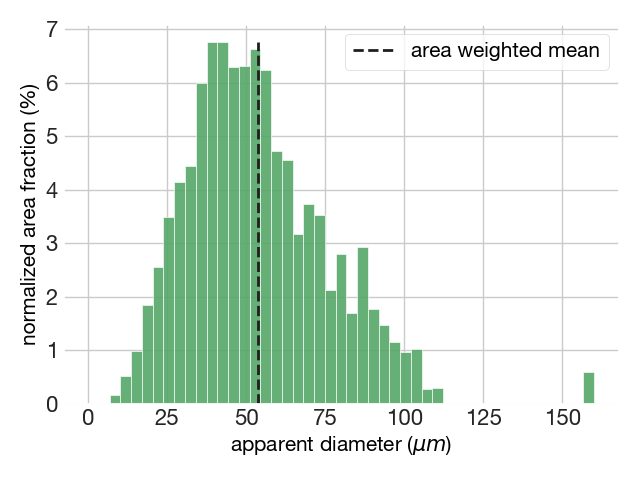
The plot module also allows plotting the area-weighted distribution of grain sizes using the function area_weighted(). This function also returns some basic statistics such as the area-weighted mean and the histogram features. For example:
fig6, ax = plot.area_weighted(dataset['diameters'], dataset['Area'])=======================================
DESCRIPTIVE STATISTICS
Area-weighted mean grain size = 53.88 microns
=======================================
HISTOGRAM FEATURES
The modal interval is 40.85 - 44.26 microns
The number of classes are 46
The bin size is 3.40 according to the auto rule
=======================================The area-weighted apparent grain size distribution plots also returns the location of the area-weighted mean.
Important
When should the area-weighted approach be used and when should it not be used? You should not use the area-weighted mean for calibrating paleopiezometers or comparing of grain size populations, as it is a poorly optimised central tendency measure (Lopez-Sanchez, 2020). On the other hand, the area-weighted plot is handy for visualizing the coarser size range, as these sizes are diluted in number-weighted distributions, but can represent a significant area or volume.
Normalized grain size distributions are representations of the entire grain population standardized by the population average, usually the arithmetic mean or the median. The advantage of a normalized distribution is that it allows the comparison of grain size distribution with different average grain sizes. For example, to check whether two or more grain size distributions have similar shapes we can compare their standard deviations (SD) or their interquartile ranges (IQR). In this case, the plot.normalized() method displays the distribution on a logarithmic scale and provides the SD or IQR of the normalized population, depending on the chosen normalizing factor.
fig7, ax = plot.normalized(dataset['diameters'], avg='amean')=======================================
Normalized SD = 0.165
KDE bandwidth = 0.04
=======================================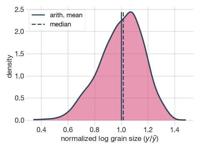
In the example above, the plot.normalized() method plotted a KDE of the log-transformed grain size distribution normalized to the arithmetic mean (note that amean = 1).
If you want to save a plot to disk you can do it using the savefig() method as follows
fig1.savefig("grain_size_pop.png", dpi=300, bbox_inches="tight")Note that before the period that precedes the method you must point to the figure you want to save, in this example a figure contained in the variable fig1. Inside the parentheses, the first parameter is the name of the file, here grain_size_pop, and the format of the image .png. After that, there are several useful parameters that you can use such as:
-
dpi=300controls the resolution (dots per square inch) of the output. -
bbox_inches="tight"fits the bounds of the figure to our plot.
for more details go to the "Getting Started" section.
To compare how different or similar two or more particle size populations are, there are two approaches, using tests such as the Anderson-Darling, Kolmogorov-Smirnov, etc., or by visual comparison. Indeed, in the previous examples we have already used such tools to compare our populations with perfect lognormal populations, both through the Shapiro-Wilk test and visually using the quantile-quantile plot. In this subsection, we consider the case where different empirically measured distributions, i.e. distributions that do not have to follow a particular distribution, are compared (although in the example a numerically generated lognormal distribution is used for convenience).
If you want to compare two or more empirical distributions the best option is to use the empirical cumulative distribution function (ECDF). For this we will use the library matplotlib to plot the different populations (here denoted as dataset1, dataset2...) using the ecdf() method.
# import matplotlib
import matplotlib.pyplot as plt

# create the figure
fig8, ax = plt.subplots(constrained_layout=True)

ax.ecdf(dataset1, label='lognormal pop')
ax.ecdf(dataset2, label='empirical pop')
# ... add more distributions if neccesary

ax.set_xlabel('diameters $\mu m$')
ax.set_ylabel("Probability of occurrence")
ax.set_ylim(bottom=-0.03, top=1.03)
# ax.set_xlim(right=101)
ax.legend(loc='best', fontsize=18)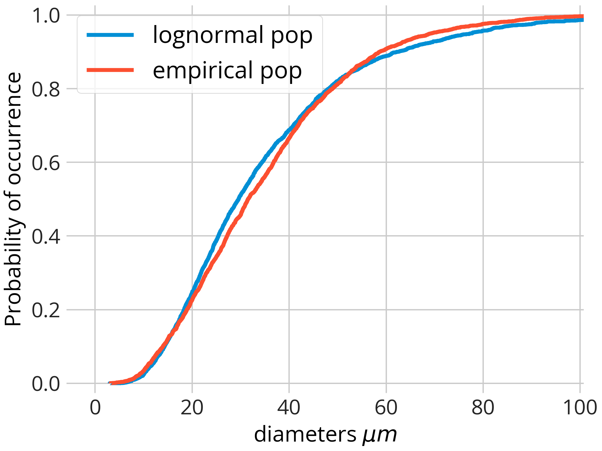
more details here: https://matplotlib.org/stable/gallery/statistics/histogram_cumulative.html
The two-sample Kolmogorov-Smirnov (KS) test is a nonparametric (i.e. it does not assume a particular distribution) test used to determine if two samples come from the same distribution. These are the results of the KS test comparing the distributions illustrated in the plot above.
# import the two-sample Kolmogorov-Smirnov test from Scipy stats module
from scipy.stats import ks_2samp

result = ks_2samp(pop1, pop2)

print('Two-sample Kolmogorov-Smirnov test:')
print(f' KS test statistic: {result.statistic:.3f}')
print(f'Statistic location: {result.statistic_location:.2f}')
print(f'           p-value: {result.pvalue:.3f}')
Two-sample Kolmogorov-Smirnov test:
KS test statistic: 0.046
Statistic location: 36.25
p-value: 0.006Here's a simple explanation of how it works and how to interpret the results of the test:
KS Test Statistic: The KS test statistic, often denoted as D, is the maximum absolute difference between the empirical cumulative distribution functions (CDFs) of the two samples. In simple terms, it measures the greatest vertical distance between the two CDFs (see figure below as example). The larger the D value, the greater the difference between the two distributions.
Statistic Location: The statistic location is the point (or points) at which the maximum difference between the two CDFs occurs. This can give you an idea of where the two distributions differ the most.
Illustration of the two-sample Kolmogorov–Smirnov statistic. Red and blue lines each correspond to an empirical distribution function, and the black arrow is the two-sample KS statistic. Source: wikipedia https://en.wikipedia.org/wiki/Kolmogorov%E2%80%93Smirnov_test
P-value: The p-value in the KS test is the probability of observing a test statistic as extreme as the one calculated, assuming the null hypothesis is true. The null hypothesis for the KS test is that the two samples come from the same distribution. If the p-value is small (typically less than 0.05), we reject the null hypothesis and conclude that the two samples come from different distributions.
The test indicates that the maximum difference is 0.046 (~5%) and that this occurs for a grain size of 36.25 microns. The p-value (<<0.05) indicates that the two samples do not belong to the same distribution.
