Analysis
This sheet contains several tables for defining different types of analyses and their corresponding graphs:
- a “Global Summary” table with general indicators
- a table for defining analyses on single variables: “Univariate Analysis”
- a table for defining analyses crossing two variables: “Bivariate Analysis”
- three tables for defining time series and their graphs: “Time Series Analysis”, “Labels for Time Series Graphs”, “Graph on Time Series”
- two tables for defining spatio-temporal analyses: “Specification for Spatio-Temporal Analysis”, “Spatio-Temporal Analysis”


The Global Summary table summarises certain indicators for the current epidemic. It has 3 columns:
- Summary Label: free field for entering a short but explicit label describing the analysis
- Summary function: free field for entering the function that will display the desired indicator. As in the dictionary, the function must be written in English, regardless of the language in which the rest of the set-up is written.
- Format: drop-down menu for defining the display format of the expected result (see also Format)
Definition in the set-up file:

Display in the linelist:

The “Univariate Analysis” table is used to describe analyses based on a single variable. It has 10 columns:
Section: this is a free field used to define blocks of univariate analyses on a theme, for example all the tables grouping patient characteristics. It will also be possible to navigate between sections in the linelist using the ‘Go to section’ drop-down menu.
Table title: this is a free field for entering the name of the table with the analyses. It should be fairly explicit and short.
Group by variable (row): this is a static drop-down menu containing the variables that can be analysed. In other words, variables with known modalities, i.e. choice_manual and choice_formula variables.
Add missing data: this is a yes/no field used to indicate whether you want to count missing data for the selected variable.
Summary function: this is a free field in which to enter the formula corresponding to the desired analysis. The formula must always be written without the ‘=’ sign and in English, whatever the language in which the set-up file is written (see formula).
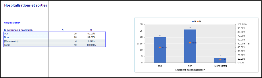
Often the aim is to show the number of patients by modalities of a variable, and the “N” function, for counting rows, is sufficient.
Summary label: this is a free field which corresponds to the label which will be displayed above the results column.
Format: this is a static drop-down menu with a preselection of possible display formats. (see also Format)
Add percentage: this is a yes/no field used to indicate whether you want to see the results as a percentage as well as a value. If yes, a “%” column will be added to the right of the “summary function” column in the linelist.
Add graph: this is a yes/no field used to indicate whether you want a vertical bar graph.
If the previous “Add percentage” option is set to “yes”, the percentage will be displayed on the secondary vertical axis of the graph.
Flip coordinates: this is a yes/no field used to indicate whether you want the graphic to be displayed horizontally rather than vertically.
If the ‘Add percentage’ and ‘Flip coordinates’ options are set to ‘yes’, the graph will not contain the percentages, as the two options are incompatible and the vertical display of the graph will prevail.
A “Note” message will be displayed in the “__checkRep” sheet.


Definition in the set-up file:
Display in the linelist:
| Column | Type | Mandatory | Details |
|---|---|---|---|
| Section | Free text | Yes | Group tables by section |
| Table title | Free text | Yes | Short title |
| Group by variable (row) | Dropdown | Yes | One categorial variable to summarise |
| Add missing data | Dropdown (yes/no) | Add rows with missing values counts? | |
| Summary function | Free text | Yes | N to count rows, other formula accepted |
| Summary label | Free text | Name of the summary | |
| Format | Dropdown | Format of the summary | |
| Add percentage | Dropdown (yes/no) | ||
| Add graph | Dropdown (yes/no) | ||
| Flip coordinates | Dropdown (yes/no) | Inverse x and y axis of the graph |

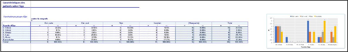
The “Bivariate Analysis” table is used to describe analyses based on two variables. It has 11 columns:
Section: this is a free field used to define blocks of univariate analyses on a theme, for example all the tables grouping patient characteristics. It will also be possible to navigate between sections in the linelist using the ‘Go to section’ drop-down menu.
Table title: this is a free field for entering the name of the table with the analyses. It should be fairly explicit and short.
Group by variable (row): this is a static drop-down menu containing the variables that can be analysed. In other words, variables with known modalities, i.e. choice_manual and choice_formula variables.
Group by variable (column): this is a static drop-down menu containing the variables that can be analysed. In other words, variables with known modalities, i.e. choice_manual and choice_formula variables.
Add missing data: this is a drop-down menu with 4 possible options, which allows you to indicate whether you want to count missing data for the selected variable(s):
- no: missing data are not added
- row: missing data is added to variables in rows
- column: missing data is added to variables in columns
- all: missing data is added to both column and row variables
Summary function: this is a free field in which to enter the formula corresponding to the desired analysis. The formula must always be written without the ‘=’ sign and in English, whatever the language in which the set-up file is written (see formula).
Often the aim is to show the distribution of patients between the modalities of a variable, and the “N” function is sufficient.
Summary label: this is a free field which corresponds to the label which will be displayed above the results column.
Format: this is a static drop-down menu with a preselection of possible display formats. (see also Format)
Add percentage: this is a yes/no field used to indicate whether you want to see the results as a percentage as well as a value. If yes, a “%” column will be added to the right of the “summary function” column in the linelist.
Add graph: this is a yes/no field used to indicate whether you want a vertical bar graph.
If the previous “Add percentage” option is set to “yes”, the percentage will be displayed on the secondary vertical axis of the graph.
Flip coordinates: this is a yes/no field used to indicate whether you want the graphic to be displayed horizontally rather than vertically.
If the ‘Add percentage’ and ‘Flip coordinates’ options are set to ‘yes’, the graph will not contain the percentages, as the two options are incompatible and the vertical display of the graph will prevail.
A “Note” message will be displayed in the “__checkRep” sheet.
| Column | Type | Mandatory | Details |
|---|---|---|---|
| Section | Free text | Yes | Group tables by section |
| Table title | Free text | Yes | Short title |
| Group by variable (row) | Dropdown | Yes | One categorial variable to summarise |
| Group by variable (column) | Yes | ||
| Add missing data | Dropdown (no/row/column/all) | Add missing values counts? | |
| Summary function | Free text | Yes | N to count rows, but formula accepted |
| Summary label | Free text | Name of the summary | |
| Format | Dropdown | Format of the summary | |
| Add percentage | Dropdown (yes/no) | ||
| Add graph | Dropdown (values/percentage) | ||
| Flip coordinates | Dropdown (yes/no) | Inverse x and y axis of the graph |
Definition in the set-up file:

Display in the linelist :
Time series analyses and graphs are defined using 3 different tables:
- one to define the table(s) (and the series to add to the graphs)
- one to define the list of associated graphs
- one to define the characteristics of graphs
See a diagram at the end of the section.

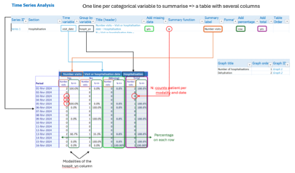
The first table is used to define the different time series. It has 12 columns, and one line represents one summary per variable (ex: counts for the different types of outcomes; or median of the length of stay). If you take the option to add a total or missing values, or if the variable is categorical, the table created will have several columns.
Series ID: this is an auto-populate field; each row in this table is automatically assigned a series ID, which is an incremental value (1). This ID is used in particular to define graphs.
Section: this is a free field which can be used to combine analyses on a theme in a single table, for example patient characteristics over time. Each section corresponds to a table in the linelist. They are displayed one above the other, and it is possible to navigate between them using the ‘Go to section’ drop-down menu.
Time variable (row): this is a static drop-down menu containing time variables. In other words, variables of type date.
Group by variable (column): this is a static drop-down menu containing the variables that can be analysed. In other words, variables with known modalities, i.e. choice_manual and choice_formula variables. It is also possible to leave this field empty, and define the analysis solely on the basis of a formula in the “Summary function” field.
Title (header): this is a calculated field. It is the name which will be displayed at the top of the table, above the corresponding analyses. It is made up of the summary label (described below), the label of the time variable (row) and the label of the variable to be analysed (Group by variable (column)).
Add missing data: this is a yes/no field which allows you to indicate whether you want to count missing data for the selected variable. If ‘yes’ is selected, a column with the missing values will be added to the right of the other columns created for each mode of the variable to be analysed.
Summary function: this is a free field in which to enter the formula corresponding to the desired analysis. The formula must always be written without the ‘=’ sign and in English, whatever the language in which the set-up file is written (see formula).
Often the aim is to show the distribution of patients between the modalities of a variable, and the “N” function is sufficient. If the “Group by variable (column)” field is empty, the function will count the number of entries in the chosen time variable.
Summary label: this is a free field which corresponds to the label used to create the “Title header” and which is used to label the column containing the results of the “summary function”.
Format: this is a static drop-down menu with a preselection of possible display formats. (see also Format)
Add percentage: this is a static drop-down menu with 3 options:
-
No: no percentage is added
-
Row: there is an additional column to the right of each value listed to show the percentage according to the time scale. The percentage is calculated on the total number of patients in the row.
-
Column: there is an additional column to the right of each value listed to show the percentage according to the time scale. The percentage is calculated on the total number of patients in the column.
Add total: this is a yes/no field used to add a row at the bottom of the table in the LL with the totals for the entire period selected.
Table Order: this is a read field which can be used to reorganise the order of analyses in the final table without having to modify the order of lines in the set-up. By default, analyses are displayed from left to right in the order in which they are described in the Time series Analysis table in the set-up.
| Column | Type | Mandatory | Details |
|---|---|---|---|
| Series ID | - | Automatic | |
| Section | Free text | Yes | Group columns by section |
| Title | - | Automatic | |
| Add missing data | Dropdown (yes/no) | Add missing values counts? | |
| Summary function | Free text | Yes | N to count rows, but formula accepted |
| Summary label | Free text | Name of the summary | |
| Format | Dropdown | Format of the summary | |
| Add percentage | Dropdown (column/row/no) | ||
| Add total | Dropdown (yes/no) | ||
| Table order | Free text |

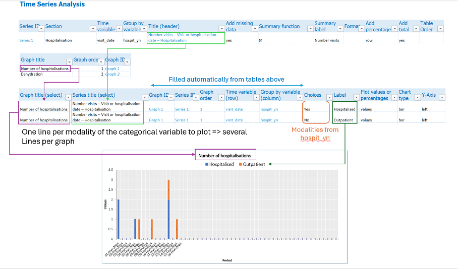
The second Time Series table is used to define the titles and order of the graphs associated with the time series defined above.
The table has 3 columns:
- Graph title: this is a free field for naming the graph
- Graph order: this is a free field which allows you to organise the graphs in the desired order.
- Graph ID: this is an automatically calculated field, with the ID incremented by 1 on each line.
One line represents one graph.
| Column | Type | Mandatory | Details |
|---|---|---|---|
| Graph title | Free text | Yes | Short title |
| Graph order | Free text | Yes | |
| Graph ID | Automatic | Yes |
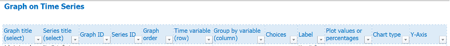
This table is used to define the characteristics of each graph. It has 12 columns. One line represent one series to plot on a graph. A graph with the number of each outcome over time would thus be represented by as many lines as there are of types of outcomes (or as there are modalities that you wish to show on this graph).
Graph title: this is a drop-down menu fed by the “Labels for Time Series Graphs” table. To define a graph, it must first be named in the previous table. Use the same graph title in different rows to indicate that several series should be on the same graph.
Series title: this is a drop-down menu fed by the “Time Series Analysis” table. It is used to link a graph to the characteristics of a group of series (variables to be displayed).
Graph ID: this field is filled in automatically once the “Graph Title” has been selected. It searches for the Graph
Series ID: this field is automatically filled in once the “Series title” has been selected.
Graph order: this field is filled in automatically once the “Graph title” has been selected. To change the order in which the graphs are displayed, simply change the order in the “Labels for Time Series Graphs” table; it is not necessary to change the order of the lines.
Time variable (row): this field is automatically filled in once the “Series title” has been selected. It searches for the time variable defined for the time series.
Group by variable (column): this field is filled in automatically once the “Series title” has been selected. It searches for the variable to be calculated defined for the time series.
Choices: this is a dynamic drop-down menu updated once the “Series title” has been selected. It will display the choices for the variable to be calculated.
Label: this is a free text column that contains le label corresponding to the choice, which will appear in the graph legend.
Plot values or percentage: this is a static drop-down menu with two options: ‘values’ or ‘percentages’, which lets you choose whether to display the results in the graph as values or percentages.
Chart type: this is a static drop-down menu with three options: ‘bar’, ‘line’ or ‘dot’. This lets you choose between 3 pre-selected chart types (bar, line or dot). Chart display can be customised directly from the linelist.
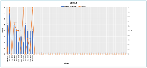
Y-Axis: this is a static drop-down menu with two options: ‘left’ or ‘right’, which lets you choose which side of the Y axis to display. This is particularly useful for displaying two different pieces of information on a single graph (e.g. Epicurve with the number of deaths in value and the CFR in %).
| Column | Type | Mandatory | Details |
|---|---|---|---|
| Graph title | Dropdown | Yes | Defined in the previous table |
| Series title | Dropdown | Yes | Choose which variable summary to plot (ex: counts for outcomes) |
| Graph ID | - | Automatic | |
| Series ID | - | Automatic | |
| Graph order | - | Automatic | |
| Time variable (row) | - | Automatic | |
| Group by variable (column | - | Automatic | |
| Choices | Dropdown (variable modality) | Yes | Choose modality to plot (ex: deads) |
| Label | Free text | Label of the modality | |
| Plot values or percentages | Dropdown (values/percentage) | Yes | |
| Chart type | Dropdown (bar/line/point) | ||
| Y-axis | Dropdown (left/right) |

Definition in the set-up file:

Display in the linelist:


The spatial analyses are described in a table with 11 columns. They are described in a similar way to the bivariate analyses, the difference being that the variables chosen for the rows are necessarily variables containing geographical data.
Section: this is a free field used to define blocks of analyses on the same theme. It will also be possible to navigate between sections in the linelist using the ‘Go to section’ drop-down menu.
Table Title: this is a free field for entering the name of the table with the analyses. It should be fairly explicit and short.
Geo/HF variable (row): this is a dynamic drop-down menu containing all variables of type hf or geo.
N geo max: This is the maximum number of lines you want to see for each analysis. (e.g. if you want a top 10, enter 10).
Group by variable (row): this is a static drop-down menu containing the variables that can be analysed. In other words, variables with known modalities, i.e. choice_manual and choice_formula variables. If the field remains empty, we will just count the number of occurrences per modality of the chosen time variable and these are the Ns (defined with the “N geo max” variable).
Add missing data: this is a yes/no field used to indicate whether you want to count missing data for the selected variable.
Summary function: this is a free field in which to enter the formula corresponding to the desired analysis. The formula must always be written without the ‘=’ sign and in English, whatever the language in which the set-up file is written (see formula).
Often the aim is to show the distribution of patients between the modalities of a variable, and the “N” function is sufficient.
Summary label: this is a free field which corresponds to the label which will be displayed above the results column.
Format: this is a static drop-down menu containing a preselection of possible display formats. (See also Format)
Add percentage: this is a yes/no field used to indicate whether you want to see the results as a percentage as well as a value. If yes, a “%” column will be added to the right of the “summary function” column in the linelist.
Add graph: this is a yes/no field used to indicate whether you want a vertical bar graph.
If the previous “Add percentage” option is set to “yes”, the percentage will be displayed on the secondary vertical axis of the graph.
Flip coordinates: this is a yes/no field used to indicate whether you want the graphic to be displayed vertically or horizontally.
If the ‘Add percentage’ and ‘Flip coordinates’ options are set to ‘yes’, the graph will not contain the percentages, as the two options are incompatible and the vertical display of the graph will prevail.
A “Note” message will be displayed in the “__checkRep” sheet.
Definition in the set-up file:

Display in the linelist: 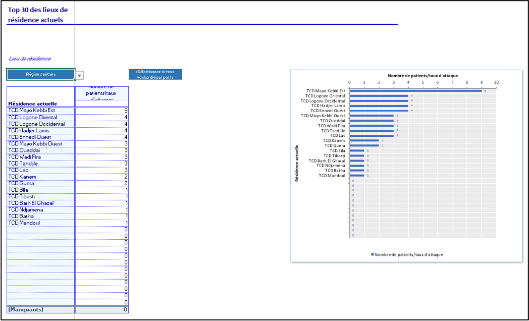
Spatio-temporal analyses and graphs are defined using 2 different tables:
- A “Specification for Spatio-Temporal Analysis” table
- A “Spatio-Temporal Analysis” table
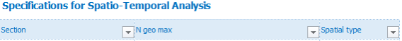
The table has 3 columns:
Section: this is a free field which can be used to combine analyses on a theme in a single table, for example patient characteristics over time. Each section corresponds to a table in the linelist. They are displayed one above the other, and it is possible to navigate between them using the ‘Go to section’ drop-down menu.
N geo max: This is the maximum number of lines you want to see for each analysis. (e.g. if you want a top 10, enter 10).
Spatial type: this is a static drop-down menu with two options, “geo” or “hf”. This defines the type of geographic variable to be used in the section (a geo variable or a health facility).

The table has 10 columns:
Section (select): this is a drop-down menu created automatically and fed by the “Specification for Spatio-Temporal Analysis” table.
Time variable (row): this is a static drop-down menu containing time variables. In other words, variables of type date.
Geo/HF variable (column): this is a drop-down menu created automatically and fed by the “Specification for Spatio-Temporal Analysis” table.
N geo max: this field is automatically filled in on the basis of the section selected and defined in the previous “Specifications for Spatio-Temporal Analysis” table.
Title (header): this is a calculated field. It is the name which will be displayed at the top of the table, above the corresponding analyses. It is made up of the summary label (described below), the label of the time variable (row) and the label of the selected geographic variable (column).
Spatial type: this field is automatically filled in on the basis of the section selected and defined in the previous “Specifications for Spatio-Temporal Analysis” table.
Summary function: this is a free field in which to enter the formula corresponding to the desired analysis. The formula must always be written without the ‘=’ sign and in English, whatever the language in which the set-up file is written (see formula).
Often you will just want to count the number of patients according to their origin or the facility consulted and see how it changes over time, in which case you simply use the N function.
Summary label: this is a free field which corresponds to the label which will be displayed above the results column.
Format: this is a static drop-down menu with a preselection of possible display formats. (see also Format)
Add graph: this is a yes/no field used to indicate whether you want a vertical bar graph.
Definition in the set-up file:

Display in the linelist file:
